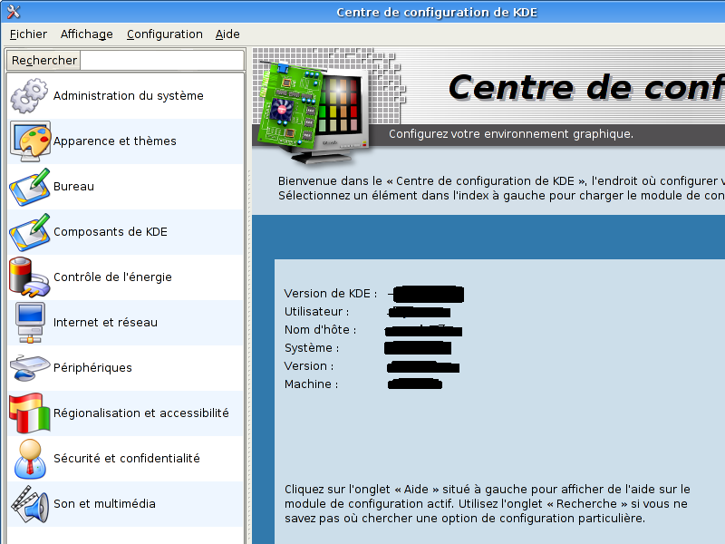
Description: Hi, these 3 screenshots were made as a rearrangement of the KDE Control Center. I din't want to reinvent the wheel; i wanted to use what alreandy exists -but rearranged. It's only meant to express my vision of what that program could be for a better use. It's not meant to be the best choice/behaviour...only my vision. Critics welcome.
The changes:
* a "search" field on top left column (always) ready to direct type-in and search
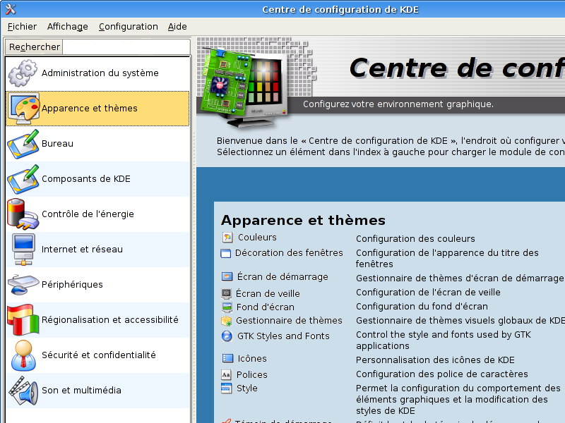
* icon view mode + big icons
* when you clic on one of the different entries (Desktop, Appearance and Themes, etc) it should simply display de sub-entries (Colours, Icons, Fonts, etc) on the right column (as it does when you are in "tree view mode")
* the sub-entries (on the right) should have their icons displayed (and as it does now, when clic the name you "enter" that sub-entry)
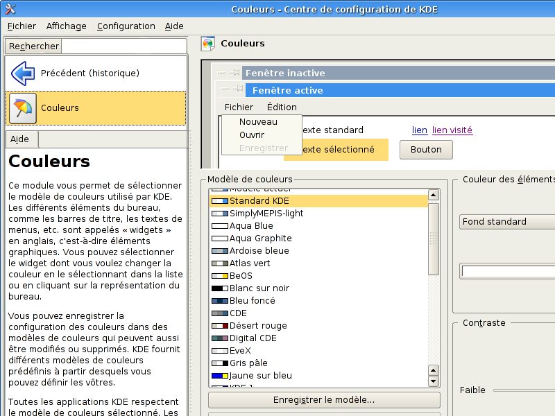
* when you have selected a sub-entry (ex: Colours) right coloumn remains the same as it acts now; left coloumn displays a "back" icon and the icon of the selected entry only (not all the others icons from the same group); it should also display under those icons a "help" section (help become visible instantly whitout additional clics! - i think it's a good thing)
And voilà! I hope you could understand my mind. If someone finds it usefull just make it happen...i'm not a coder (nor a graphist!)


Ratings & Comments
0 Comments