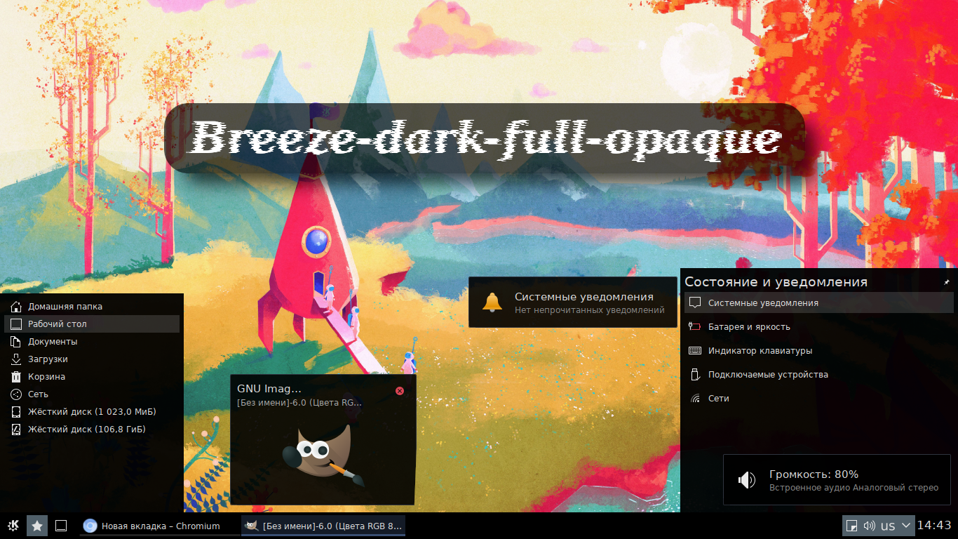
Source (link to git-repo or to original if based on someone elses unmodified work):
Available as/for:
Description:Icons - Breeze dark ( mix )
Color theme - Breeze dark ( mix )
Color correction - 1.00
As the brightness is shifted down, the colors become more contrasting. (Recommended for light backgrounds)
The panel theme works well with the "Breeze classic" window design by setting the active window title to black.
Panel background - ~ / .local / share / kf5 / plasma / desktoptheme / Breeze-dark-opaque / widgets / panel-background.svg
Transparency - 0%
Dialog background - ~ / .local / share / kf5 / plasma / desktoptheme / Breeze-dark-opaque / dialogs / background.svgz
Transparency - 0%
Tooltip background - ~ / .local / share / kf5 / plasma / desktoptheme / Breeze-dark-opaque / widgets / tooltip.svgz
Transparency - 9%
Widget background - ~ / .local / share / kf5 / plasma / desktoptheme / Breeze-dark-opaque / widgets / background.svg
Transparency - 5%
Win10 icon - ~ / .local / share / kf5 / plasma / desktoptheme / Breeze-dark-opaque / icons / win10.svg
KDE icon ( dark theme ) - ~ / .local / share / kf5 / plasma / desktoptheme / Breeze-dark-opaque / icons / kde.svg
Version 1.4
Added textures for clock and calendar.
Ratings & Comments
2 Comments
Why leave transparency in tooltips and widget background?
I think it's more pleasing to the eye than a solid color. You can fix the transparency: Breeze-dark-opaque/widgets/background.svg