
WinXP-dark Global Theme
Source (link to git-repo or to original if based on someone elses unmodified work):
Description:
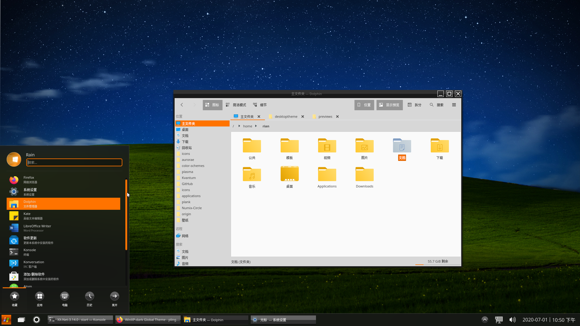
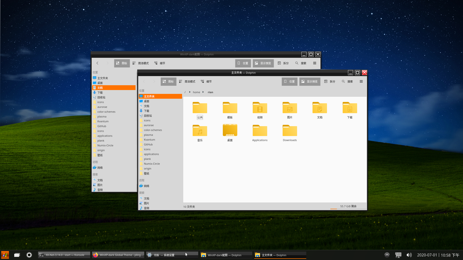
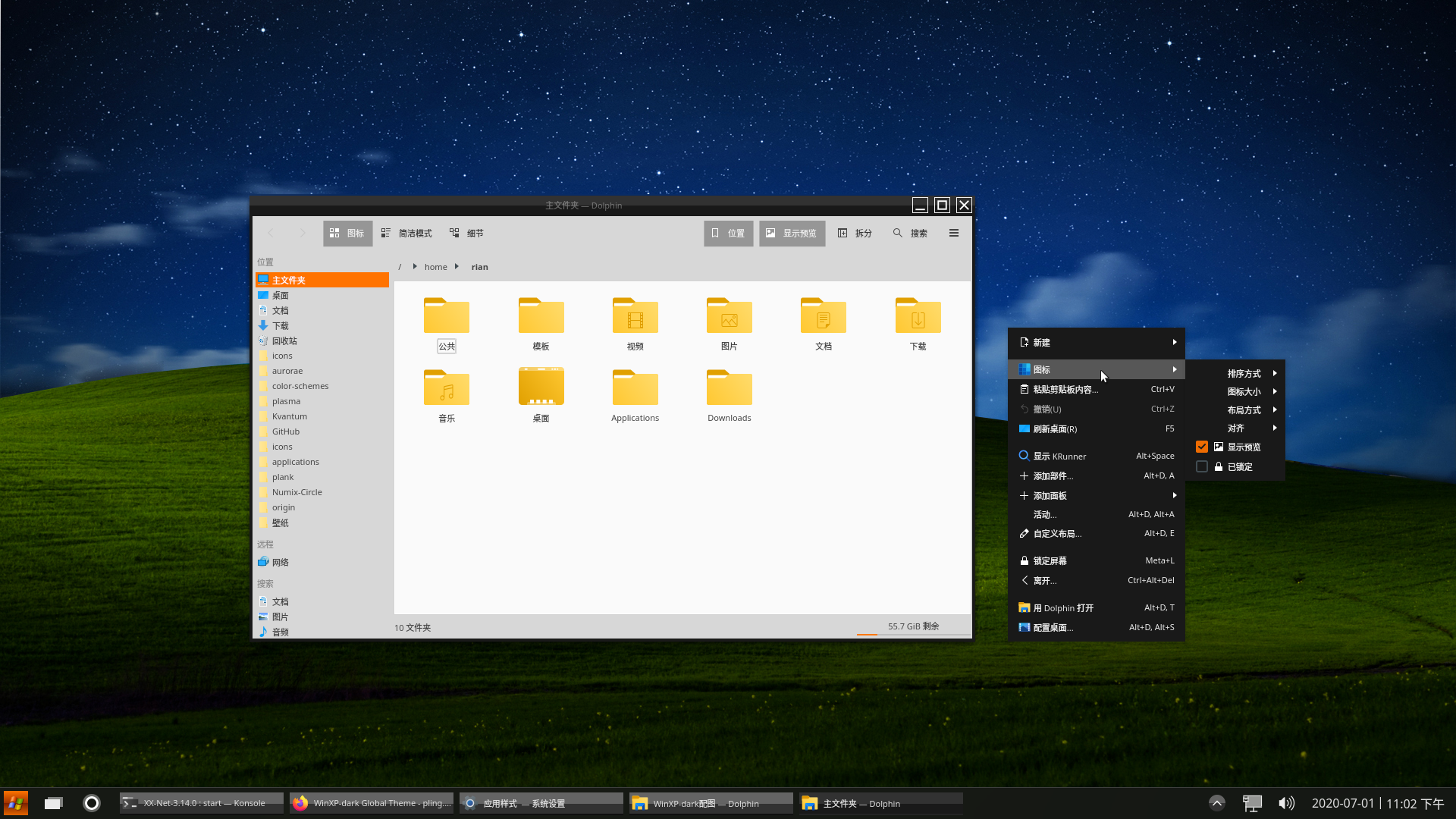
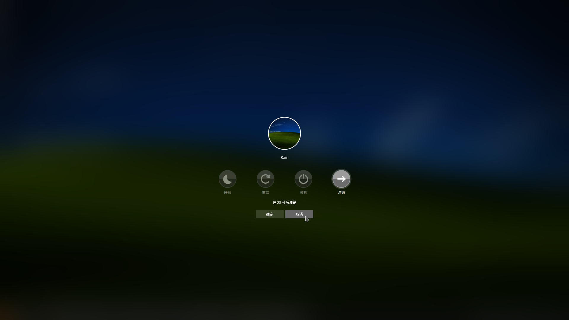
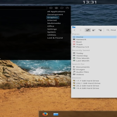
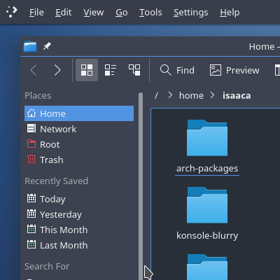
WinXP-dark kde is a light clean theme for KDE Plasma desktop.
In this repository you'll find:
Aurorae Themes
Kvantum Themes
Plasma Color Schemes
Plasma Desktop Themes
Plasma Look-and-Feel Settings
WinXP-dark kde is a light clean theme for KDE Plasma desktop.
In this repository you'll find:
Aurorae Themes
Kvantum Themes
Plasma Color Schemes
Plasma Desktop Themes
Plasma Look-and-Feel Settings
Plasmoids for KDE
------------------------------
Main launcher: Avalon Menu
Clock: Split digital clock
------------------------------
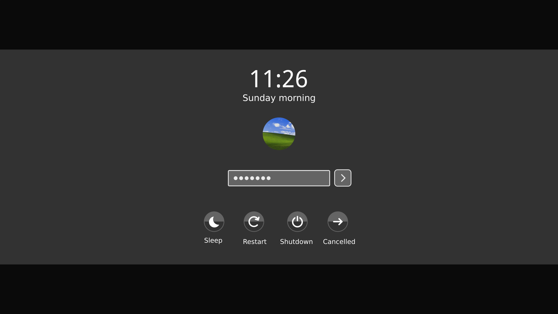
WinXP-dark Sddm Theme:https://www.pling.com/p/1389014/
WinXP-dark Color Theme:https://www.pling.com/p/1389013/
WinXP-dark Plasma Theme:https://www.pling.com/p/1389018/
WinXP-dark Aurorae Theme :https://www.pling.com/p/1389012/
WinXP-dark Wallpaper:https://www.pling.com/p/1389010/
WinXP-dark Kvantum:https://www.pling.com/p/1389016/
------------------------------
We10X icon theme :https://www.pling.com/p/1366371/ Last changelog:
In this repository you'll find:
Aurorae Themes
Kvantum Themes
Plasma Color Schemes
Plasma Desktop Themes
Plasma Look-and-Feel Settings
WinXP-dark kde is a light clean theme for KDE Plasma desktop.
In this repository you'll find:
Aurorae Themes
Kvantum Themes
Plasma Color Schemes
Plasma Desktop Themes
Plasma Look-and-Feel Settings
Plasmoids for KDE
------------------------------
Main launcher: Avalon Menu
Clock: Split digital clock
------------------------------
WinXP-dark Sddm Theme:https://www.pling.com/p/1389014/
WinXP-dark Color Theme:https://www.pling.com/p/1389013/
WinXP-dark Plasma Theme:https://www.pling.com/p/1389018/
WinXP-dark Aurorae Theme :https://www.pling.com/p/1389012/
WinXP-dark Wallpaper:https://www.pling.com/p/1389010/
WinXP-dark Kvantum:https://www.pling.com/p/1389016/
------------------------------
We10X icon theme :https://www.pling.com/p/1366371/
2020.07.01
Adjust color coherence








Ratings & Comments
6 Comments
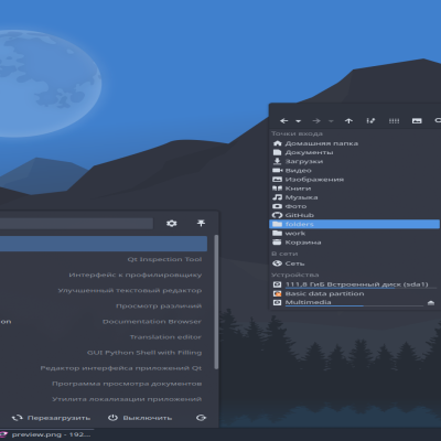
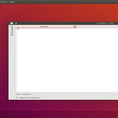
Three small points that maybe you can improve by analyzing your screenshots, you can see that the background of the Spectacle window is blue, wouldn't it be more coherent in orange? On the login screen the outline of the password field is also blue, wouldn't it look better in orange? Finally, in the start menu, it would be interesting if the outline of the search field and the line that shows which category of the menu is selected, were also in orange, following the same visual language as the file explorer.
Yes, may be I prefer blue, hahaha :) I will continue to adjust
10 Perfect!
The traditional version was amazing, since the dark version did not follow the same pattern, it should look like this image https://digitalside.com.br/site/wp-content/uploads/2014/07/zune-theme-windows-xp.jpg
https://m.youtube.com/watch?v=_kAihd2XaM4
Thank you, really need to change