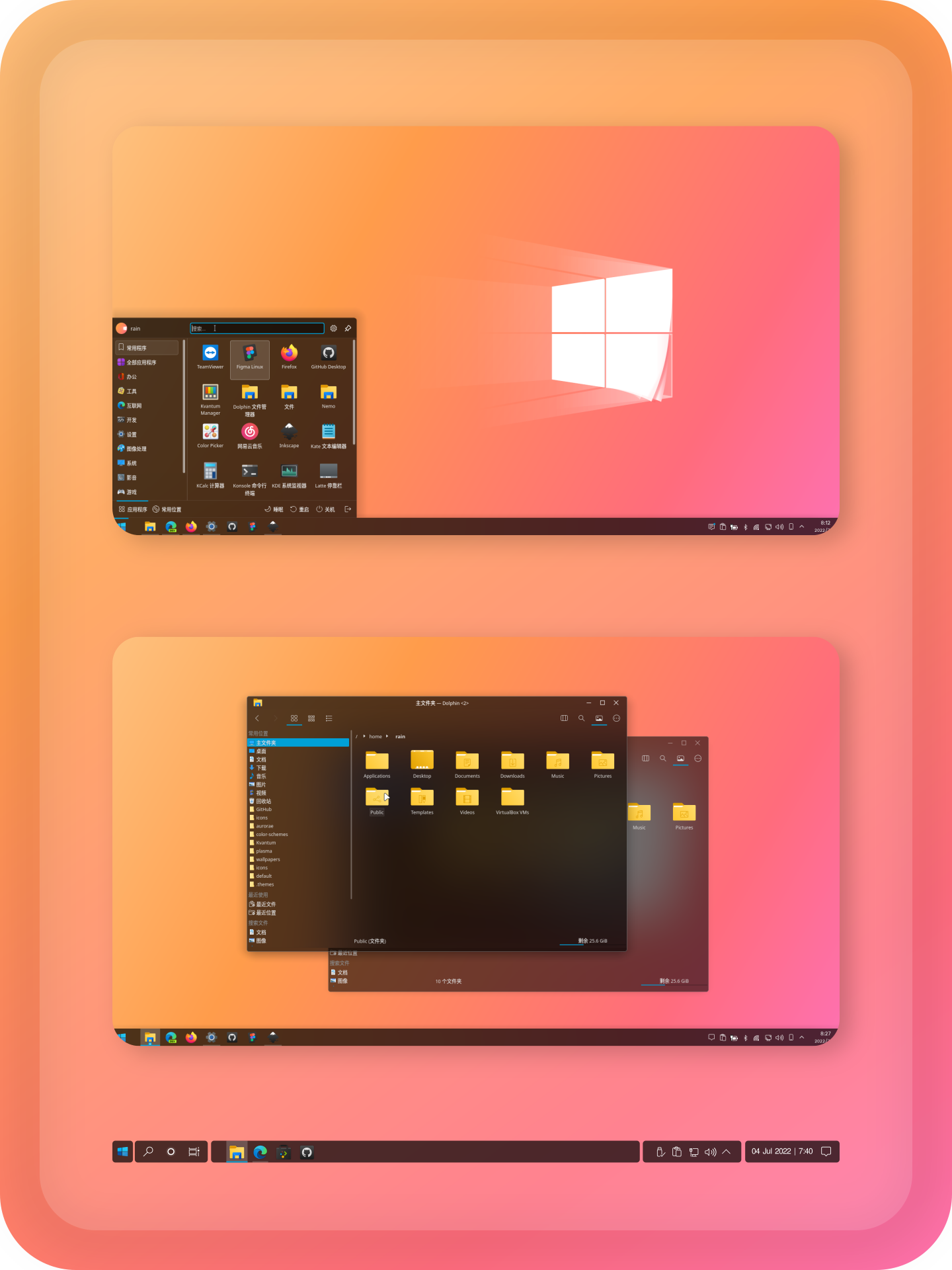
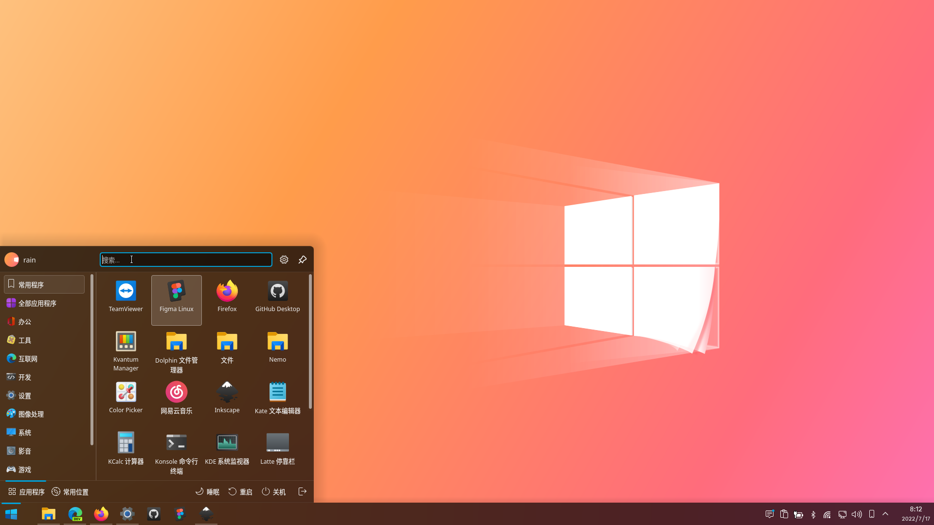
10Bro I having an issue with the round corners and blur, on this type of theme (Aurorae's), like in WinSur-Dark the windows has a kind of glitch in the corners.
Thank you very much.
I have tried this improvement you mentioned at that time, but I may have to match the theme with the icon theme separately. Or I don't know the other way, need to find in the later work.
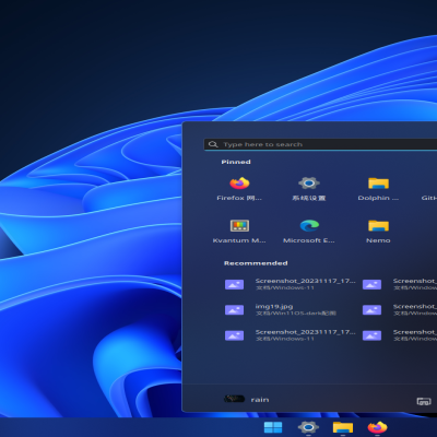
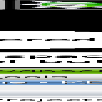
Yeyushengfan258, maybe for now, it would be interesting to at least eliminate the white background color, increase the vertical size of the blue line to a total of 26px and move it 3px to the left, improve the aesthetics and the design is more consistent, see how would be in the image below:
https://imgur.com/a/9ARm37p


Ratings & Comments
34 Comments
10 One of the best themes! But can you please port it (and other themes/icons as well) over to Plasma 6? Thank you!
Thanks for the support, I would if I could.
10 10 the best
Thank you.
10 10 the best
Thank you.
10 Bro I having an issue with the round corners and blur, on this type of theme (Aurorae's), like in WinSur-Dark the windows has a kind of glitch in the corners.
What does it look like? It is best to provide screenshots.
10 One of the best UI out there !
Thank you.
10 10 the best
Thank you
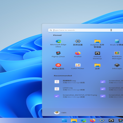
Below is a suggested improvement for the theme. https://imgur.com/a/iZ1E3QS I'm a fan of your work, congratulations!
Thank you very much. I have tried this improvement you mentioned at that time, but I may have to match the theme with the icon theme separately. Or I don't know the other way, need to find in the later work.
Because I think the interactive color change of the font needs to be changed in the icon theme.
Plz add HiDPI screens support !
Yeyushengfan258, maybe for now, it would be interesting to at least eliminate the white background color, increase the vertical size of the blue line to a total of 26px and move it 3px to the left, improve the aesthetics and the design is more consistent, see how would be in the image below: https://imgur.com/a/9ARm37p
I don't think it's very conspicuous.
9 ;)
10 10 the best
Thank you.
10 10 the best
genial se nota un gran trabajo :D
Thank you.
10 10 the best