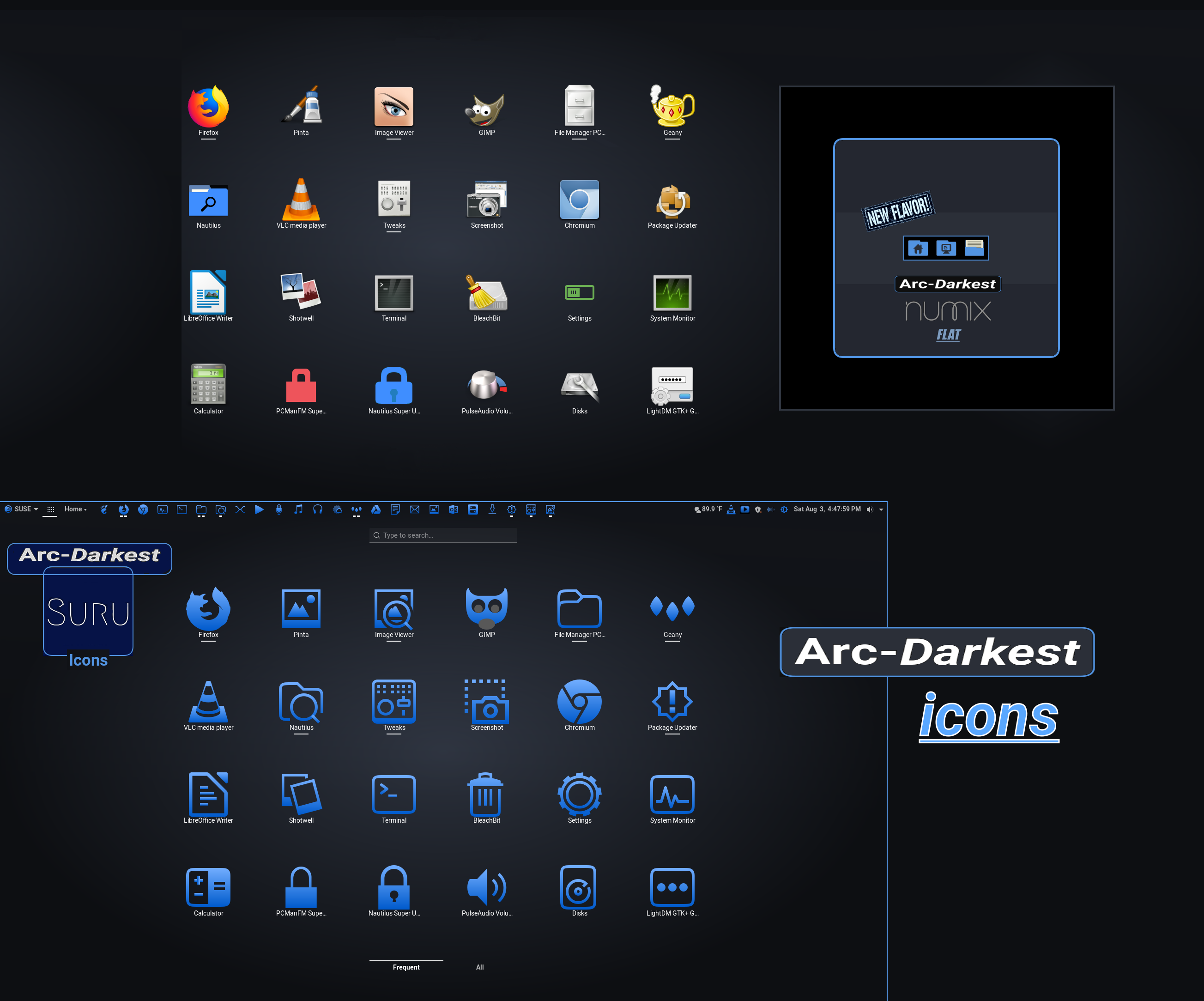
Description: Arc-Darkest is a flat, dark-mode theme with transparent elements, for GTK, xfwm4, openbox-3, GNOME-Shell, and Cinnamon desktop environments. Arc-Darkest also has two varieties of matching Icons and Folders.
This is the matching desktop theme. FOR ICONS & FOLDERS GO TO: https://www.pling.com/p/1333421/
The new rankings are still coming in for 2022, and Arc-Darkest enjoys another #1 & also a #6 spot in the GTK Linux world - according to top Linux/GTK sites: 'itsfoss,' and 'ubuntupit.' Thanks again faithful users! https://itsfoss.com/best-gtk-themes/ https://www.ubuntupit.com/best-mate-themes-for-linux/
The well-embraced standard Arc theme has always been available in the three variants of Arc, Arc-Dark, and Arc-Darker; but, at last, a fourth and measurably even darker dark-Arc has arrived on the GTK+ scene. Even at it dimmest, the earlier Arc variants have never quite satisfied those who need the lights turned down real low, but this fourth variant should fix all of that.
The forth Arc desktop theme darkens only six elements, on the whole, but where it happens makes all the difference. Significantly, keeping the official Arc hues, contrasts, and structure wholly intact was foremost in this project's objective. Thus, nothing is altered one tiny bit in those crucial areas - as the existent, intact, Arc hues are pragmatically darkened.
Moreover, the signature Arc-Blue hue is not darkened or altered in any way via the new Arc-Darkest variant. The goal was invariably to keep Arc as we know it, while merely darkening the elements necessary to align with the brightness values more associated with what heavy users demand from dark themes. We hope we achieved that for you.
Special thanks to horst3180 at: https://github.com/horst3180/Arc-theme, for initially advancing Arc, and for inspiration. Further thanks to NicoHood at: https://github.com/NicoHood/arc-theme, for keeping Arc alive and great, more currently.
Both the Suru++ and the Numix icons and folders have been carefully crafted to match the new Arc-Darkest desktop scheme, but they can surely compliment other desktop themes that sport matching color hues.
Special thanks to the Numix team for their inspiration, expertise and contributions at: https://github.com/numixproject/numix-icon-theme. The Suru-grounded icon set was initially designed and developed by Sam Hewitt - under GPL3. The original Suru icon set and concept was created by Matthieu James - Canonical Design Team. Core developers are Andrea Bonanni (original author) and Gustavo Costa . Devices icons are inspired by La Capitaine created by Keefer Rourke - under GPL3/MIT. Emoji icons are derived from the Twenoji created by Twitter Team - under MIT. Some icons are based on Numix mimetypes icons created by the Numix Team - under GPL3. Devices and places icons and several apps icons are inspired by Papirus icons created by Alexey Varfolomeev - under GPL3. Numberless icons are from Gravit Designer, under GPL3/MIT.
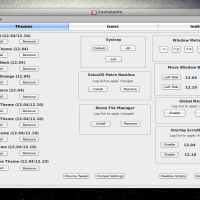
Manual Installation Is Easy:
For themes: 1) Extract the "tar.xz" file into your "~/.themes/" folder - to install for current user only - or into the "/usr/share/themes/" folder - for the theme to be applied globally. 2) Use the GNOME Tweak Tool or an equivalent app to enable it for your desktop.
If installing manually, make sure to install the dependency: "Murrine theme engine" if you do not already have it; and update your GTK+packages if you have not.
For icons: 1) Extract the "tar.xz" file into your "~/.icons/" folder - to install for current user only - or into the "/usr/share/icons/" folder - for the icons and folders to be applied globally. 2) Use the GNOME Tweak Tool or an equivalent app to enable them for your desktop.
When installing the Geany text editor theme, put the unzipped file in your home directory at: ~/.config/geany/colorschemes (create the 'colorschemes' directory, to mimic previous directions, if it doesn't yet exist )
Logging out and then logging back in may be necessary on some operating systems to fully implement themes and icons.Last changelog:
23-10-21: Version 2.1.5
This update tweaks the static color animation to the scrollbars and sliders controlled by the shell. Here, the static animation was changed to now render a less saturated and slightly dimmer version of the standard, Arc-blue accent color (versus the off-white hue, temporarily used). These tweaks beautify while improving contrast and user comfort. Commit: d021829
Loving this theme.
Just only little problem on Ubuntu 20.04. The Ubuntu Software (app store) has an invisible UI. I am noticing this across all non-native themes. Would there be a possibility of a fix?
Got a reply off of another theme. If the themes are installed in /usr/share/themes instead of ~/.themes then it causes this issue with the Ubuntu Software which is now a Snap application.
Okay rtl88, you guys should start paying me for coming to your rescue but I have the new Ubuntu 19.10 ‘Eoan Ermine’ that just came out and this them looks proper. I dont know how to show you a screensot but it would looki like yours not the guy with the funky screenshot. Just sayin, I dont see how it is your problem. Go relax your theme is perfect!
1010 the best
This is the only Arc I have seen that gets a seal of approval for accessibility. The other ones are just too muddled for contrast and clarity. Its not their fault, I know, it is just how it was designed... strictly for good eyes. Thank you for producing an Arc the others can use. I did read the normal variant is very popular, and the color is also amazing on the normal variant, that is why some hated not being able to use it. Blessings to you!
Hello eh8t, I noticed you started your profile just to comment on this theme, so I wanted to get right to you. I am a co-developer of it, and I wanted to thank you for trying the theme. The dark text on those elements is per Arc specs. We get complaints on the dark text sometimes, but when we change it, it becomes something different than Arc. See, the blue hue, value, and saturation are unchanged from original Arc, so that dark text shows up identical versus the original too. Both GNOME and Cinnamon shells have been re-tested since your comment, and they perform as expected. Anything you don't like is ether a personal preference or how your equipment renders it. On HD screens for example things look different versus standard, etc. Good luck with your theme search!


Ratings & Comments
63 Comments
9 9 excellent
10 Perfect, just what I was looking for. Thanks!
10 best on Ubuntu 20.04 desktop
10 10 the best
9 9 excellent
10 10 the best
9 9 excellent
6 6 okay
10 10 the best
Loving this theme. Just only little problem on Ubuntu 20.04. The Ubuntu Software (app store) has an invisible UI. I am noticing this across all non-native themes. Would there be a possibility of a fix?
I haven't had the testers run across that one, but sually, trying the other version helps with those sorts of issues.
Got a reply off of another theme. If the themes are installed in /usr/share/themes instead of ~/.themes then it causes this issue with the Ubuntu Software which is now a Snap application.
Thanks, that's important to know.
10 10 the best, I'm upping the rating form the 9 I had here a long time. You all have done so much to keep this theme current and awesome. Thanks!
10 wow !! it looks really cool on my opensuse !! Nice job!!
Very nice, except for the dotted lines in the scroll earea's. Personally I find them very ugly and don't understand the use.
Hi, peppermint, thanks for the comment. All GTK3 have the dotted lines; its built in. Perhaps a non-GTK (Qt-based) theme would suite you better.
I know. In this video it's explained how to remove them: https://www.youtube.com/watch?v=ghxKvCU2oi0
10 10 the best
10 Thanks you for white word!!! You makes the big change of new white texts. Love for you brother!!
Okay rtl88, you guys should start paying me for coming to your rescue but I have the new Ubuntu 19.10 ‘Eoan Ermine’ that just came out and this them looks proper. I dont know how to show you a screensot but it would looki like yours not the guy with the funky screenshot. Just sayin, I dont see how it is your problem. Go relax your theme is perfect!
10 10 the best This is the only Arc I have seen that gets a seal of approval for accessibility. The other ones are just too muddled for contrast and clarity. Its not their fault, I know, it is just how it was designed... strictly for good eyes. Thank you for producing an Arc the others can use. I did read the normal variant is very popular, and the color is also amazing on the normal variant, that is why some hated not being able to use it. Blessings to you!
7 7 good The shell dialogs remain in dark text, rendering many fields illegible
Hello eh8t, I noticed you started your profile just to comment on this theme, so I wanted to get right to you. I am a co-developer of it, and I wanted to thank you for trying the theme. The dark text on those elements is per Arc specs. We get complaints on the dark text sometimes, but when we change it, it becomes something different than Arc. See, the blue hue, value, and saturation are unchanged from original Arc, so that dark text shows up identical versus the original too. Both GNOME and Cinnamon shells have been re-tested since your comment, and they perform as expected. Anything you don't like is ether a personal preference or how your equipment renders it. On HD screens for example things look different versus standard, etc. Good luck with your theme search!
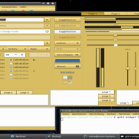
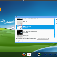
Allow me to attach images of the issue I am experiencing so as to better illustrate my point: https://imgur.com/a/AsGq0vN