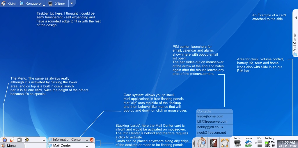
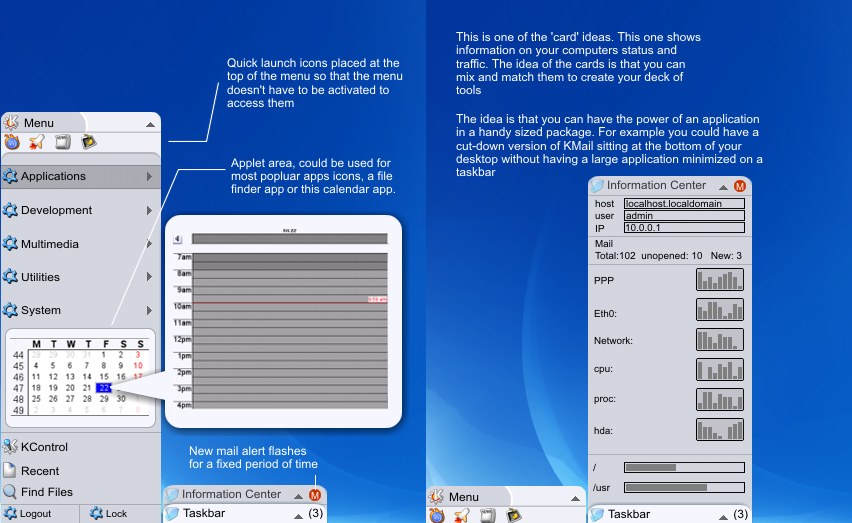
Description: I have tried to make my menu/kicker idea useable, subtle and expandable.
The idea came from those trading card games, you make your deck depending on how you work and each card in your deck is part of your overall strategy.
I have only really showed 2 'cards' here, the Information center and the taskbar, but you can have as many as you like with whatever application/function you want on them.
there are further explanations on the screen shots.
THIS IS JUST AN IDEA: the download is just the first screenshot.
There is a chance that this might become a reality. A source forge project has been started by hyrcan at http://sourceforge.net/projects/slicker
If you know any developers that could help please get them to go there and get involved.
I am working on an interactive flash version of the idea so you can play about with how it works. WARNING, it will be quite a rough impression of the hopefully finished thing works.Last changelog:
I have been listening...
1) I have removed the taskbar card and replaced it with transparent taskbar at the top of the screen
2) I have moved the kmenu button underneath the quick launch buttons on the main menu card (which is all in one by the way, just twice the height of the others), so now the kmenu is in the bottom left hand corner, just where it should be
3) I renamed the taskbar card 'Mail Center' but that really means nothing I just wanted a quick title for it.
Yeah this looks great, like the other +/- 200 comments say... but the question is... What about usabilty?
The menus takes space, and with a single one, this space consumed isn't much, but with menus in all the borders, it's like have a smaller monitor!Have you got any idea for this BIG problem ??
It might be solved if you can do menus that always are shown and other that not, and this could be changed by the user in a context menu with a right-clic in the menu, or something like that. I'd like to see a screenshot with this feature, with applications running (I know this proyect isn't done, I talk about an "emulation" of what it will be ;)).
I'd like a reponse please.
PD: Appologies for my bad english. A spanish KDE-Gentoo-user.
"No worry be happy"
about that problem: i was thinkig the same, but didn't manage to post this yet :)
...so i think the solution would be if the cards and all the other elements, would have the ability to fade (alpha blending WILL be avaliable in KDE future, until then you could ask mosfet for help), so ALL the desktop space would be available, and these applets would be transparent (on top)
this way you would have both - the workspace in its full size and these applets running and be seen.
another idea would be to bind a key-combination (like ALT+F5 or something) to hide/show these applets - that would increase the usability even more :)
about the screenshot:
there is a topic in gentoo forum considering cards... a user Tommorow made an application for cards and on the forum there are also available some screenshots and a source of his project at the curent state :)
here's the link: http://forums.gentoo.org/viewtopic.php?t=24636&highlight=
i've posted a request to the gentoo forum in which i appel all programers interested in this project to come and help ...hopefully you'll get some more programmnig hands :)
an idea just emerged in my head: what if you would integrate kopote (kde's icq, irc, msn, aol ... client) as you planned to integate kmail? ..that would be really nice :)
i feel that linux should not look like windows and therefore i welcome slicker ..i think it has potential to be the next big breakthrough in gui OS development :)
Looks very original.
Here is something I have banging around in my head. What would be the difficulty of creating mini Flash applets for icons or background images for title bars, etc.? I know that there are GPL'd version of the Flash player out there, so it would fit into the "free beer" mentallity. I figure it would be more processor intesive.
But it would really be a step ahead of any animiated icons you'd find in windows.
I guess the biggest draw back is no Flash editor for Unix or Linux.
I don't know if someone has already said this, or if you already plan on it, but what about maybe having a "plug-in" feature so that other developers can create little tab things like the information center, perhaps to display the weather or stocks, or anything else they might think up.
thats the idea. To make it easy for developers to make their own apps compatible.
There is the work going on at the moment at http://sourceforge.net/projects/slicker
and I think the developers are making sure that it's easy to convert apps. For this kinf of idea to work it needs a load of different applications.
I feel that I should point this out, as it had escaped my attention until today, when I by accident checked the SourceForge.net project again, that there is stuff going on! http://slicker.sf.net has more info and the FLASH promised by fop in an earlier message, and also a link to the page. I did not know, as SourceForge neglected to e-mail me about this fact, but I have actually been added to the members list, but because I only just checked today, I didn't know before today. Just mentioning this because it would seem to me that some people might be missing out here :) Thank you for your time again ;)
thats part of the flash presentation I promised. I am working on the whole desktop where you can activate the cards and the slider PIM thing.
I am having a little trouble with making the cards snap into position when they are near the bottom of the screen, but it will get there.
i REALLY like it ...it would probably be a major brakethrough in all GUI powered OSs (windoze, eat your heart out!)
the only problem is, that someone has to make it ...we can't only dream about it ...that would be useless
...i would LOVE to contribute as much as i can ...but that's REALLY limited ...i'm no programmer, and not a lot of a painter ...but i could be there for ideas :)
Hello everybody, this project is great, I started studying QT only for this(and I hope I could help), I saw the slicker project and I have some questions(I cannot log to sourceforge so I'm talking here):
Why use a external taskbar? isn't possible to use the cards framework to do it, i mean we couldn't make a task-list card?
The idea of the deck is marvelous, is possible to create cards for anything(tasks,menu, systray, Pim, and so on)
You want something more than just cards on your kicker (or slicker as the case may be). With cards for everything it would get kind of dull and boring, staring at the same thing.
and very original. I like it! If you can fit the applets, it will be very good!
I like the color combination you made on the screenshot too :)
As usual when i can opine for new GUIs features, i request a best hotkeys implementation.
It will be good to asign a hotkey for the panels (as Win key for show the start menu, but more intensively, for any panel.
1st I must say: YOUR IDEA IS WONDERFUL!!!
Then:
How about this "cards" to auto attract things the way WindowMaker does? I know you can move icons and stuff in KDE but it isn't cool like WindowMaker. Also icons explosion would be *really* cool and maybe I'll try KDE again when this is implemented.
Very good idea, and they say that open source isn't innovative!
Gustavo
Thanks for updating based on comments. Some additional items...
1. I think the "K" should be larger.
2. I think the "K" should remain at the bottom of its card even when expanded -- do you expand a deck? :-)
I can hardly wait for the first alpha. I'll be installing it.
According to Fitts law (which I know is not always the best thing to reffer to) anything placed in the corner of the screen is easy to hit (the corners are four of the five easiest single pixels on the screen to hit from any one particular position on the screen (question 3)). This basically means that the size of the K card is unimportant, as long as it is placed in a corner. Of course, I see the problem if the K card is placed anywhere but one of the corners, which with the deck system of course is possible. But then again, it ought to be possible to decide on a per-card basis how much of the card is shown when it is hidden, as well as when the card is placed in a corner, the edge close to the corner should be square (i.e. flat against the edge of the screen) in stead of round (this could, of course, be theme-based so as to be defined by whichever theme the decks are using (a square area is, by default, faster to draw on the screen than a more advanced shape, such as a square with rounded corners, and thus faster). Just another couple of pence from me there :) Keep the productive suggestions comming people! :)
a flash "fake" desktop and I have taken the hint that people don't like the menu card. So based on a suggestion I have made the K icon span the whole height of the double sized menu card and put the quick launch at the bottom. the card kind of expands upwards but the K icon remains where it is.
I might have time to finish the flash idea tomorrow it'll make more sense then (hopefully)
First, I think this is the best idea I've seen so far for improving KDE and I really hope someone implements it.
Now, for the suggestion, I think the K menu is still too small, and the quick launch bar on top of it, althought a nice idea, is too small to be really usable (I see many users clicking on the wrong icon). I think you should just make the K menu card twice as big, as it is, but remove the quick launch bar. You have a terminal and home icons next to the clock, the user should be able to choose what icons go there, thus becoming that part something similar to the "quick launch bar". Also, this way the K menu is much bigger. Remember, from a usability point of view, the bigger is usually the better, and in this case I think so.
Salva.


Ratings & Comments
84 Comments
This is beyond cool! I honestly dont know what to say besides "Awesome!"
Yeah this looks great, like the other +/- 200 comments say... but the question is... What about usabilty? The menus takes space, and with a single one, this space consumed isn't much, but with menus in all the borders, it's like have a smaller monitor!Have you got any idea for this BIG problem ?? It might be solved if you can do menus that always are shown and other that not, and this could be changed by the user in a context menu with a right-clic in the menu, or something like that. I'd like to see a screenshot with this feature, with applications running (I know this proyect isn't done, I talk about an "emulation" of what it will be ;)). I'd like a reponse please. PD: Appologies for my bad english. A spanish KDE-Gentoo-user. "No worry be happy"
about that problem: i was thinkig the same, but didn't manage to post this yet :) ...so i think the solution would be if the cards and all the other elements, would have the ability to fade (alpha blending WILL be avaliable in KDE future, until then you could ask mosfet for help), so ALL the desktop space would be available, and these applets would be transparent (on top) this way you would have both - the workspace in its full size and these applets running and be seen. another idea would be to bind a key-combination (like ALT+F5 or something) to hide/show these applets - that would increase the usability even more :) about the screenshot: there is a topic in gentoo forum considering cards... a user Tommorow made an application for cards and on the forum there are also available some screenshots and a source of his project at the curent state :) here's the link: http://forums.gentoo.org/viewtopic.php?t=24636&highlight=
i've posted a request to the gentoo forum in which i appel all programers interested in this project to come and help ...hopefully you'll get some more programmnig hands :)
an idea just emerged in my head: what if you would integrate kopote (kde's icq, irc, msn, aol ... client) as you planned to integate kmail? ..that would be really nice :) i feel that linux should not look like windows and therefore i welcome slicker ..i think it has potential to be the next big breakthrough in gui OS development :)
Looks very original. Here is something I have banging around in my head. What would be the difficulty of creating mini Flash applets for icons or background images for title bars, etc.? I know that there are GPL'd version of the Flash player out there, so it would fit into the "free beer" mentallity. I figure it would be more processor intesive. But it would really be a step ahead of any animiated icons you'd find in windows. I guess the biggest draw back is no Flash editor for Unix or Linux.
Forget flash. SVG is the way to go.
I hope to see this soon for KDE. Linux really need to break away from a winDoze look and feel. This new kicker will rock!!!
bUT, i THINK THE DRAWERS SHOULD BE ON TEH TOP, TAKE AN EXAMPLE FROM LOTUS SMARTSUITE 9.6 AND UP.
I don't know if someone has already said this, or if you already plan on it, but what about maybe having a "plug-in" feature so that other developers can create little tab things like the information center, perhaps to display the weather or stocks, or anything else they might think up.
thats the idea. To make it easy for developers to make their own apps compatible. There is the work going on at the moment at http://sourceforge.net/projects/slicker and I think the developers are making sure that it's easy to convert apps. For this kinf of idea to work it needs a load of different applications.
I feel that I should point this out, as it had escaped my attention until today, when I by accident checked the SourceForge.net project again, that there is stuff going on! http://slicker.sf.net has more info and the FLASH promised by fop in an earlier message, and also a link to the page. I did not know, as SourceForge neglected to e-mail me about this fact, but I have actually been added to the members list, but because I only just checked today, I didn't know before today. Just mentioning this because it would seem to me that some people might be missing out here :) Thank you for your time again ;)
thats part of the flash presentation I promised. I am working on the whole desktop where you can activate the cards and the slider PIM thing. I am having a little trouble with making the cards snap into position when they are near the bottom of the screen, but it will get there.
i REALLY like it ...it would probably be a major brakethrough in all GUI powered OSs (windoze, eat your heart out!) the only problem is, that someone has to make it ...we can't only dream about it ...that would be useless ...i would LOVE to contribute as much as i can ...but that's REALLY limited ...i'm no programmer, and not a lot of a painter ...but i could be there for ideas :)
Hello everybody, this project is great, I started studying QT only for this(and I hope I could help), I saw the slicker project and I have some questions(I cannot log to sourceforge so I'm talking here): Why use a external taskbar? isn't possible to use the cards framework to do it, i mean we couldn't make a task-list card? The idea of the deck is marvelous, is possible to create cards for anything(tasks,menu, systray, Pim, and so on)
Sign up at sourceforge. We need coders to get this realized!
You want something more than just cards on your kicker (or slicker as the case may be). With cards for everything it would get kind of dull and boring, staring at the same thing.
and very original. I like it! If you can fit the applets, it will be very good! I like the color combination you made on the screenshot too :) As usual when i can opine for new GUIs features, i request a best hotkeys implementation. It will be good to asign a hotkey for the panels (as Win key for show the start menu, but more intensively, for any panel.
This could really be great! is the project ongoing? do you need any help? /occe
1st I must say: YOUR IDEA IS WONDERFUL!!! Then: How about this "cards" to auto attract things the way WindowMaker does? I know you can move icons and stuff in KDE but it isn't cool like WindowMaker. Also icons explosion would be *really* cool and maybe I'll try KDE again when this is implemented. Very good idea, and they say that open source isn't innovative! Gustavo
emulate something like that already. Use Enlightenment with an appropriate theme (e.g. SpiffE) and apply a "pager" border style.
Thanks for updating based on comments. Some additional items... 1. I think the "K" should be larger. 2. I think the "K" should remain at the bottom of its card even when expanded -- do you expand a deck? :-) I can hardly wait for the first alpha. I'll be installing it.
According to Fitts law (which I know is not always the best thing to reffer to) anything placed in the corner of the screen is easy to hit (the corners are four of the five easiest single pixels on the screen to hit from any one particular position on the screen (question 3)). This basically means that the size of the K card is unimportant, as long as it is placed in a corner. Of course, I see the problem if the K card is placed anywhere but one of the corners, which with the deck system of course is possible. But then again, it ought to be possible to decide on a per-card basis how much of the card is shown when it is hidden, as well as when the card is placed in a corner, the edge close to the corner should be square (i.e. flat against the edge of the screen) in stead of round (this could, of course, be theme-based so as to be defined by whichever theme the decks are using (a square area is, by default, faster to draw on the screen than a more advanced shape, such as a square with rounded corners, and thus faster). Just another couple of pence from me there :) Keep the productive suggestions comming people! :)
a flash "fake" desktop and I have taken the hint that people don't like the menu card. So based on a suggestion I have made the K icon span the whole height of the double sized menu card and put the quick launch at the bottom. the card kind of expands upwards but the K icon remains where it is. I might have time to finish the flash idea tomorrow it'll make more sense then (hopefully)
First, I think this is the best idea I've seen so far for improving KDE and I really hope someone implements it. Now, for the suggestion, I think the K menu is still too small, and the quick launch bar on top of it, althought a nice idea, is too small to be really usable (I see many users clicking on the wrong icon). I think you should just make the K menu card twice as big, as it is, but remove the quick launch bar. You have a terminal and home icons next to the clock, the user should be able to choose what icons go there, thus becoming that part something similar to the "quick launch bar". Also, this way the K menu is much bigger. Remember, from a usability point of view, the bigger is usually the better, and in this case I think so. Salva.