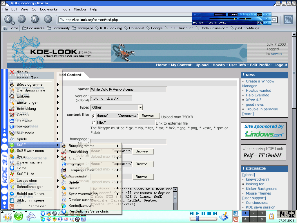
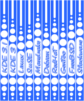
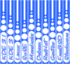
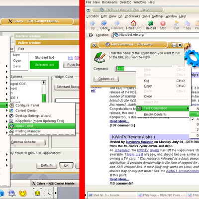
Description: The first Screenshot shows my K-Menu, the second Screenshots show all WhiteDots-Sidepics (KDE 3.1, KDE 3, Linux, SuSE, Mandrake, Debian, RedHat, Gentoo, FreeBSD and Slackware) in the first version and the third Screenshot shows them in the second version.
Write a comment, if you want a sidepic any other distribution.
Installation:
1. Extract the files and move them to $HOME/.kde/share/apps/kicker/pics/ (if the directory doesn't exist, you have to create it). For a global installation you have to move the files to /usr/share/kde3/share/apps/kicker/pics/ (or /opt/kde3/share/apps/kicker/pics/ if you use SuSE).
2. Rename the kside_*.png you want to use to 'kside.png'.
3. Restart kicker (type 'killall kicker; kicker' or restart KDE).
Nice to see some of these graphics coming out.
Good work too.
One question.
How did you get the large and small icons/launcher buttons on your kicker?
It's a karamba thing isn't it?
well, my comment was not ment that serious and you're right.
I just don't like these little grafx.
But as I see there are people who love it and that's fine.
I joined especially so I could comment on the samson8t remark. What is your contribution to the Linux world and KDE in particular.???
I wish I had the ability to make such a contribution and the contributer is to be complimented on an effort that has obviously been given a lot of thought and consideration. It is a nice piece of work and I have downloaded it and intend to use it.
So samson whatever, if you can't say something wothwhile then say nothing at all. Nice people behave that way.
I would suggest that you remove the lower dots and move the text to the bottom, perhaps with only one dot there. The design as it is now pulls rather a lot of attention, something this should not do. Other than that, nicely done.
Who really needs this?
Your comment "You don't have to pay for it, so don't sell it!" is rubbish, too.
Who do you think wants to sell it? Nobody would pay for it.
I should remind you that comments like this is utterly and completely unusable. They serve nothing but to de-moralize the community. Please, when reviewing things, keep your comments to the technical quality of what you see. Personally, this is not something I would use, however I have still clicked good because the technical quality of his work is indesputable. The lines are well defined and they will fit well with a Luna (XP) style interface.
Your comment on licensing is the right idea but put in seriously the wrong way. License is important, however by putting it like that, basically he has given it away without a license. IF he changes it to a proper license then it is fine, but as it is, he has no legal claim to it (he has also put himself out of the posibility of having it included in any commercial distribution (SuSE, Mdk, RedHat...) as a result of his comment (do not charge for it), as that's what distros are supposed to do).
Thank you for your time, and please think before you write generic rants. I have read your previous comments, and most seem intelligent and relevant. Don't take your problems out on this forum, keep that on efnet or real life, where it belongs.


Ratings & Comments
9 Comments
Nice to see some of these graphics coming out. Good work too. One question. How did you get the large and small icons/launcher buttons on your kicker? It's a karamba thing isn't it?
It's no Karamba, it's a Kicker-Applet called Quicklauncher.
Congrats Samson8t on being decent and fronting up to say Sorry. That takes a lot of guts and is to be admired. Cheers. John
Keep'em comin' !!!
well, my comment was not ment that serious and you're right. I just don't like these little grafx. But as I see there are people who love it and that's fine.
I joined especially so I could comment on the samson8t remark. What is your contribution to the Linux world and KDE in particular.??? I wish I had the ability to make such a contribution and the contributer is to be complimented on an effort that has obviously been given a lot of thought and consideration. It is a nice piece of work and I have downloaded it and intend to use it. So samson whatever, if you can't say something wothwhile then say nothing at all. Nice people behave that way.
I would suggest that you remove the lower dots and move the text to the bottom, perhaps with only one dot there. The design as it is now pulls rather a lot of attention, something this should not do. Other than that, nicely done.
Who really needs this? Your comment "You don't have to pay for it, so don't sell it!" is rubbish, too. Who do you think wants to sell it? Nobody would pay for it.
I should remind you that comments like this is utterly and completely unusable. They serve nothing but to de-moralize the community. Please, when reviewing things, keep your comments to the technical quality of what you see. Personally, this is not something I would use, however I have still clicked good because the technical quality of his work is indesputable. The lines are well defined and they will fit well with a Luna (XP) style interface. Your comment on licensing is the right idea but put in seriously the wrong way. License is important, however by putting it like that, basically he has given it away without a license. IF he changes it to a proper license then it is fine, but as it is, he has no legal claim to it (he has also put himself out of the posibility of having it included in any commercial distribution (SuSE, Mdk, RedHat...) as a result of his comment (do not charge for it), as that's what distros are supposed to do). Thank you for your time, and please think before you write generic rants. I have read your previous comments, and most seem intelligent and relevant. Don't take your problems out on this forum, keep that on efnet or real life, where it belongs.