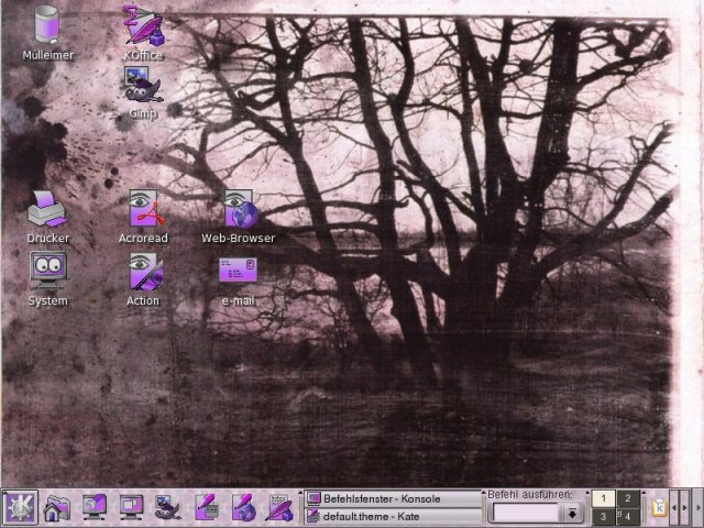
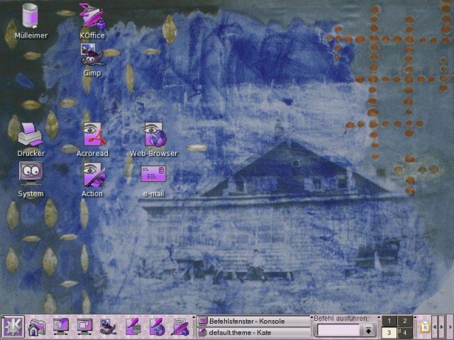
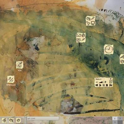
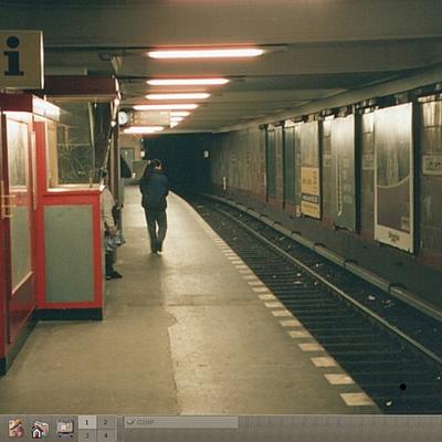
Description: Places of my childhood - 30 years later - I saw changes and things that had not changed. I connected it with my recollections. Based on a few of the artworks a desktop theme for KDE was build.
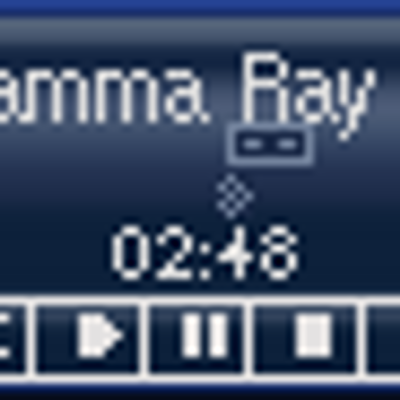
The file contains - a desktop theme with 4 Wallpapers - a IceWM decoration - a icon set (1000 "outdated" icons) - 2 splash screen themes. - a KFM bg image - a color schema for the konsole - a OpenOffice.org-1.1 toolbar iconset - a KFM about and KControl intro view (KDE 3.4+)
Download and unpack the content file. Run the script install.sh and change your desktop settings. You may use the theme with kthememanager or without any theme manager.Last changelog:
09/08/06: More icons added (Openoffice.org-2.0 apps and mimetypes, K3b actions, Amarok actions)
04/24/06: More icons added, mostly for KDE 3.5.
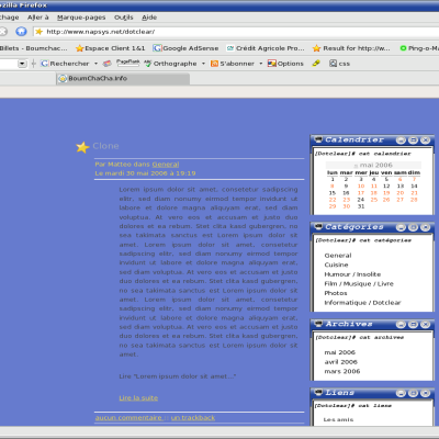
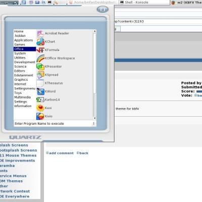
02/02/06 Added the KFM about and KControl intro view for KDE 3.4+ (screenshot on my homepage) and a few more icons.
10/01/04 Small action icon update for Digikam and KMail and a few docked icons.
09/05/04 Added an updated OpenOffice.org-1.1 toolbar iconset
I had found this theme months ago, then I had to reinstall my desktop. After searching all over, I couldn't find it.
And now it comes back! I couldn't be more happy. This theme is my favorite of all of them. Quite beautiful and stunning.
This is pretty good. It's definately something different, and appealing. Almost gothic. Thank you also for going through the trouble of creating a whole theme set as well. :)
I think the low rating is more a result of a rather "unusual/unfamiliar" color-scheme, combined with some slightly "outdated" icons. If people like it, the better. I love other designs more, but that does not count. What counts is the overall "usability" and "consistency" of the theme and in my opinion, the usability is low, due to the highly disturbing colors that are not muddy, nor bright but a mess in between. From a point of consistency I must admit, it is consistent and thus gets a very slight "good" from me.
I am not discouraged about the low rating. I know: "People are feeling blue" (and like most the WINDOWS XP style ???).
The color schema is not a misstake! It has the feeling, I wanted to show. The "outdated" icons are a contrast to actually used icons over all systems (WINDOWS, KDE, GNOME, Apple ...). The main feeling is ok. But I am not comfortable with all my icons. It is a hard job. I have to notify the great job of Everaldos "Crystal SVG" or the "Noia" icon set.
I am happy about all the returns!
Greetings


 and KControl intro view (KDE 3.4+)


Ratings & Comments
7 Comments
I happen to like this,..alot. Great job.
I had found this theme months ago, then I had to reinstall my desktop. After searching all over, I couldn't find it. And now it comes back! I couldn't be more happy. This theme is my favorite of all of them. Quite beautiful and stunning.
This is pretty good. It's definately something different, and appealing. Almost gothic. Thank you also for going through the trouble of creating a whole theme set as well. :)
Dont be discouraged by low ratings from kids that just want the best OSX knockoff. This is good, quality art.
I think the low rating is more a result of a rather "unusual/unfamiliar" color-scheme, combined with some slightly "outdated" icons. If people like it, the better. I love other designs more, but that does not count. What counts is the overall "usability" and "consistency" of the theme and in my opinion, the usability is low, due to the highly disturbing colors that are not muddy, nor bright but a mess in between. From a point of consistency I must admit, it is consistent and thus gets a very slight "good" from me.
I am not discouraged about the low rating. I know: "People are feeling blue" (and like most the WINDOWS XP style ???). The color schema is not a misstake! It has the feeling, I wanted to show. The "outdated" icons are a contrast to actually used icons over all systems (WINDOWS, KDE, GNOME, Apple ...). The main feeling is ok. But I am not comfortable with all my icons. It is a hard job. I have to notify the great job of Everaldos "Crystal SVG" or the "Noia" icon set. I am happy about all the returns! Greetings
Dude cool