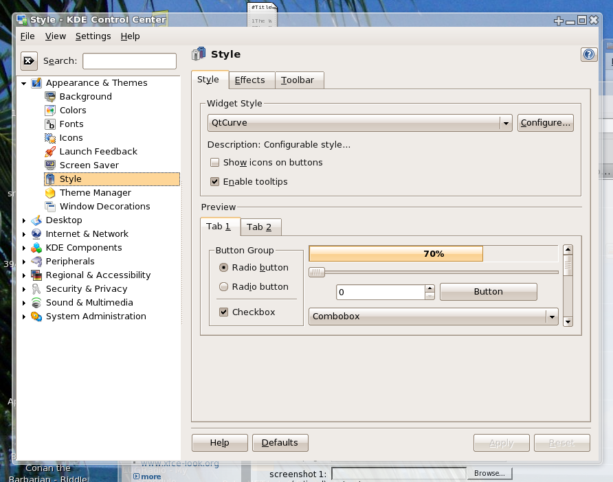
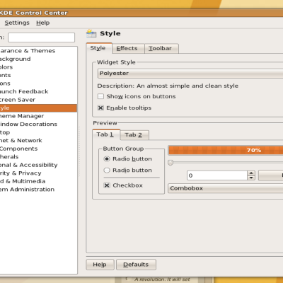
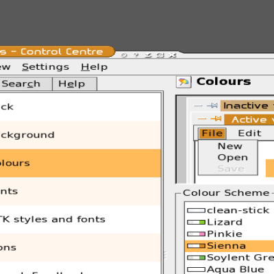
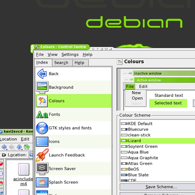
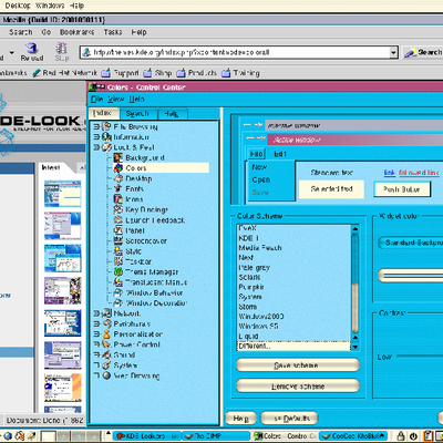
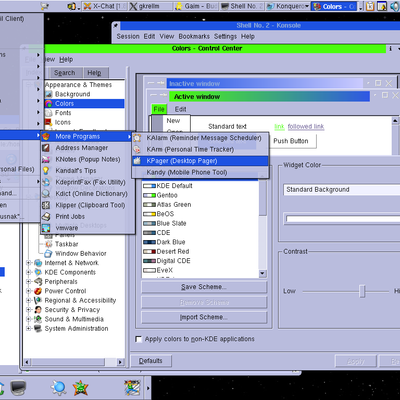
Description: Here's a revision of my Human colour scheme, with the correct selection colours. I've uploaded it separately (not as an update) because GTK doesn't use the selection colour for progress bars, so either way there are going to be problems, and this way people can choose which one they like better.
This is one of the nicest looking color schemes I've seen. Wonderful job adjusting human enough to make it different while still matching and staying faithful to the original.
Great Work!


Ratings & Comments
1 Comment
This is one of the nicest looking color schemes I've seen. Wonderful job adjusting human enough to make it different while still matching and staying faithful to the original. Great Work!