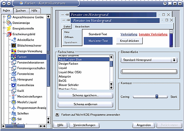
Description: This color scheme is designed to fit nicely with the Aqua Fusion Icon Theme and its complementing wallpapers (http://www.kde-look.org/usermanager/search.php?username=AquaFusion).
It is loosely based on an idea by Jason Joerges, who made an excellent color scheme from the Aqua Fusion color palette (http://www.kde-look.org/content/show.php?content=3401).
Those who would like to have a dark blue, silken appearance may also try this alternative scheme. It is tested for months now to be as usable and eye soothing as possible.
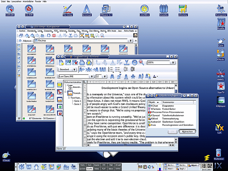
It's probably the best color scheme. I've been using it for at least two months, with plastik style & deco.
It is also great with kde1 window decoration.
Oddly enough it does not fit so well in keramik style (the scrollbars are too dark).


Ratings & Comments
1 Comment
It's probably the best color scheme. I've been using it for at least two months, with plastik style & deco. It is also great with kde1 window decoration. Oddly enough it does not fit so well in keramik style (the scrollbars are too dark).