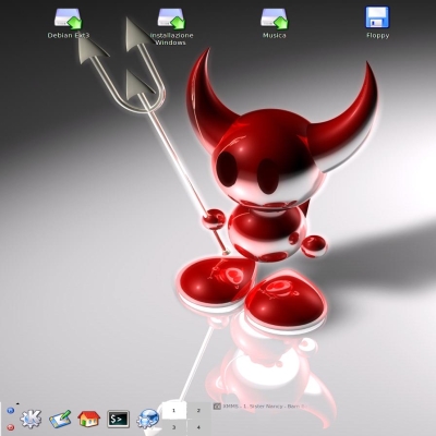
currently i do a bufixed version from the umicons icons and add many new icons and some replacemet icons as you can see (back, forward....in Konqueror). Some of them you could see in the screenshot.
Just wanna let you know ;-)
No, i do not know when its done. Not to long i think....
Color-scheme is my "Green Tea": http://www.kde-look.org/content/show.php?content=7746
bye
edit: Uploaded a new screenshot just to show you more new icons and changes.
You've done an amazing piece of artwork...
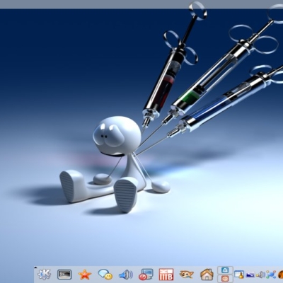
Though I'm not a native english speaker...I'm pretty sure it's supposed to be "mail_reply" and not "mail_replay"... well even if the latter one would be kinda interesting (how about kmail reading out new mail....?) Just nitpicking.... great stuff!
Oops... I'm sorry. /me just took a look at the icons directory and the email reply icon is named mail_replay.png for no obvious reason... I'm confused. I've a (different) mail_reply.png icon too but it wont show up in kmail .?.?. zzz
Holy shit this icon set kicks ass. No joke dood, cheers! All you homos who like Noia are just, homos. Excuse the sadistic prose but get real fellas, Noia is just gay and not in the slightest refined. Looking at icons like that can play with your head. This icon set it raw and at the same time just beautiful. Its sweet visual paradox and to me its a huge breath of air since a while. Good work friend. Heres to your great work. Salut!
You have some serious problems, not only are you using profanity to express your opinion and defining someone's sex by their choice of icons and calling icons homosexual (gay shouldn't be used to call something stupid) but you fail to aknowledge that your opinion is not a fact or absolute in any way.
It is just that, an opinion, last time I checked people have differnet opinions and there is not one right and wrong, especially when it comes to looks. I personally think this icon set is great, but I don't think Noia sucks at all and it is evident that you are in a minority, Noia has recieved tens of thousands of downloads and an excellent rating.
i hope your not older than 13, because if you are than you really didn't do a lot of growing up.
Noia is one of the best icons sets out there for KDE! So please no offense about this icon set and people with different sexual predilection!
I understand that some peolpe doesn't like any more Aqua or blueish Icons/Themes...
But you should tell your opinion in other ways...
i think, every complete and smooth looking iconset is really great. KDE can benefit very much of complete and good looking eye candy! the Noia is one of the complete great things! maybe it looks a kind of cartoonish, but, didn't you like cartoons when you were a child ?! oh, but then, you must have been a gay-child? and later, when you noticed, you hated that?!
*g* ok, enough..
i like Umicons too, though, i think, they wouldn't be my favourite icon-set for a long time, actually, i am using the Lycoris icon-set. ok, looking a bit like windows, but for me, i like a clean but good looking style. that's easy for the eyes, if you have to work with the computer for hours..
This is an amazing iconset, I like them as much as Noia 1.0 and that's saying a whole lot!
I really hope they will get in 3.2 like Noia will, that would be awesome! It's not on the developer plan http://developer.kde.org/development-versions/kde-3.2-features.html but I'm sure that tehy would let you have these added to 3.2 since icons don't really have bugs (not in the sense that they will crash your computer) style bugs and usabiltiy bugs are entirely different.
icons ! well, it seems like there is just another complete damn good iconset (for KDE3.2?:) !
Great!
p.s. where did you get the wallpaper ? it is very cool and really fit to the iconset and color-scheme..


Ratings & Comments
13 Comments
Which XMMS skin are you using in the screenshots? Where can I get it? Thanks
It's called Cubaed'03 http://www.1001winampskins.com/skin_details.html?id=3191
You've done an amazing piece of artwork... Though I'm not a native english speaker...I'm pretty sure it's supposed to be "mail_reply" and not "mail_replay"... well even if the latter one would be kinda interesting (how about kmail reading out new mail....?) Just nitpicking.... great stuff!
Oops... I'm sorry. /me just took a look at the icons directory and the email reply icon is named mail_replay.png for no obvious reason... I'm confused. I've a (different) mail_reply.png icon too but it wont show up in kmail .?.?. zzz
I've uploaded a second screenshot. There you can see the difference between the icons! :) For example, Knode use them too.
Holy shit this icon set kicks ass. No joke dood, cheers! All you homos who like Noia are just, homos. Excuse the sadistic prose but get real fellas, Noia is just gay and not in the slightest refined. Looking at icons like that can play with your head. This icon set it raw and at the same time just beautiful. Its sweet visual paradox and to me its a huge breath of air since a while. Good work friend. Heres to your great work. Salut!
You have some serious problems, not only are you using profanity to express your opinion and defining someone's sex by their choice of icons and calling icons homosexual (gay shouldn't be used to call something stupid) but you fail to aknowledge that your opinion is not a fact or absolute in any way. It is just that, an opinion, last time I checked people have differnet opinions and there is not one right and wrong, especially when it comes to looks. I personally think this icon set is great, but I don't think Noia sucks at all and it is evident that you are in a minority, Noia has recieved tens of thousands of downloads and an excellent rating. i hope your not older than 13, because if you are than you really didn't do a lot of growing up.
Noia is one of the best icons sets out there for KDE! So please no offense about this icon set and people with different sexual predilection! I understand that some peolpe doesn't like any more Aqua or blueish Icons/Themes... But you should tell your opinion in other ways...
i think, every complete and smooth looking iconset is really great. KDE can benefit very much of complete and good looking eye candy! the Noia is one of the complete great things! maybe it looks a kind of cartoonish, but, didn't you like cartoons when you were a child ?! oh, but then, you must have been a gay-child? and later, when you noticed, you hated that?! *g* ok, enough.. i like Umicons too, though, i think, they wouldn't be my favourite icon-set for a long time, actually, i am using the Lycoris icon-set. ok, looking a bit like windows, but for me, i like a clean but good looking style. that's easy for the eyes, if you have to work with the computer for hours..
This is an amazing iconset, I like them as much as Noia 1.0 and that's saying a whole lot! I really hope they will get in 3.2 like Noia will, that would be awesome! It's not on the developer plan http://developer.kde.org/development-versions/kde-3.2-features.html but I'm sure that tehy would let you have these added to 3.2 since icons don't really have bugs (not in the sense that they will crash your computer) style bugs and usabiltiy bugs are entirely different.
icons ! well, it seems like there is just another complete damn good iconset (for KDE3.2?:) ! Great! p.s. where did you get the wallpaper ? it is very cool and really fit to the iconset and color-scheme..
Get it here: http://www.deviantart.com/view/1576232/
I really like your icons. they look great! I cannot wait until you release them. Good Work!