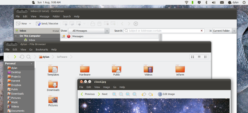
The Monoblin icon theme is a subset of the Moblin icon theme with the odd change so that it only appears for action icons, status icons and a few other common toolbar items. The result is a symbolic style for action icons, going with Gnome 2.28's more sparing use of colours and icons. That means beautifully consistent, unobtrusive toolbars that get out of your way, helping you focus on actual content.
For all other purposes (for example, application icons), the theme inherits from the ubuntu-mono-light theme, and this can be happily changed to just about anything. So, unlike many major icon themes, it doesn't try too hard; it is designed to blend seamlessly with your existing system.
The GTK+ theme I am attaching is based on the original Victory theme, with a few small changes. Victory is a really beautiful theme on its own, but I added back Murrine's simpler default look for expander widgets and I messed with tooltips, basically to bring it a little closer to stock Ubuntu.
I changed the menus in a somewhat unusual way, replacing divider lines with whitespace that actually divides things. I have a long ramble about design and philosophy on this topic, but I'll just leave it at this: that's an unusual, though very simple adjustment. If you have any feedback about it, I would love to know!
Awesome theme, very clean and uncluttered, however two minor issues:
On the main empathy window the title is non-centered, this is the only window where it happens.
http://img840.imageshack.us/img840/8485/screenshotmf.png
Also, I find the fact that whitespaces replace dividers disconcerting. It's *way* too much wasted space.
As a side effect of the above, and I think this is actually a bug because it reduces functionality, the grab areas are also missing. For example the notification area grab bar.
This:
http://img576.imageshack.us/img576/3299/graba.png
Versus this:
http://img819.imageshack.us/img819/2223/grabm.png
I couldn't figure out Victory's title bars, either. In the metatheme, it actually defaults to the Ambiance title bar (which has a strictly left-aligned title) even though the Victory one is still provided as an option.
The grab handles are an unrelated Victory theme thing. I kind of liked them being removed so I didn't change it, but I can definitely see where you're coming from. My hope is that eventually they won't be there to remove anyway. (Rather, that Gnome Panel will make a really awesome change to how and when applets are editable). So, for me, it's a step in that direction :b
If you want it back, you can edit the gtkrc file in "~/.themes/Victory + Monoblin/gtk-2.0". Jump to line 1386 and delete the line that starts with
class "PanelAppletFrame"
Thanks for the feedback on the menus! That is the bit I'm really interested in here, as I said. I admit, I found it a little disconcerting at first, too. However, I'm stubborn so I kept playing with it and finding reasons to like the design, and I've convinced myself that I was just too used to the other way :b
It does take up a little more space, but that's the price we pay for having lots of different content on the screen. We have to group those things and separate them somehow, and Gnome has been using lines as its one means of doing that. It can end up looking like a really badly formatted spreadsheet.
Nice theme. I really like the look. Only problem so far is that the menu bar text is the same colour as the menu bar background in Thunderbird 3.06 (for me anyway)
Oh my! I see that, too. I thought it would be an XUL thing, but it doesn't happen in Firefox and the theme isn't doing anything explicitly for either of the two.
I'll stare at it for a bit and hopefully something will spring to mind…
That nailed it. Great. Thanks for the tip. I was surprised to find that I was actually using the canonical Thunderbird anyway!
Good news for the theme too!!!


Ratings & Comments
7 Comments
... I can not distinguish between activated and not activated buttons in the toolbar.
Awesome theme, very clean and uncluttered, however two minor issues: On the main empathy window the title is non-centered, this is the only window where it happens. http://img840.imageshack.us/img840/8485/screenshotmf.png Also, I find the fact that whitespaces replace dividers disconcerting. It's *way* too much wasted space. As a side effect of the above, and I think this is actually a bug because it reduces functionality, the grab areas are also missing. For example the notification area grab bar. This: http://img576.imageshack.us/img576/3299/graba.png Versus this: http://img819.imageshack.us/img819/2223/grabm.png
I couldn't figure out Victory's title bars, either. In the metatheme, it actually defaults to the Ambiance title bar (which has a strictly left-aligned title) even though the Victory one is still provided as an option. The grab handles are an unrelated Victory theme thing. I kind of liked them being removed so I didn't change it, but I can definitely see where you're coming from. My hope is that eventually they won't be there to remove anyway. (Rather, that Gnome Panel will make a really awesome change to how and when applets are editable). So, for me, it's a step in that direction :b If you want it back, you can edit the gtkrc file in "~/.themes/Victory + Monoblin/gtk-2.0". Jump to line 1386 and delete the line that starts with class "PanelAppletFrame" Thanks for the feedback on the menus! That is the bit I'm really interested in here, as I said. I admit, I found it a little disconcerting at first, too. However, I'm stubborn so I kept playing with it and finding reasons to like the design, and I've convinced myself that I was just too used to the other way :b It does take up a little more space, but that's the price we pay for having lots of different content on the screen. We have to group those things and separate them somehow, and Gnome has been using lines as its one means of doing that. It can end up looking like a really badly formatted spreadsheet.
Nice theme. I really like the look. Only problem so far is that the menu bar text is the same colour as the menu bar background in Thunderbird 3.06 (for me anyway)
Oh my! I see that, too. I thought it would be an XUL thing, but it doesn't happen in Firefox and the theme isn't doing anything explicitly for either of the two. I'll stare at it for a bit and hopefully something will spring to mind…
This is probably a Mozilla bug - not a theme bug. They've fixed it in Thunderbird 3.1. Firefox 3.5 also had the same problem. Upgrading should fix the problem. Hope this helps. http://www.webupd8.org/2010/07/thunderbird-31-ubuntu-ppa-repository.html - Darin
That nailed it. Great. Thanks for the tip. I was surprised to find that I was actually using the canonical Thunderbird anyway! Good news for the theme too!!!