


Mozilla Icons
Doug


Source (link to git-repo or to original if based on someone elses unmodified work):
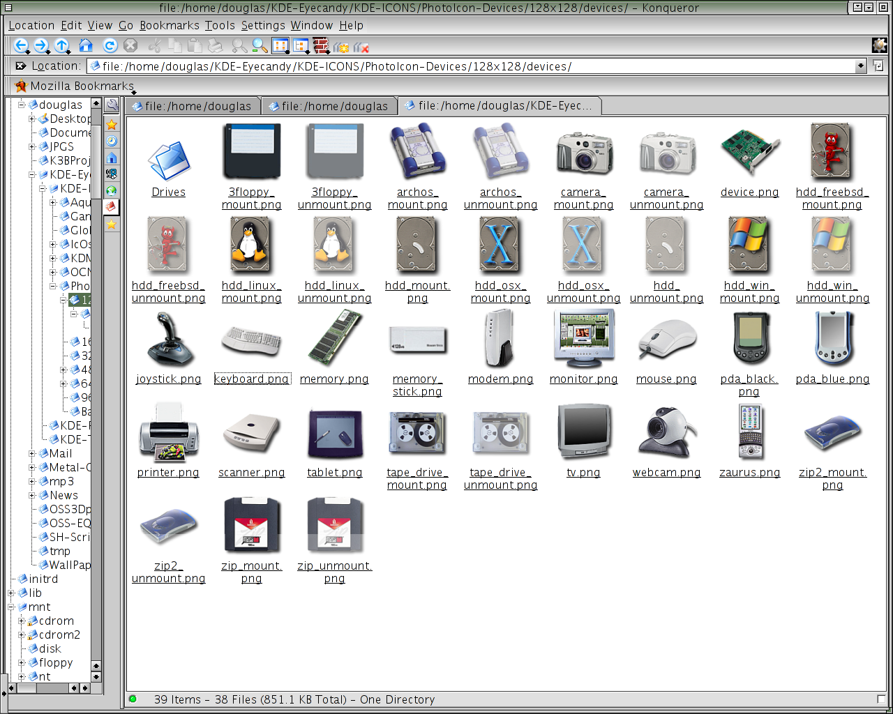
**PhotoIcons Version 0.0.3 - 02/02/03***
I did not get to enough time to finish up this icon set this weekend. Despite that I only have about maybe 8-12 icons left to do and I'll wrap up and finish with all the device icons. 
1.) I fixed up the printer icon a bit on this release.
2.) I added 25 new icons.
3.) Added index.desktop file. I am using the same technique as the Aqua guys to scale my icons. Please follow the instructions below inorder to correctly install my icons.
A.) Go to ~/.kde/share/icons directory and extract the icons package there using archiver.
B.) Then install the icon package again via the Kcontrol panel.
E.) Then change the size of your icons in the KControl panel and see the magic at work ( **crosses fingures ** ) !
P.S. Any problems you have please post here. Thanks ! Oh yeah please don't crush my server. I just got a hypermart account because this icon set is to big for KDE-Look.org. So don't /. the server please and eventually my hypermart account. Thanks.
**PhotoIcons Version 0.0.2 - 01/26/03***
1.) I haven't really done much this weekend in terms of adding more icons, I
went ahead and re-made the previous icons all over again. I replaced the
printer icon with a image of one that looks better IMHO.
2.) I went ahead and changed the appearance of the mounted icons as advised by someone else. Now when mount-able icons are not mounted they are semi-transparent. Let me know if you guys like that idea or not ? If you have
better suggestions or would like to help then please feel free to do so ! My
email as always in the license text file.
3.) I added 10 new icons for you guys to try out and nitpick. : ) Of course I
will be adding more icons next week and more then likely drawing to an end with the device icons and moving onto the filesystem icons next. **Sarcasm** Boy is that going to be fun. **Sarcasm**
4.) Changed the version of this icon set to start off with "ver X.X.X" instead of "ver X.X".
See you guys next week !!
Yours truly, Doug
**PhotoIcons Version 0.0.1 - 01/20/03***
1.) Added drop shadow to Archos Icon, which in turn made the image(s) slightly
smaller yet they are still their correct size. In other words the 128x128 is
128x128 but the image was reduced in size to compensate for the dropshadow
which I added.
2.) Added 2 more icons, printer and tablet.
3.) This icon set will now be under the GPL license.


More Icon Sub-Sets from Doug:
Other Icon Sub-Sets:


Ratings & Comments
19 Comments
The link is broken.... Actually was wanting to use some of the icons in a karamba theme im making. Hope you can put it up somewhere else ; ) Looks great
Ten link nie dziala :( moze ktos wie skad mozna sciagnac ten zestaw ikon???
Love the art of that icon set. but the link is broken. wtf?
well,the icons look great,but the only problem is that i can't download,because the link is missing...can anyone gave me a working link to these iconset?
Problem with photos is that they are unrecongisable when icon sized (16x16 to 48x48). I don't think a usable icon set can be created from photos. (I tried before and failed miserably :-)
Great work - I especially love the transparency on the Icons :) Once request, though - there's only one thing stopping me from making full use of this Icon set, and that's a CD-ROM or DVD icon. If you could make something like this I would be extremely happy :) Thanks again for a great icon set! -Mark
Should I use the CD, CDRW, and DVD-Rom images from OS-X ? I have been debating this for a while now. I would like to know what everyone else thinks. I would of course add alternatives that are differrent but I think that they would go nicely with this icon set and match the floppy and zip icons as well. The alternatives would be images of external drives or maybe just internal drives. Depends on what you guys think. Please give me some feed back. Thanks in advance Doug.
Are OS-X icons GPL'ed or similar licensed? I doubt it; and if they are not, you won't be able to use a free license for your icons. The IcOsX icons suffer the same problem. Just a thought.
I'll look into the matter but I think you might be right.
This looks realy Good TM. If you finnish the complete icon theme it will be my default iconset :-D
Mine 2. Loveitloveitloveitloveit But I am also waiting for the folders.
Please keep up this GREAT set! I promise I'll download it as soon as it is barely usable.
I think I will try to make something that does not look like a link, but just so you both know if you look closely at the 128x128 image you can see that the mounted icon has a green dot were the power light is supposed to be and the other does not. To tell you the truth it would be very hard to do something like that and still make it noticeable to the viewer on an icon 128x128 let alone 64x64 or below.
Very nice icons indeed, I only got one little comment. The arrow on the mounted icon makes you think it's a link to a device instead of a mounted device.
Hey's right... perhaps it would be a nice thought to make little lights on the device to turn on like a power led or something similar. Or maybe make the unmounted device semi transparent. It would be something different too :-)
I think I will give the semi-transparent idea a try this weekend along with other ideas as to how to show mounted and unmounted devices.
I'm waiting to see the folders. Folders are of course the most visible part of any icon set.
BEAUTIFUL ICONS! Please continue your work.
Well, you've got me interested :-D I realy like photo-realistic icons. Please make some more!