


KPoet
Doches


Source (link to git-repo or to original if based on someone elses unmodified work):
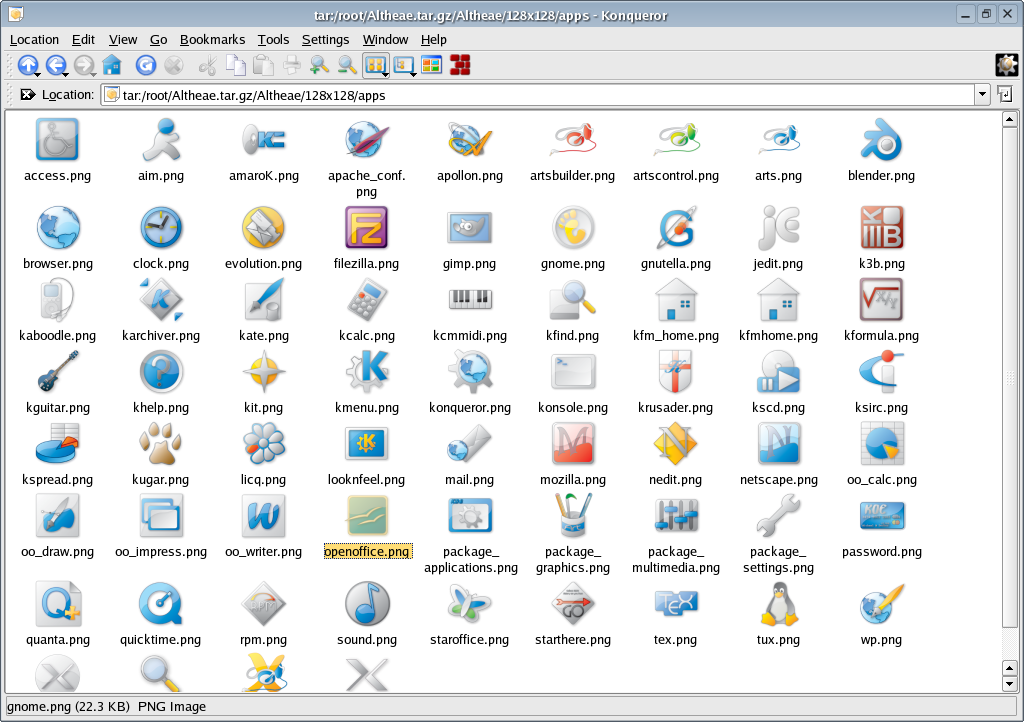
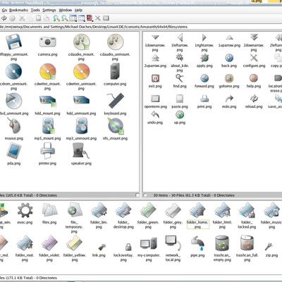
.5 - Lots of new apps (270 icons)
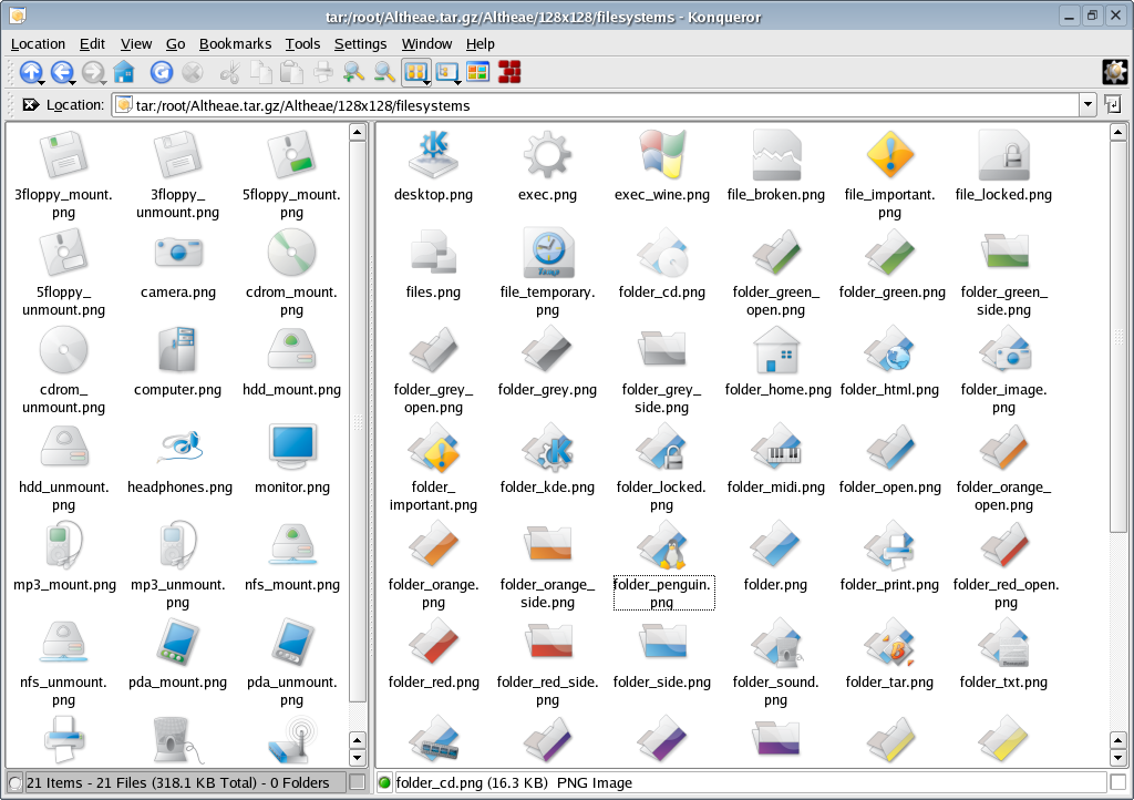
.4 - Filled out filesystems, plus others (229 icons)
.3 - Added basic actions, plus others (180 icons)
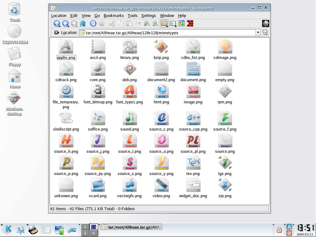
.2 - Added mimetypes, plus others (112 icons)
.1 - Preview (38 icons)


More Icon Sub-Sets from Doches:
Other Icon Sub-Sets:


Ratings & Comments
35 Comments
has plenty of issues right now. It keeps serving this file up as plain text making it impossible to download. And thanks to thier stupid PHP you can't use wget, either....
Same here - with Konqueror. Try with Firefox, worked for me.
Those icons rock. The pastell blue colour fits perfect with a grey background.
Can i use your icon for private non commercial project? please? It's so amazing and i love it
Can i use your icon for private non commercial project? please? It's so amazing and i love it thx
I love your style. Thanks for your amazing work, and I hope you continue to add to this set!
can I make requests? I just love your icon set. I really need your version of Firefox and Thunderbird :)
for this rocking Icon set! Is anyone continuing the work? I'd hate to see this one die out. It's by far the most professional looking Icon set for kde. The candy coated primary colors of all the others have really started to bother me. It has more substance than the greyscale line icon sets making the icons easier to distinguish. It's simply the best iconset for KDE.
your icons belong to the best i've ever seen. thank you
you need to redesign the "home" icons
To what? They are old, part of my originals...what should I change them to?
I like it a lot. I confused everaldo po files icon "a" with your "a" until I got to it.:) I don't know what "core" is exactly applied to ,so in my icon theme I put a bomb like everaldo and you.
I'm pretty sure that KDE uses the "core" icon for core dumps (When a critical program crashes, and linux "dumps" a copy of memory into a file for debugging). Apple traditionally uses a bomb icon for program crashes, so I think we just kinda adapted it.
Thanks...
I love the iconset! thank you! --Paul
please keep making more of these!! Need kdepim icons next! (kaddressbook, kontact, korganizer, etc).
I love this Icon set .. goes perfectly with my plastik color scheme :-) Too bad the kmail icon and the help ion are still orange :( Maybe in a next update? :) Keep up the good work!
An excellent job. Thank you!
Hi For my taste, this is the most beautyfull icons theme design I saw. It has smooth gradients that make it fit every where. Thank you very much for that "fine art". I am to download it to my workstation at work then relay it to my home computer, then install it as soon as I get home after work :-) Bretzel
I've always used the Amaranth icons and now I have more variety. Awsome work.
Very cool iconset! But grey color make me sad :).
In my opinion. I really like the colors. Hope you finish the rest soon?
Ist's look great on my Desktop. really nice.
Why use the same colour as everyoen else? Blue is so common. Try green or red. I'm glad you used gray before.
Where is u r manu icons set? Pls add menu icons set immediatly. Nice and cool icons