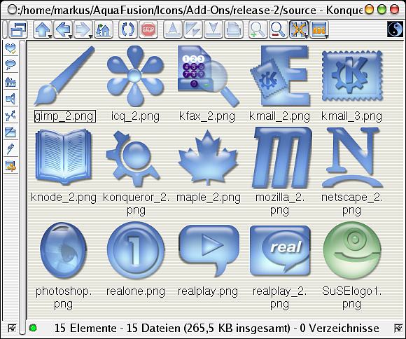
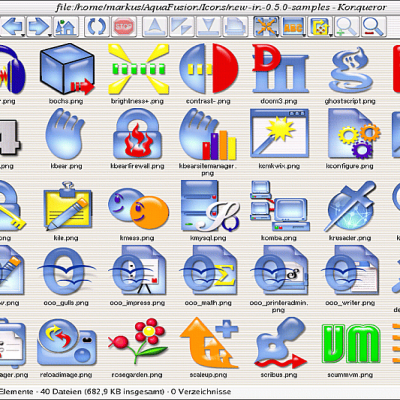
Description: This is an add-on package for the "Aqua Fusion" Icon Theme. The download provides alternative monochrome icons no longer included in the main package and a number of popular application icons, some of which originate from or are similar to copyrighted artwork.
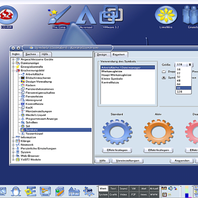
You can install this add-on like any other icon set. Just use KControl to [install] and don't forget to [apply] afterwards. The presence of the Aqua Fusion Icon Theme on your system is required to let the add-on work properly. (If you want to use the add-on icons without the theme you have to unpack and copy them by hand.)
Any suggestions and opinions are highly appreciated. Feel free to use the comments section to add your favourite commercial application to our TODO-list.
Hi,
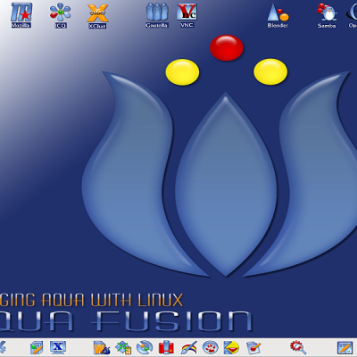
I have Aqua-fied my desktop and really like the look....On this page though, the second screenshot shows a cool wallpaper (yes I saw the previous post) and a REALLY COOL kicker panel (at least I think it is the kicker). The kicker looks aqua-fied (not grey-striped) similar to aqua icons....how can I get this look for my kicker?
Thanks
Mike
True.
But we want to complete first those icons useful for *all* distribution (i.e. KDE generic). Some dists (like S.u.S.E) add awful lot icons of their own. They take much time and effort to create and are of limited use only (for a fraction of people). Not to mention special icons for other platforms like e.g. SPARC or platforms (think of *BSD).
When we have finished (almost) all KDE and important application / game icons we may decide to add missing parts we will be asked for. :-)
The wallpaper *is* included in the wallpaper package I mentioned (there is just no screenshot of it available).
The "taskbar" is indeed an iconbar you get automatically with the wallpaper.
Hi,
that is a great Icon Theme!
I installed it immediately, and
finally my desktop has a really
good look.
However, I need more icons!
I desperately could need icons for
Mathematica, for Maple, and also for various KDE actions such as
'Quick Browse', 'Recent Documents',
'Configure Panel', 'openterm' etc.
Currently, some menus show a wild
mix of your nice icons together with the standard 'hicolor' icon
theme icons.
Wow!
Michael
The iconset is SO nice... I like it but... The only thing is TOO MUCH BLUE that it's so difficult to recognize small icons in my kicker (consider I'm using 16x16 icons in it)...
Suggestions for changing colors: Licq/Sim: Green
Back/Forward/Up: Green
Tux: Grey or Black (to have a realistic "penguin" look)
Help: Red
Bookmarks: Red
Messenger: One of both children in other color making a contrast
Make the folder icons in the whole color they are... not only the corners.
Noatun/Kaboodle: change the color to one of both.
The KOffice icons are great... but their "shields" makes SO DIFFICULT to recognize them... Please... Remove the shield !!!
I really like the iconset but, is too much blue to use them with a "macOS X like" color scheme (I'm using Liquid with the Modern color scheme), and I hope you continue the developing of this iconset, is great...
Sergio
Thank you very much for your helpful and detailed input! :-)
Well, Dan will most certainly reply to the color issue, but since the Koffice badges were my idea... they will be replaced by new and improved KOffice icons in the next major release of the Aqua Fusion Icon Theme. They serve just as a temporary solution until more elaborated icons are available.


Ratings & Comments
14 Comments
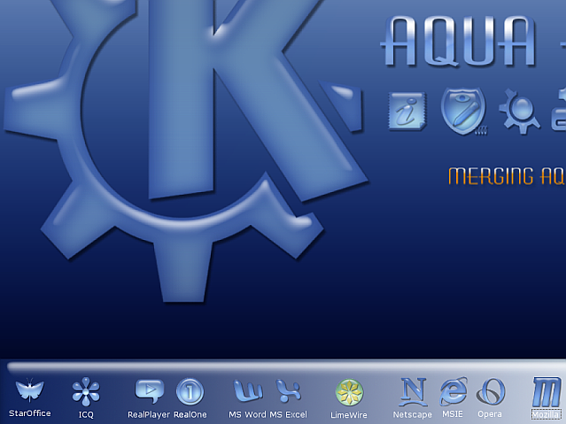
Hi, I have Aqua-fied my desktop and really like the look....On this page though, the second screenshot shows a cool wallpaper (yes I saw the previous post) and a REALLY COOL kicker panel (at least I think it is the kicker). The kicker looks aqua-fied (not grey-striped) similar to aqua icons....how can I get this look for my kicker? Thanks Mike
What about slackware Icons, or LFS Icons as like as suse's lizzard for window bar? Slackware and LFS Icons and art stuff should be welcome ;)
True. But we want to complete first those icons useful for *all* distribution (i.e. KDE generic). Some dists (like S.u.S.E) add awful lot icons of their own. They take much time and effort to create and are of limited use only (for a fraction of people). Not to mention special icons for other platforms like e.g. SPARC or platforms (think of *BSD). When we have finished (almost) all KDE and important application / game icons we may decide to add missing parts we will be asked for. :-)
I want to have the same taskbar you show in some of your screenshots, that white with horizontal grey lines...
Where can i download this very nice wallpaper and this cool taskbar??? MadElk
The wallpaper can be found at http://www.kde-look.org/content/show.php?content=2764 The taskbar is part of the Acqua themes: http://www.kde-look.org/content/show.php?content=153 http://www.kde-look.org/content/show.php?content=154
The wallpaper and the taskbar are not the same as on the second screenshot.... another link...?
The wallpaper *is* included in the wallpaper package I mentioned (there is just no screenshot of it available). The "taskbar" is indeed an iconbar you get automatically with the wallpaper.
it`s great! Thanks
How do you make your menu so transparent, it looks like it doesn't exist?
what "iconbar" is that? the one you are using for that smooth panel at the bottm..i cant seem to find it there
Hi, that is a great Icon Theme! I installed it immediately, and finally my desktop has a really good look. However, I need more icons! I desperately could need icons for Mathematica, for Maple, and also for various KDE actions such as 'Quick Browse', 'Recent Documents', 'Configure Panel', 'openterm' etc. Currently, some menus show a wild mix of your nice icons together with the standard 'hicolor' icon theme icons. Wow! Michael
The iconset is SO nice... I like it but... The only thing is TOO MUCH BLUE that it's so difficult to recognize small icons in my kicker (consider I'm using 16x16 icons in it)... Suggestions for changing colors: Licq/Sim: Green Back/Forward/Up: Green Tux: Grey or Black (to have a realistic "penguin" look) Help: Red Bookmarks: Red Messenger: One of both children in other color making a contrast Make the folder icons in the whole color they are... not only the corners. Noatun/Kaboodle: change the color to one of both. The KOffice icons are great... but their "shields" makes SO DIFFICULT to recognize them... Please... Remove the shield !!! I really like the iconset but, is too much blue to use them with a "macOS X like" color scheme (I'm using Liquid with the Modern color scheme), and I hope you continue the developing of this iconset, is great... Sergio
Thank you very much for your helpful and detailed input! :-) Well, Dan will most certainly reply to the color issue, but since the Koffice badges were my idea... they will be replaced by new and improved KOffice icons in the next major release of the Aqua Fusion Icon Theme. They serve just as a temporary solution until more elaborated icons are available.