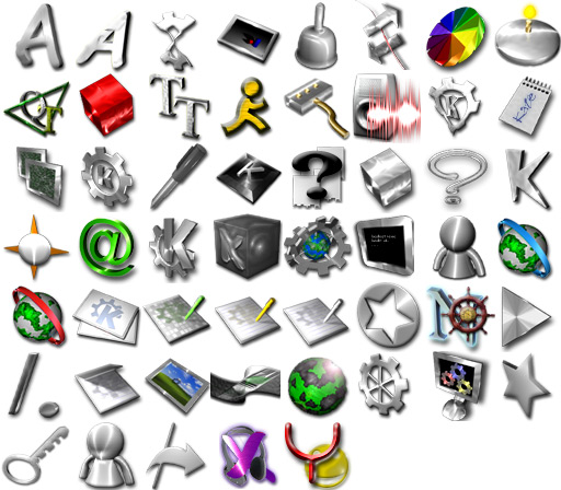
Description: "Steel Icons" is an icon set for KDE comprised of Steel/Silver icons with shadows. I know everybody loves the Crystal/Aquafusion/Marbles Icons (with the exception of aquafusion, I do -- its just too blue! but I saw Metrope, and thought, wow, those don't look like they're trying to be OS X, they look like, well, like Linux (actually, like KDE; I hate Gnome's look, it just looks childish). So I set out to design some icons that weren't based on OS X, Windows, or who-knows what else. Tell me what you think, please.Last changelog:
1.2.5 - Straightened out version numbers with themes.freshmeat.org, added apps/devices, 153 icons
02/12/03 - New Screenshots (no liquid-stipples)
0.3 - Completely redone mimetypes, redone apps, and new apps/filesystems icons. Design is generally softer and less harsh
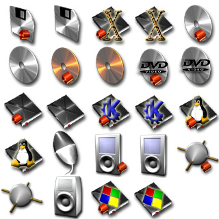
0.2 - Hard drive icons have been added for KDE, Linux, Windows, and MacOS. There are also icons in different colors for a few apps, and the old trash icon has been replaced.
Great theme but i lost it in my last machine crash ...
Please someone do a re-upload for this icon theme.
All the Linux Community must give thanks for this to happen.
Very nice work, each is individual, yet the set goes well together. KDE is the best option for a graphic desktop (as mentioned, gnome is childish), and It's good to see that it's being given a life of it's own.
I'd have to agree with you on on the apparent trend of all themes trying to look like some other OS (though I always thought the over use of blue was an attempt to emulate any of microwhore's products) when Linux is, quite simply, better.
and they're so shiny...
Interesting set of icons, but when I try to untar the downloaded file, i get an error stating that it is not a gzipped file. Also unable to untar (unzip) the file with the window utiltity winzip, which has no problem with these files on other occassions.
Steel icons seem a pretty specialized icon set to me. I was looking for something that meshed well with my desktop and all the massively colored icons just looked wrong. I'm sure they work for a greater number of themes, are more versatile, but if everyone creates icon sets with that goal in mind we'll have a million icon sets that work okay for anything but not exceptionally for anything.
These are awesome! Keep up the good work.
Love this set - however! Try as I might I cannot get it to install on my system. Running Mandrake 9.0 and KDE 3.0.3
I followed the install instructions, making sure I hadn't unpacked the download, and when I click on 'Install new theme' the file text window just clears each time, and the icons are not installed. Is there a bug here or is it possible to install them from the command line?
TIA for any help, would love to be able to use this set...
I love the various metallic wallpapers. This is the perfect complement to those. I'm sick to death of all the damn aqua crap out there. QUIT DOING THE SAME THING OVER AND OVER PEOPLE!!!
I don't like them. While they might look OK on a desktop, I think that the set is way too busy, and that they will look bad scaled down to 22x22 to fit on toolbars.
To each their own.
awesome icons, would really love it if you can make a full set so that kde menus and konqueror uses these icons in the style of the metal folders instead of those annoying default ones
Keep up the good work ;)
cheers mobtek
When click the little browse folder on preferences-look and feel-icons and i click install theme... nothing happens!!! I'm thinking beacause theres no index.desktop file! If that is the problem, tell me, if it isnt the problem... please tell me! I love those icons alot and I really want to use it.
This icon theme looks great! It isn't cartoonish or blue, like most KDE icons are. I don't like a lot of color on my desktop, so a steel theme is perfect. I've set my theme to MGBreizh, set my color scheme to Next, and Style to Keramik. I'm also using the Technical-1 icons. A complete set of Steel icons would complete the look I'm trying to acheve.
Impressive, original iconset. THese look awesome! However, I think most of them would fit in much better in GNOME 2.2 than in KDE. Please submit your icons to art.gnome.org too.
well...first, I'm comfortable with KDE, it's what I use, after all, and don't even have gnome installed, so...second, I don't know the specs for a gnome iconset; if you do, or know of a site that details it, shoot it to me, yes? If gnome's not to good for crystal, i guess it's not too good for me...yea....ok....
Try to make 'em a bit colorful... Think in people (like me) who use small icons (16x16) in kicker... and watching a plenty of grey icons, make a bit difficult to recognize them "on the fly"...
This iconset combines so well with the Qinx widget style, for people who was asking for a "metal based" style...
Sergio
sorry but i don't agree, bright colour go completely against the idea behind the theme. A stell icon-set has to be grey, with a nice grey, steel background - if you don't like the idea, just pick one of the scores of high-colour iconsets we have here ...
fred
How did you get shadows on the icon-texts on your desktop, is that an option for kde 3.1 or something (didn't see it when i tried rc3)
I want that on my desktop!!!


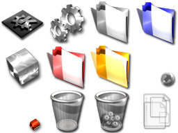
 but I saw Metrope, and thought, wow, those don't look like they're trying to be OS X, they look like, well, like Linux (actually, like KDE; I hate Gnome's look, it just looks childish). So I set out to design some icons that weren't based on OS X, Windows, or who-knows what else. Tell me what you think, please.


Ratings & Comments
48 Comments
Great theme but i lost it in my last machine crash ... Please someone do a re-upload for this icon theme. All the Linux Community must give thanks for this to happen.
9 Great theme set.
unable download
I was precisely looking for an icon theme that had less blue in it. This is just great, thank you !
Very nice work, each is individual, yet the set goes well together. KDE is the best option for a graphic desktop (as mentioned, gnome is childish), and It's good to see that it's being given a life of it's own. I'd have to agree with you on on the apparent trend of all themes trying to look like some other OS (though I always thought the over use of blue was an attempt to emulate any of microwhore's products) when Linux is, quite simply, better. and they're so shiny...
Pleaze make konqueror icons too! When you open up konqueror and you see non steel icons it ruins the effect. :) Great icons though.
Thank you very much! This set is great, exactly what I was looking for.
Thank you very much! This is set is great, exactly what I was looking for.
Interesting set of icons, but when I try to untar the downloaded file, i get an error stating that it is not a gzipped file. Also unable to untar (unzip) the file with the window utiltity winzip, which has no problem with these files on other occassions.
That's porobably the fault of kde-look.org. Thier servers are often misconfigured...
Steel icons seem a pretty specialized icon set to me. I was looking for something that meshed well with my desktop and all the massively colored icons just looked wrong. I'm sure they work for a greater number of themes, are more versatile, but if everyone creates icon sets with that goal in mind we'll have a million icon sets that work okay for anything but not exceptionally for anything. These are awesome! Keep up the good work.
Love this set - however! Try as I might I cannot get it to install on my system. Running Mandrake 9.0 and KDE 3.0.3 I followed the install instructions, making sure I hadn't unpacked the download, and when I click on 'Install new theme' the file text window just clears each time, and the icons are not installed. Is there a bug here or is it possible to install them from the command line? TIA for any help, would love to be able to use this set...
I love the various metallic wallpapers. This is the perfect complement to those. I'm sick to death of all the damn aqua crap out there. QUIT DOING THE SAME THING OVER AND OVER PEOPLE!!!
I don't like them. While they might look OK on a desktop, I think that the set is way too busy, and that they will look bad scaled down to 22x22 to fit on toolbars. To each their own.
awesome icons, would really love it if you can make a full set so that kde menus and konqueror uses these icons in the style of the metal folders instead of those annoying default ones Keep up the good work ;) cheers mobtek
When click the little browse folder on preferences-look and feel-icons and i click install theme... nothing happens!!! I'm thinking beacause theres no index.desktop file! If that is the problem, tell me, if it isnt the problem... please tell me! I love those icons alot and I really want to use it.
where you ever about to get the Steel Icon set to work?
This icon theme looks great! It isn't cartoonish or blue, like most KDE icons are. I don't like a lot of color on my desktop, so a steel theme is perfect. I've set my theme to MGBreizh, set my color scheme to Next, and Style to Keramik. I'm also using the Technical-1 icons. A complete set of Steel icons would complete the look I'm trying to acheve.
GOOD, NO, GREAT!!
Impressive, original iconset. THese look awesome! However, I think most of them would fit in much better in GNOME 2.2 than in KDE. Please submit your icons to art.gnome.org too.
well...first, I'm comfortable with KDE, it's what I use, after all, and don't even have gnome installed, so...second, I don't know the specs for a gnome iconset; if you do, or know of a site that details it, shoot it to me, yes? If gnome's not to good for crystal, i guess it's not too good for me...yea....ok....
..work! original and piece for eye! keep going.
Try to make 'em a bit colorful... Think in people (like me) who use small icons (16x16) in kicker... and watching a plenty of grey icons, make a bit difficult to recognize them "on the fly"... This iconset combines so well with the Qinx widget style, for people who was asking for a "metal based" style... Sergio
sorry but i don't agree, bright colour go completely against the idea behind the theme. A stell icon-set has to be grey, with a nice grey, steel background - if you don't like the idea, just pick one of the scores of high-colour iconsets we have here ... fred
How did you get shadows on the icon-texts on your desktop, is that an option for kde 3.1 or something (didn't see it when i tried rc3) I want that on my desktop!!!