


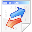


BitTorrent GUI Crystal Icon
yemu


Source (link to git-repo or to original if based on someone elses unmodified work):
i made the arrows look more "crystal-like" and added 0/1 background (taken from the binary mime type from crystal set)
i made the version with both arrows blue
2004.03.30: update by Jim Higson who noticed a few stray pixels on the left of res/blue version and fixed it. thanks jim!


More Icon Sub-Sets from yemu:
Other Icon Sub-Sets:


Ratings & Comments
5 Comments
These are great icons, and I've been using them for a while now. One comment, though. Since red usually indicates outward flow, and blue inward flow (blood flow metaphor), shouldn't the upward arrow be red and the downward arrow be blue? Maybe I'm being too picky. Thanks for the great icons!!!!
The red blue arrows makes me think of Palm's HotSync, but even tough, it's in my crystal folder right now!
Think "giftake" is from battletech but I could be wrong =p Just wanted to say great icon, am using it now )
One comment is the 'Bittorrent' text on the top of the icon isn't legible except for in 128x128, which is pretty rarely used. Maybe in 64x64 and below you could just have "Bt" but make the writing bigger? The same goes for the 1s and 0s. They can't really be made out on the samller icons. Maybe keep them the same size as the icons get smaller, but just have less of them.
A very nice icon that embodies the fundamental quality of bittorrent, the give-and-take (wasn't there some fiction book that used the phrase giftake?). The question is whether laypeople know that this is a characteristic of bittorrent. For that reason, I was wondering if the image could get a more "torrentious" quality. Something like a wave made up of 1's and 0's, or a stream of arrows. Just thinking aloud here. It's already a great icon :)