


KPoet
Doches


Source (link to git-repo or to original if based on someone elses unmodified work):
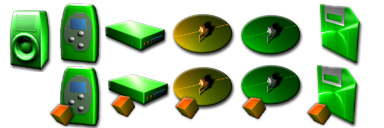
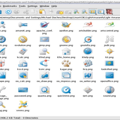
0.2 - ~31 icons, added some new devices, and tweaked old ones.
0.1 - Pilot: will do complete theme if these are well-recieved


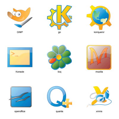
More Icon Sub-Sets from Doches:
Other Icon Sub-Sets:


Ratings & Comments
26 Comments
please more of this! jupi
This is a VERY nice green theme. I think ti would be great to have a full version of this :)
I like the style of these Icons, they would probably look best with a Matrix themish thing. However, could you make a blueish set as well? Sorry, but that's my fav colour ;)
I REALLY like this set! Please dont change the green! Green is actually my favorite color, and this shade of green works really great with Icons I think. I would LOVE a full set!
It works perfectly with the Matrix Reloaded Theme.
Please do continue with them :D
Wow, great Icons. Although they dont really fit the style I am looking for, I'm totally phyced about the originallity. And my gosh! They aren't blue/glass/aqua/crystal/osX!!! If I see any more of that stuff I'm going to puke! You don't happen to have any orangish/yellowish icon sets in the works do you? Keep it up!
Wow...a LinuxCult Admin likes it...Always good. And yes, actually, I am/was working on a metallic orange theme, based off the same basic stuff as these, but with a different style. However, I stopped working on it, because they were too similiar to these. If you'd like them, or would like to look at them, email me. I've only done about 20.
Hehe yeah I know...SHH! Seeing that linuxcult hosts the crystal icon set...heh. Well just because I mod there dosnt mean I have to like it. Anyways, yeah I would love to see the orange versions.
These icons are superb and just the right shade of green! Bless you for doing these and I anxiously await seeing MORE of them! Fantastic... just simply FANTASTIC!
These are great. I would really like a green icon set. I am tired of all of this blue crap.
I got flamed for doing some green splash screens. They told me suse succed. I'm a debian user! AND I FRIGGIN LIKE GREEN. Let's stamp out this blue M$ mindlessnes
For ages I have been waiting for some decent looking green icons/themes anything. Everyone seems obsessed with blue at the moment. I'm currently working on a green, metalic theme and these icons will be perfect for it. Nice work. WE NEED MORE GREEN!!!!!!!!
Great icon set. Is it possible to have it in a red or yellow or orange based schema? Hi
Hey I like 'em.. I would like to saee them a little softer green though, but let us know when they are done!
YES, MORE, MORE...
Good job man keep up the great work. I like this green icon set. It gives more choice for those who want something other then a blue colored based icons set.
Originally, I did these icons in an orange-metallic color, but changed to green because I realized that they were slowly turning into the icons from my previous set. I will, however, try for a lighter green (pastel? yellowish?).
please don't change them. I like them, as they are. Maybe an alternative would be to offer two different icon sets? One in original green, and the other... I dunno... Greetz, Mona
How about making the slightly lighter green? A lot of people use blue because it is a cool and relaxing colour. Interestingly, I read in a scientific magazine that green is a very natural and relaxing colour to humans because well, almost all of mother nature is green. I practiced with some green colours and everybody seems to like it. Check it out at [shameless plug]: http://www.cpsc.ucalgary.ca/Research/GJ/453/ Reza
I'm in love. It just looks great.
I realy love them, especially how greenish they look like. But in doubht they will look as good if they are shrinked to 32x32or even smaller. :-( Having them smaller is a must for my screen (800x600) else to mush screen would be lost. :-( But if you succeed in doing smaller icons as green and great, I'd be pleased with dropping my present icons. :-)
800x600? tried to make a virtual size of 1024x768 or even bigger? that was possible with X in a built-in way, though M$ would make you think otherwise. it was good since I used a 15' before getting LCD, X video subsystem had never been disrupted by some crashing programs so I could always move my mouse and viewport around. this known feature was somehow covered up by today's 'clever'??? GUI installers.
forgot to clarify, the screen of my pre-LCD days are 800x600 physical res on a 1024x768 virtual res
But I don't like the green color.