


I'm making them with The Gimp and Sodipodi.
That not finish but I'm working on them after school and when I have time.
Hope you'll like them...
Give comments


Source (link to git-repo or to original if based on someone elses unmodified work):
V. 0.2 : New tar, tgz, rpm, deb icons ^_^
You can now download them !
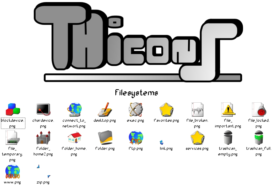
V. 0.3 : You can now install them. I start the filesystem icons. I added the README file and the 22x22 icon size.
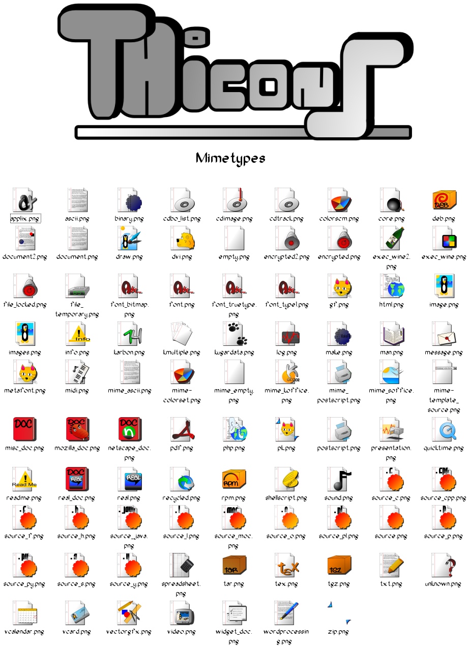
V. 0.4 : 96x96 size now working.I'm finishing the mimetypes before continuing the filesystems. I remove the "Originaux [223x223]" and "Originaux [Sodipodi]" folder, the package is lighter. New tar/tgz/rpm/deb icons, "image" icon is a little bit changed. 83 icons per size. 581 icons. SVG file is now in the SVG folder.
V. 0.5 : I didn't have my new mouse, but as I started some new icons before, I put the new set overall. Now 92 icons per size, 644 icons at all. I think there was some little problems with the 22x22 size, so I repared it. Now under GPL.
V. 0.6 : I bought my new mouse and I continued the set. Now 108 icons per size. 756 at all. I finished the Mimetypes . If something's missing, tell me.
Don't forget to give comments !


Other Icon Sub-Sets:


Ratings & Comments
7 Comments
.. Mandrake...
What do you mean by "it is so ...Mandrake... ?" Simple ? Strange ? Bad ? Good ? Something else ?
I just mean "Mandrake" ;) The colors (kind of yellow with kind of lilac), the style somehow, the accessories (the star)... The icons are very good though I don't like the ones by Mandrake
i like it a bit more simple, so this one is fine. finally not some crystal or osx-clone icons. :) i like specially the rpm icons colors. i would suggest to change the color of the .deb and .tar files to the yellow in order to have a consistent look for the packages. and yellow looks best here. also: try to reduce the amount of red. red always reminds me of "alarm" and i don't think that some music files should cause an alarm in my head (although some artists music does :P). i am looking forward to see the full set.
I like the icons a lot. Some, like man.png or the rpm/tar/tgz ones, could be a little more realistically 3D, as they currently look a bit flat. But there is potential for a good set here, which I would certainly add to my computer.
The font name is Oak You can found it in the font links in the fonts section of KDE-look (of course ;) thanks for comments...
Im liking that font and those icons. What font is that?