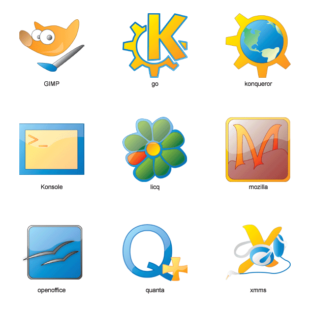
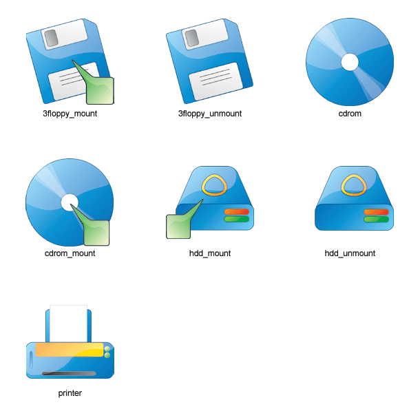
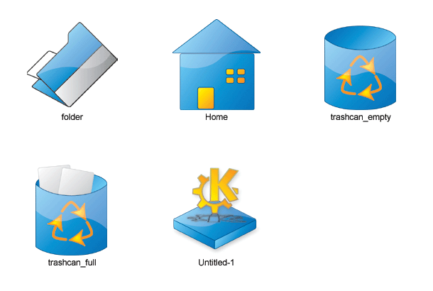
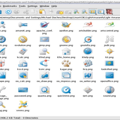
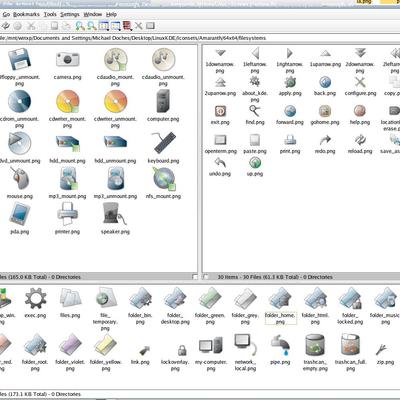
A rework of my "Amaranth" theme, with more vibrant colors. Meshes much better with crystal than the old, predominately greyscale set!*Update* This idea is dead; Just too ugly for further contemplation. See "Light Amaranth" for it's progeny.


Ratings & Comments
6 Comments
reminds me too much of PHPBB! that site has some pretty rude staff members. silver would look great though... possibly green or orange....
i very much like the greyscale set. i've been using it for months. will you be updating that as well? i'd like to see what may come of it.
Yes please do. Your icons have been my desktop standard for some time. Love your work.
... your icon for xmms. A nice set of icons overall, please keep going :)
i think they are great i love your work.. If i may make a sugestion.. i think the icons could use a bigger border..( just my opinion) anyways they look great keep them up!
Nice and simple.