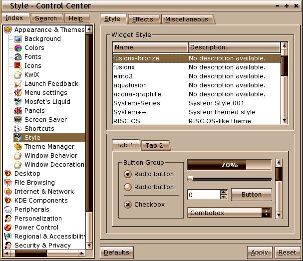
Description: "Fusion X Bronze" is a shiny new KDE 3 style especially suited for use in warm colored enviroments. It has its very unique look and feel and will give your desktop a stylish appearance.
This was derived from our "Fusion X" theme inspired by Max Rudberg's BBX appearance theme designed for use with Apple's OS X operating system.
You'll find a KDE pixmap style and a corresponding IceWM window decoration inside the package. Untar the archive somewhere and run "sh ./install.sh" as user on the command line.
After the script finished successfully, open KDE's Control Center, chose "Appearance & Themes" and select the style "fusionx-bronze". Go to "Window Decorations", select "IceWM" then the "Configuration [IceWM]" tab and chose "fusionX-bronze".
NOTE: If you don't like the window button order you can change them via the window decoration "Buttons" tab.
We recommend using "Noia warm" icons with this style.
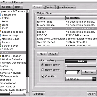
I like this style alot, but can it be changed to silver? I think that will help a bit on the readability of buttons. Also the tabs in konqueror seems a little bit boxy and miss colored on the right side. The scrollbars looks very much like real bronze :)
Regards.
-Luguber
Unfortunatly it is not always possible to license packages as we'd like to. This art is based on others' work and we all have to respect their copyrights. The "spirit of free software" doesn't mean you can ignore the "spirit of fundamental fairness".
We (me and Dan) have released a bunch of artwork under free and copyleft licenses. Have a look at our personal accounts and the AquaFusion account.
If you feel uncomfortable with this license then please don't use this software. We are sorry for this inconvinience, but we didn't chose the license for fun or because we are jealous.
It's inherent to the design. All eyecandy is kind of distracting, on the other hand ergonomic designs tend to be very boring. Other designs (like Keramik or Liquid) have their very own distracting spots.
Most buttons bear only standard messages like "OK" or "Cancel". There shouldn't occure too much misunderstandings. Moreover you can chose a bolder font to increase readability.


Ratings & Comments
6 Comments
I like this style alot, but can it be changed to silver? I think that will help a bit on the readability of buttons. Also the tabs in konqueror seems a little bit boxy and miss colored on the right side. The scrollbars looks very much like real bronze :) Regards. -Luguber
Stay tuned. *wink* *wink*
God what a restrictive license. 'must not be altered'? wtf is that shit? that goes against the whole spirit of the FREE SOFTWARE you are using.
Unfortunatly it is not always possible to license packages as we'd like to. This art is based on others' work and we all have to respect their copyrights. The "spirit of free software" doesn't mean you can ignore the "spirit of fundamental fairness". We (me and Dan) have released a bunch of artwork under free and copyleft licenses. Have a look at our personal accounts and the AquaFusion account. If you feel uncomfortable with this license then please don't use this software. We are sorry for this inconvinience, but we didn't chose the license for fun or because we are jealous.
maybe its just me, but that darkened bar that runs through the middle of the buttons makes the text in them harder to read.
It's inherent to the design. All eyecandy is kind of distracting, on the other hand ergonomic designs tend to be very boring. Other designs (like Keramik or Liquid) have their very own distracting spots. Most buttons bear only standard messages like "OK" or "Cancel". There shouldn't occure too much misunderstandings. Moreover you can chose a bolder font to increase readability.