


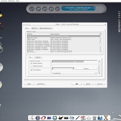
Milk
ThEOnE


Source (link to git-repo or to original if based on someone elses unmodified work):
* 1.6 Fixed windec fix and added more space betwen the buttons (now you might use the windec at the left or right without differences). Fixed the menu background that allow rezise your window without modifications.
* 1.4 Fixed some bugs with the buttons and the kwin deco.
Changed the combox background (i like more the brushed combox background but ...)to the white color.
* 1.2 Added kwin deco.
* 1.0 INITIAL VERSION


More KDE 3.0-3.4 Themes from ThEOnE:
Other KDE 3.0-3.4 Themes:


Ratings & Comments
23 Comments
Hi, I have tried reading your instructions for installing this theme, but it is not working. it doens't even appear in the control panel centre sections so what do you have to do? I really want this awesome theme. it looks mad
'The One', are you still working on this? Because we are still waiting... You have given us some hope. I don't know too much about icewin dec, but I tried kristall, which is also an icewin dec. And it worked very smooth, could you please see if there is any difference between iTunes windec and kristall windec that is making things bad? I mean the 2 top corners aren't round when you shadow the window.
where can i find the window decs. that would make it complete
This is a great style! Thank you for creating it. The only thing I have found wrong is when you right click a taskbar button for an open window, the popup list has a few menu items that are in a bold font. When I put my cursor over one of the bold items, the text seems to blend into the highlight so that it isn't readable. But it returns to a readable font when I move the cursor off that menu item. It really isn't a problem, just thought I would let you know in case you are a perfectionist like me ;) Anyroad, it is one of the best styles I have seen on this site. Good work!
Ok,first sorry for my bad english,but i hope you undersstand what i want to say: When you open the Konqueror you have two windows there normally,on the right the big one with all the files,and on the left one the trees. On the right i can set a brushed background,is this for the left side possible to?i think it would look great if the whole window is brushed!
I like the "ribbed" blue scrollbars on the Acqua style (here on kde-look) much better since they match the original Aqua OSX theme... maybe these could be changed. Also, windec buttons should default to the left side (like your screen shot) or at least be easily configurable from the IceWM control and need the 3 colors; red, yellow, green so the user knows which does what. I tried your IceWM windec, but it still has sharp edges at the top rounded corners (see the kwinacquamod_l3m-1.2 for a nice looking windec that maybe you can use parts of). I look forward to a nice IceWM windec like this because these KDE ones are too difficult to compile on many Linux systems.
OK ... i add a new options for the kwin engine ... hope it.
why is the style not working with kde 3.2 alpha ?
This is what I was waiting for. and once I even tried to make one for myself. (if only I was not that busy these days ;) I have to say it's such a good job. Only one little issue I noticed. When u double click on the window title, and shadow it to a title bar, the four corners are kinda messed up. Even if you bring the window content back later, u still see the bad corners, until u minimize and retore the window. Hope this can bring some nice improvement to the windec. Again, thank you very much.
yeah I noticed that too with the corners. I've been having a bit of fun with the themerc file :P http://mobtek.customer.netspace.net.au/currentKDEtheme.jpg
The window decs come with the theme included in the theme tarball in the directory ~/icewm-themes/ Just do the normal icewm theme installation. http://www.kde-look.org/help/index.php?type=18 On another note is there any reason why the rounded edges under the wm decoration don't cope with certains sizes? see: http://mobtek.customer.netspace.net.au/roundedbar-repeated.jpg Other than that, great job on the theme, looks fantastic cheers mob
another thought, I'd like to see the edges of the menubar not rounded. Also the menubar not to have that raised look but to be flat and flush with the window decoration with just a black line underneath instead like in the menus. Also for the window dec to have the minimize, maximize and close buttons show their icons when the mouse is over them. again great theme :) cheers mob
This style is great, but I think that background of the menubar should be centered. It is great when window is maximized but when you resize it you can notice the difference. Also I think that menubar shouldn't have rounded corners.
Thanks man, I have wanted something like this for a long time (especially in my mac everything stage) good job, and keep improving it.
this style is great!!...could you post details on how to get the window decorations pleeeaaassseee!!!!
This looks nice, can't wait to try it out. I just recently installed Fedora Core (Redhat "Severn") Test version 3, the new Linux OS. http://fedora.redhat.com/ . This is my first experience with Linux and I like it.
This was exactly what I was waiting for! Thank you! Please continue improving it! Window decorations would indeed be nice!
That one is really nice. I am dreamin of a Alphablending for the menues, could you do that ? Nice Job, very Nice... Greetz Seraphyn
i do not used the stly yet, but in the screen shot the combox color is grey, but in it will be more beautiful if ti was white and have a glassy feel.
Looks like knifty. -maitre
this window-deco is normaly include in kde, i can't tell you the name of it, because i'm not in kde! greets,flo
your window decoration looks nice. Maybe you could make a theme and include that with it. Also some other nice features would be a kicker backgournd. I just selected the image out of the installer directory for the background. A couple of small changes and this can be a reall nice theme.
What window decoration did you use? This is just the style, right? Did you also make the matching window decoration?