


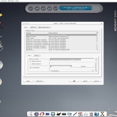
Milk
ThEOnE


Source (link to git-repo or to original if based on someone elses unmodified work):
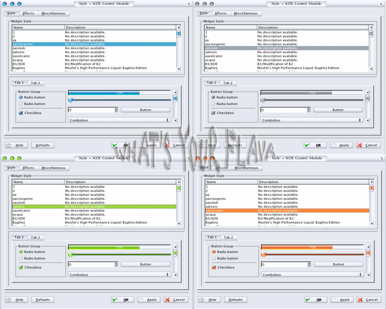
* 2.0 Finally the style is complete ... with all its flavors ... (fixed any windec, radio, checkbox bugs)
* 1.6 This relase have many fixed like a buttons size, the comboxbox, the tabs, and the kwin deco.
* 1.2 Added Some wallpapers
* 1.0 INITIAL VERSION


More KDE 3.0-3.4 Themes from ThEOnE:
Other KDE 3.0-3.4 Themes:


Ratings & Comments
25 Comments
PLEASE fix the broken button spacing on the left! It drives me nuts every time I see it! AluminumAlloy is the best skin I've used, and I want to use it with the icons on the left (custom button positions). [x] [_] . [+] is weird, fix it!
Very sleek and very cool! I love it.. keep up teh good work!! ;) I have the cryo one ;)
It's a great theme. I've just installed it and it's now my default. Great work!
Good work indeed! Only one thing is bothering me in window deco - the buttons are separated with different amount of space, example: [x] [x][x] ... redo it with same amount of space and perfecto :P
As nice as this is, my flavour has to be one that has a GTK/Gnome complement -- such as Galaxy, Bluecurve, *eramik, etc. Without that, no matter how handsome a style is, the lack of a corresponding one for GTK/Gnome will lead to an incongruous-looking desktop. I hope Qt/KDE and GTK/Gnome can perhaps work on a common styling system. Nonetheless, good on you for this one.
Some distros are working towards a common look in KDE and Gnome such as Mandrake with their Galaxy theme. But really KDE and Gnome are completely separate projects so theres no reason for them to merge their looks. In fact Gnome is a fork of KDE so there is kind of rivalry between the two.
instead of making four static colors why dont you just allow the colors to be changed in the colors dialog? Sorry if im wrong, but all your themes seem to be static in colors (and whats worse is there all pretty much the same, just different colors), while they should use the colors chosen by the suer in the color preferences.
That's because it's a straight pixmap theme. You need a separate pixmap for each color. User configurable colors in a theme like this would be completely unmanagable.
make sense, thanks for explaining =)
Actually, it would be managable -- it's been done with Keramik, Liquid, etc., which both use similarly fancy widgets. It's just a matter of having to write the style...
a very kewl theme
What we need now is a sunken Smooth Stripes Gloss, Sosumi & Mafia... When linux gets the "look" of XP/OSX themes-styles-skins...whatever, then things will begin to change for the better. As I've said before linux needs to look like a ferrari coming out of the gates, not a kia with pre-school looking colors/icons and or themes.
Nice Theme,but in the Menues the Font is very often Bold/Black. The Edges are not very sharp.I tried tzo change font and all stuff,but its always bold,How i can change this?. btw what font do you used?
You could use Lucida Sans Unicode Font for the better and clean look ... if you don't know where you get it i could add this font to a package, only tell me what you think.
I cant change the Backgroundpic from my Kicker ? I tried it with right Mouseklick Prefs and change Background. I won't work for the Icons. Could anybody help me ?
Can you make buttons smaller? They're very big ;\
I guess that this is a pixmap theme, right? Could you please tell me, how you've learned to do that? Is there any tutorial on Pixmap Themes available? Where do I have to look, to find out more about pixmap themes?
I don't like the tabs. IMO the selected tab should look like it is a netural extension of the corresponding dialog it is connected too...
I like your theme!!! so continue, make it better...
wow, looks very nice, continue your good work....
It's soo cool! I'll use it in a presentation on afternoon to cool up my desktop!!
Very nice, it needs a lot of polishing, but your definetly on the right track!
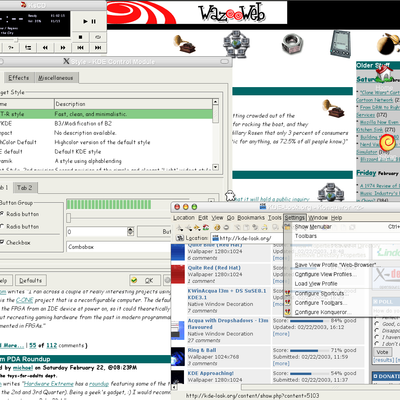
Very nice port! Now if only the kicker could look this good.
It looks nice. It's not my taste tho. Still! I dearly apreaciate a 'new' style. Good luck on making it stable! We need alot more style's for KDE
This is cool. With more themes like this..Gnome2 is in for a run for it's money. VERY GOOD! Cheers!