


xTremeKDE
tDream


Source (link to git-repo or to original if based on someone elses unmodified work):
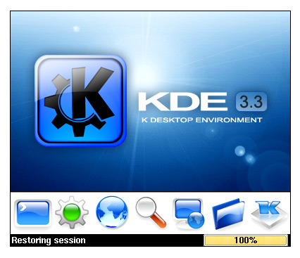
Version 1.5: Screenshot 2 now shows the splash screen with a lot more gloss and finish after many email comments and suggestions.
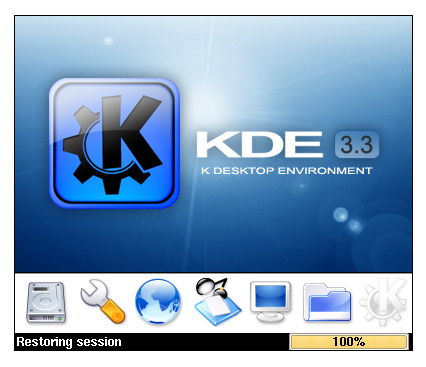
Version 1.7: Shows KDE 3.3 starting up with new splash screen.
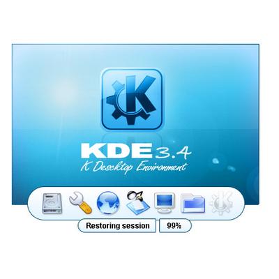
Version 2: Brightened the splash screen up. Make a few other changes in the gloss of the 'K'
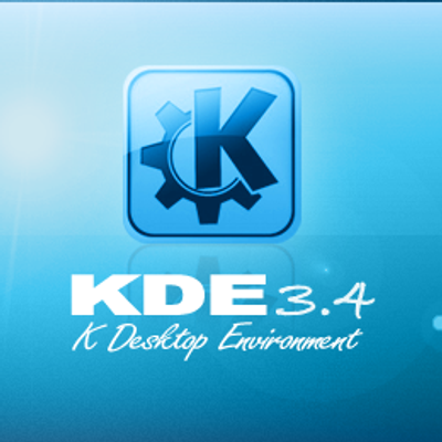
Version 2.1: Changed the Startup screen to show newer 'Bright Blue' version.
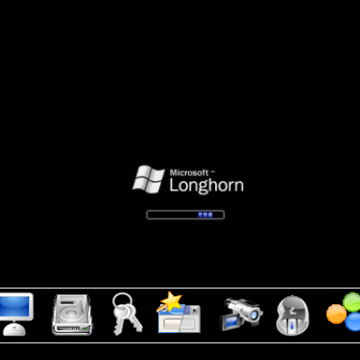
Version 2.2: Now includes screenshot 3 which features some icons from the Sparkling icons set.


More KDE 3.x Splash Screens from tDream:
Other KDE 3.x Splash Screens:


Ratings & Comments
10 Comments
i think ATM 2 is the best. however, 1 looks very clean and simple. 3, can look really cool, except the white bg blends in with the icons and it looks messed up. also, i wouldnt mind a version with Nuvola icons.
I like the splash except for the icons. I'm sure it will get better with the 'Sparkling' icons!
imho in the KDE 3.3 splash screen candidate there must be appearing the icons which will be used as default in KDE 3.3 otherwise it will not be accepted.
I understand your point of view. This icon set does not seems to be maintained and is far from being completed. But they are still the best that I have seen so far on this site.
*bows low* This is very beautiful. I like both versions. The only thing I miss is KDE 3.3, since I'm not into betas that much. But you do great things with your former conference icon design. Keep going and make my eyes burn with so much eyecandy. Thank you for doing so well! :-)
Thank you :)
I vote for the second one. The second one is much better. The first has not good composition. But what about the icons and progressbar?
Justed wanted to add a "me too". I also prefer the second version. Great work!
LOL. They are the same. The second version has just added the icons, to give an impresion of what the final result will look like.
They were different until 22/07/2004. When I made both the splash screens 'blue'