


 but it definitely doesn't meet the requirements. For one, it's got gradients; Not to mention, the shield's cross is more than slightly christian in origin. But, I figure that the name of this program is "Krusader," an obvious play on "Crusader," which is a most definitely christian concept. Not a particularly good one, I'll be the first to note.
Anyway, enough cover-my-ass. Hope you like it.
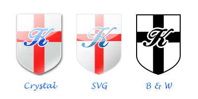
[Edit] Ok, ignore the rant above - this is a serious submission. Or at least, there's no reason for it not to be, with these changes. First preview is an updated version, with cross removed and cursive "K" changed to "K!" in different colors. Added user/root mode distinction, too. Download contains all versions.


Ratings & Comments
8 Comments
This is awesome! Man, I wish I could do that! /me drools... ;-)
Grats on your icons, they are evolving really nice, good job! The only note (if I should make notes as another contender :)) is that with esp. on smaller, less detailed icon sizes (on the panel, for example), the two icons are hard to distinguish.
Excellent work! Really good looking!
Like the shield and style, but it does violate the rules.... Try this: Put something on the shield that represents the "Twin Panels", and instead of a lone, cursive "K", make it "K!" - in three contrasting, but secondary, colors - for example dark green, tan (or gold), with black and white highlights.... for the "Root Mode" and dark blue, tan, and b&w highlights for "User Mode". Just one idea....
...At least, I think that's what I've done. Hrm. Hope it's better. More suggestions?
I dont know what the requirements are, but I like this icon a lot. Its well done!
Logo guidelines # in SVG format # no gradients - should work both black n' white and in color # all designs need to be original artwork and not violate any copyrights # No offensive or religious material # must at least be GPL'd # the logo will be used for our website and Krusader promotion Icon guidelines # Same conditions like the logo # gradients are allowed # png for the default kde icon sizes # Based on the logo, we would like to have icons as well, or the other way round :) # in 2 different colors, one for normal-mode and one for root-mode
The guidelines can be found at http://kde-look.org/news/index.php?id=180 regards, Frank Schoolmeesters Krusader Krew