


Version 1.0: Original conference logo (see snapshot 1)
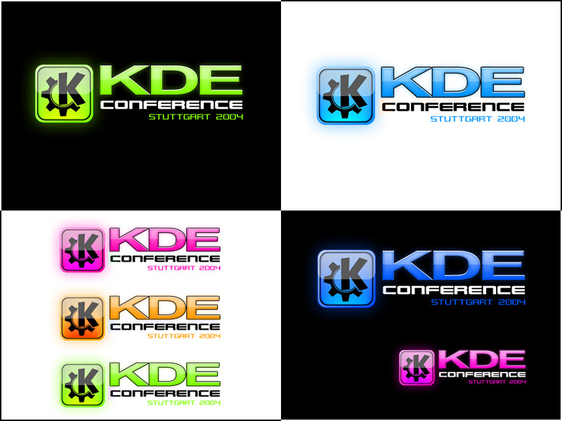
Version 2.0: Now has new 'gloss' versions, more colour alternatives... (see snapshot 2)
Version 2.1: A third snapshop has been added for the alternative green on black combination.
Version 2.2: Added large green on black logo to snapshot 1 to show the logo larger.
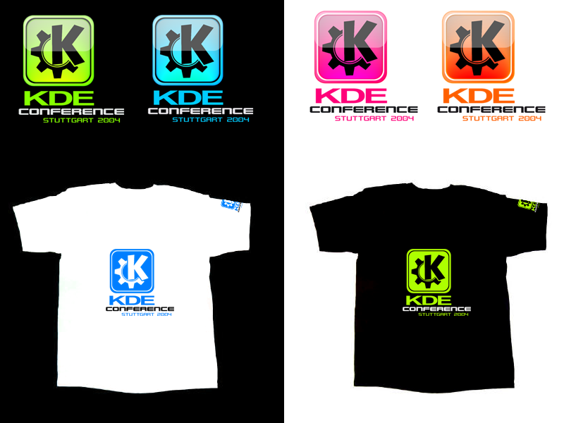
Version 2.3: After a mention that this logo would look good on a t-shirt I thought I'd try and see what it 'virtually' looked like
 see snapshot 2
Version 2.4: Added layered GiMP file for the Gloss version as requested
Version 2.5: Added 'side-on' versions of the conference logo which keeps the same logo 'feeling' but gives an alternative to the original in diferent colours
see snapshot 3Version 2.6: Added a downloadable desktop pattern for monitor resolutions of 1024 x 768 click download link 4
Version 2.7: For a bit of fun I've created a 3D desktop pattern out of the logo I made. I thought it was pretty cool so I have added it as download 5
Version 2.8: Created some really nice shiney versions of the kde conference logo so I have changed screenshot 3 with the new versions.


Ratings & Comments
30 Comments
The blue logo are very good and much more like KDE.
seems like ALL Conference submissions dropped some % in the last few hours.
Looks like it... I thought it was just me... the entries seem to keep going down not up lol... I think the top 10 + entries are all within 1% of each other. Makes for an exciting finish I guess :) Nice quotation at the end of your message by the way... Windows always has had a way of screwing itself up.
Well, if the ratings are close it's OK. I'm just wondering, why almost ALL postings went down almost simultanously in the same timeframe of just a few hours.
I'm really not sure why the ratings are going down so much, i guess it might be because there are double the number of entries now. Also its the last week and a lot more people are voting for ALL the entries and everythings evening up. Cheers for the link too!
BTW: The full article, of which I have taken this signature, can be found at http://www.theregister.co.uk/content/56/33226.html
Did you notice how fast this submission went down from 80% to 77%?? Considering it was 80% for so long this is obviously not normal... Last time I ask. Why not only allow members to vote? That would that care of this issues definitly.
I agree... Only member votes would be great. Just relying on cookies and IP addresses is not enough, especially for a contest. On the other hand, if a content is rated pretty high, it only takes a few bad votes to make the percentage drop, but it takes a lot of good votes to raise it from - let's say - 79% to 80% (while it might just need one vote to drop it from 85% to 80%).
how interesting... i was thinking the same... i was looking forward to the close competition with mine and 'Sitting around the gear' running up to the finnish date of Feb 8th... we were swapping positions by 1 or 2 percent... i check today and I have drop from around 82% to 77% and 'Sitting round the gear' seems to have fallen to around 80% after only a matter of hours or checking... I was wondering if there was going to be someone governing this competition more closely and allowing people one vote and the ability to transfer there vote (for members only)... ...otherwise I feel there may be un-even voting... and not much point updating if people are going to mess with the percents so much...
Well, my submission dropped to 78% this morning. The voting system was never reliable, but it seems to be normal, that submissions are dropping after some days - don't know why though. So, you have the best changes to win, if you post a good logo on February 7th., where just a few votes will raise the percentage pretty high.
yeah i guess you could post an entry on the last day and it could shoot up but equally people could vote it back down... I also think there must be something strange with voting system because you mentioned that it only takes 1 or 2 votes to take an entry from 85 to 80 percent. But i'm under the assumption that this equals out because I watched pretty closely my entry going up then down like you mention then slowly creep back up. Then after a few times like that it would only gown down 1 percent and creep back up... but on saturday it seemed to be 'hammered' with bad votes that it just shot down. I also think other logos were hit by this too... as i remember most logos were around the 80 percent mark with the exception of 2 logos above 80percent. Now most logos are low 70 percent with a few mid 70's... I think i'll just put it down to someone was drunk and decided to have some fun with peoples logo rating and messed with them till he/she gave up... I wont continue to moan on about this now 'cause at the end of the day its just a competition, and a fun one at that :)
out of this!
... done :)
In understand from reading the KDE-wiki on http://kde.ground.cz/tiki-index.php?page=CeBIT that they also need a new logo
yeah, cheers letting me know :) I'll have to have a more in depth look and find out what its all about. thanks again :)
I like the crystal like logos on the preview. Will you release them in a higher resolution?
Yes, I will add hi-res versions of these tommorow :)
New large 'gloss' version ready to download as promised :)
The best!!! You must win this, but let's wait till February 8 ;) If the contest ended right now, then in my opinion you'd win this one. I think that it looks very good especially on the T-Shirts.
thank you :)
I hope they choose this one and make it available to the public, because I really would love the pink logo on a white shirt! Really nice!!
hehe, yeah the t-shirts both look pretty cool :)
Send me one of those hot black tshirts! :P
would if i could! ;)
I think the bottom logo would look great on a black T-shirt.