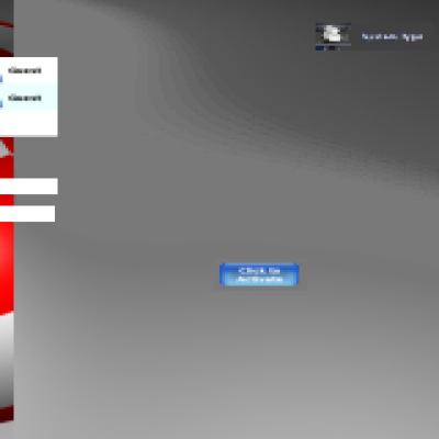
I would like to see this users list without white background, I'm waiting for it for years :/
Is it really so hard to make kdm to be able to look nice (I mean for people who would like to click in login manager rather than type)?
I like it.
In my honest opinion, one thing I would add:
when a user is selected, apart from showing the password field (as I can figure out by the mockup) on the right side of selected user area (the rectangle containing username, passw and icon) I would add a big icon - say a "PLAY" symbol or whatever - with the same height.
Clicking on it means "OK, go".
In this case this login button appears on the user right only when a user is selected, and IMHO is more intuitive, and you could remove the unique login button at the end.


Ratings & Comments
3 Comments
I can't help but feel that the line underneath "KDE 4" is a bit cheesy. Otherwise, looks good.
I would like to see this users list without white background, I'm waiting for it for years :/ Is it really so hard to make kdm to be able to look nice (I mean for people who would like to click in login manager rather than type)?
I like it. In my honest opinion, one thing I would add: when a user is selected, apart from showing the password field (as I can figure out by the mockup) on the right side of selected user area (the rectangle containing username, passw and icon) I would add a big icon - say a "PLAY" symbol or whatever - with the same height. Clicking on it means "OK, go". In this case this login button appears on the user right only when a user is selected, and IMHO is more intuitive, and you could remove the unique login button at the end.