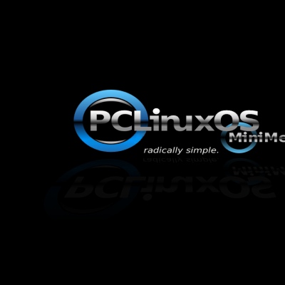
I've been looking everywhere but couldn't find a logo for PCLinuxOS MiniMe so I made this one.
It uses the PCLinuxOS logo but I've added a small blue circle and 'MiniMe' with a reflection. Hope you like it!
Any suggestions are welcome!
See the new v0.2 here - http://www.kde-look.org/content/show.php/PCLinuxOS+MiniMe?content=89722Last changelog:
Ok.....I've registered a new license for this logo because the original 'PCLinuxOS' logo (as seen on www.pclinuxos.com in the top left corner) was created by 'tame', inspired by 'Ludi' and I'm not sure of the licenses they used, hence, the change of license on my logo because it incorporates the original.
Let me be the first to say that I like this a lot! I really do. I think it looks really good. I do feel like something is missing. Like when I look at it, I think, "This looks really good. It has a lot of potential, but something is missing. What is it??"
Maybe others can comment, or you can think of it. Heck, I'll keep it in mind, too. Keep up the good work!
You know what I think is missing, a refection of about 75% of the original, at a perspective angle outward. Now that would look cool. My opinion though. Still I like it too.
Thanks for the comment skittlelinux. I'll have a think about it too.
Could it be the reflection that I erased from under the 'PCLinuxOS'? (The original had a reflection under it) Instead, I put a reflection under the 'MiniMe'.
It may be that the background needs something. I'll do another one with some kind of background and see if it looks more complete......
Oh, Linuzoid. Seems you got that comment in just as I did mine :) Seems we're also thinking along the same lines, something to do with the reflection.
Do you mean a reflection of the PCLinuxOS part of the image would be cool?
Yes, the whole thing together, all of it, remove the one you have for Mini me and reflect the whole thing and then add a perspective aspect to it, the reflection even at that the back with the upper part and pulling forward and outward, so it looks like it's coming at you, not a lot but just enough to give it that feel. Hope you know what I mean.


Ratings & Comments
6 Comments
Let me be the first to say that I like this a lot! I really do. I think it looks really good. I do feel like something is missing. Like when I look at it, I think, "This looks really good. It has a lot of potential, but something is missing. What is it??" Maybe others can comment, or you can think of it. Heck, I'll keep it in mind, too. Keep up the good work!
You know what I think is missing, a refection of about 75% of the original, at a perspective angle outward. Now that would look cool. My opinion though. Still I like it too.
Thanks for the comment skittlelinux. I'll have a think about it too. Could it be the reflection that I erased from under the 'PCLinuxOS'? (The original had a reflection under it) Instead, I put a reflection under the 'MiniMe'. It may be that the background needs something. I'll do another one with some kind of background and see if it looks more complete......
Oh, Linuzoid. Seems you got that comment in just as I did mine :) Seems we're also thinking along the same lines, something to do with the reflection. Do you mean a reflection of the PCLinuxOS part of the image would be cool?
Yes, the whole thing together, all of it, remove the one you have for Mini me and reflect the whole thing and then add a perspective aspect to it, the reflection even at that the back with the upper part and pulling forward and outward, so it looks like it's coming at you, not a lot but just enough to give it that feel. Hope you know what I mean.
Ok, cool. Got it. ;)