Description: Has been annoyed by some small, small things in Konqueror for quite some time now, I'm no C++/QT-coder so instead I made a dummy in GIMP that shows what I mean. Since don't know how QT works I have no idea if these ideas really work.
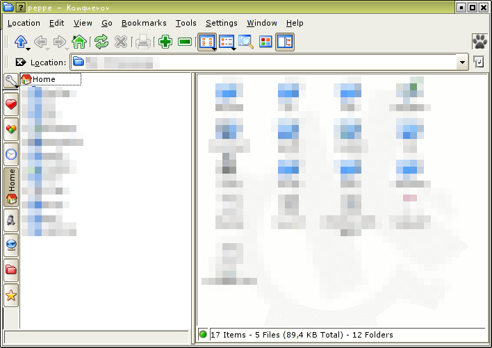
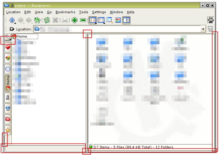
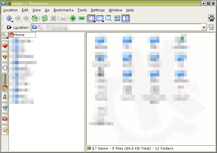
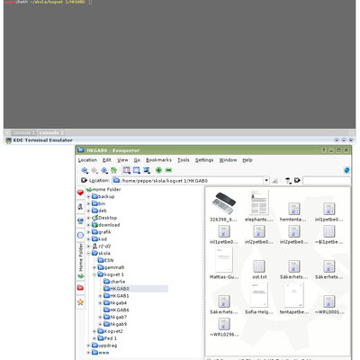
Screenshot 1, shows how Konqueror in filemanager-mode looks today. Screenshot 2, shows what areas I have adjusted. Screenshot 3, shows the final result.
As you can see it just about moving lines, removing ugly lines, adjusting space between lines etc. Have removed the statusbar under the side bar and moved down the statusbar in the main window a bit.
If this turns out to be quite popular I'm thinking of posting this to kde-artist or bugs.kde.org.
The theme I'm using is qt-curve and some of the problem probably lies there, but I've also tried with Plastik and I see some of the things there as well.
Comments, suggestions etc are more than welcome.Last changelog:
Many of my suggestions seems to be avalible if you choose the right theme;-) So check out Lipstik on this site, http://www.kde-look.org/content/show.php?content=18223 . Really nice and much cleaner than both Plastik and QT-curve.
I have also observed this ugliness in KDE. But users like you can help make KDE look awesome good.
Please make a wishlist my vote is already with you. Thanks.
Yes, some of this looks better in this style.
Some of these appear to be artifacts of the Style since I do not have them with HiColor Classic. This style looks cleaner, but the Konqueror status bars would probably still look better without as much detail.
Some of these are going to be style specific or just might not work.
You also need to make the distinction between the window frame and the main window of what it holds. I don't think that it is possible to integrate these two.
I've got the same problems with the services bar as you've shown shown. But my splitter is continuous and has rounded corners.( a bit like your intended splitter except rounded in the pane)
Also if you turn on multiple services there's another horrible black line between the service panes.
i believe this is a theme thing. Konq is just building its mainwindow using regular widgets. The way they are drawn is defined in the theme.
If im not mistaking i've seen a mockup before on the 'slitter'.
_cies.
Actually all the things he pointed out are not theme related. They can be achieved with layout adjustment and changes to the classes.
The excessive use of frames is a fair point. The Splitter widget may look like that for some themes, but I know from looking at the sources that KDockWindow splitters do not draw a splitter, they draw a QFrame, and it looks crap. Look at amaroK, I made it so amaroK's splitter uses the proper drawing code.
The redundant statusbar in the left pane has bugged me for ages too.
If I had time or inclination I'd make a patch, but I don't really have either, sorry :(


Ratings & Comments
12 Comments
Hey, take a look there: http://www.kde-look.org/content/show.php?content=18419
Nice, more people that are being annoyed by the small things in KDE/Konqueror=)
I have also observed this ugliness in KDE. But users like you can help make KDE look awesome good. Please make a wishlist my vote is already with you. Thanks.
Yes, some of this looks better in this style. Some of these appear to be artifacts of the Style since I do not have them with HiColor Classic. This style looks cleaner, but the Konqueror status bars would probably still look better without as much detail. Some of these are going to be style specific or just might not work. You also need to make the distinction between the window frame and the main window of what it holds. I don't think that it is possible to integrate these two.
I've got the same problems with the services bar as you've shown shown. But my splitter is continuous and has rounded corners.( a bit like your intended splitter except rounded in the pane) Also if you turn on multiple services there's another horrible black line between the service panes.
We need more fine detailed UI work like this! There are lots of little ugly areas that detract from the coherent look of KDE.
i believe this is a theme thing. Konq is just building its mainwindow using regular widgets. The way they are drawn is defined in the theme. If im not mistaking i've seen a mockup before on the 'slitter'. _cies.
Do you happen to know how to adjust the theme as shown by peppelorum?
I'm using qt-curve, has added this in the description now.
mine does, bu it is a ugly hack. The problem is that some parts have frame, others do not. The icon view has it, and that's why there are two frames.
Actually all the things he pointed out are not theme related. They can be achieved with layout adjustment and changes to the classes. The excessive use of frames is a fair point. The Splitter widget may look like that for some themes, but I know from looking at the sources that KDockWindow splitters do not draw a splitter, they draw a QFrame, and it looks crap. Look at amaroK, I made it so amaroK's splitter uses the proper drawing code. The redundant statusbar in the left pane has bugged me for ages too. If I had time or inclination I'd make a patch, but I don't really have either, sorry :(
Far cleaner this way !