


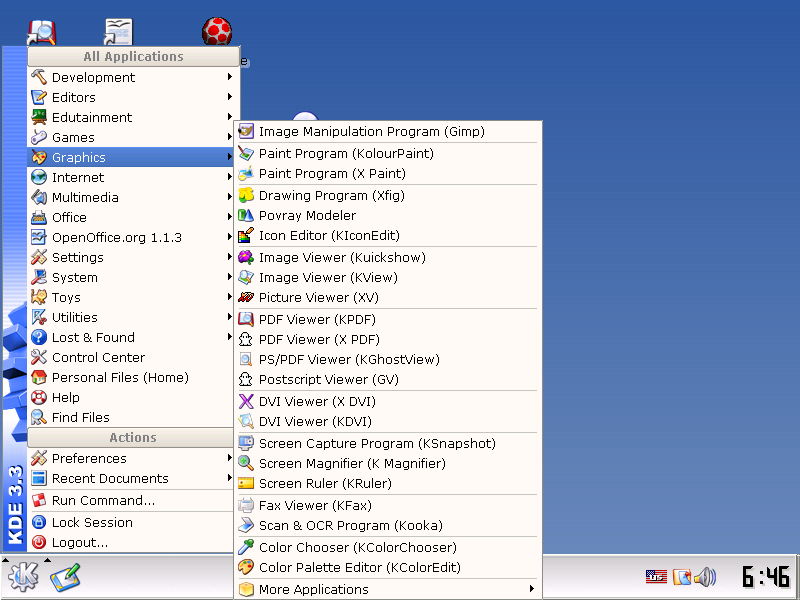
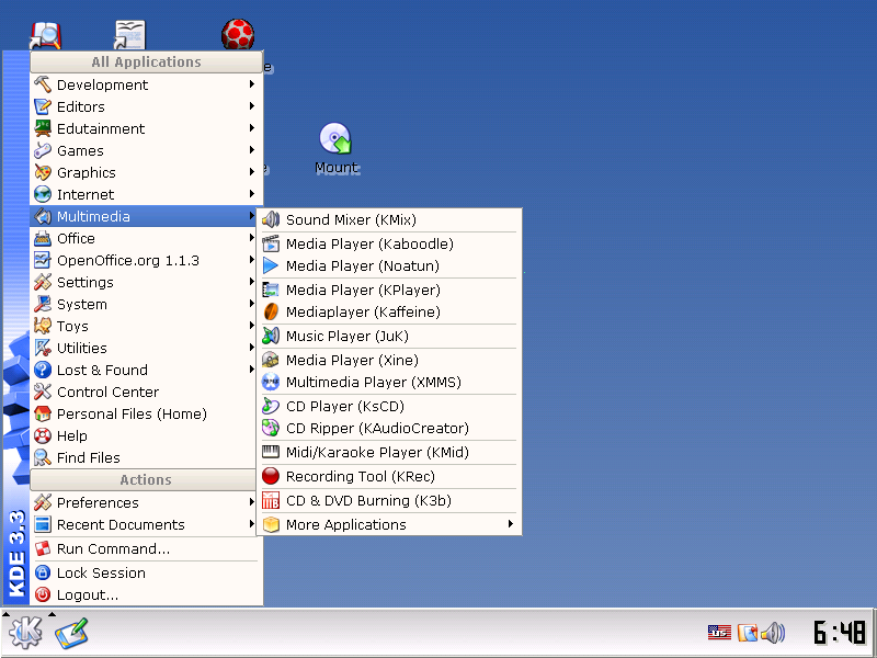
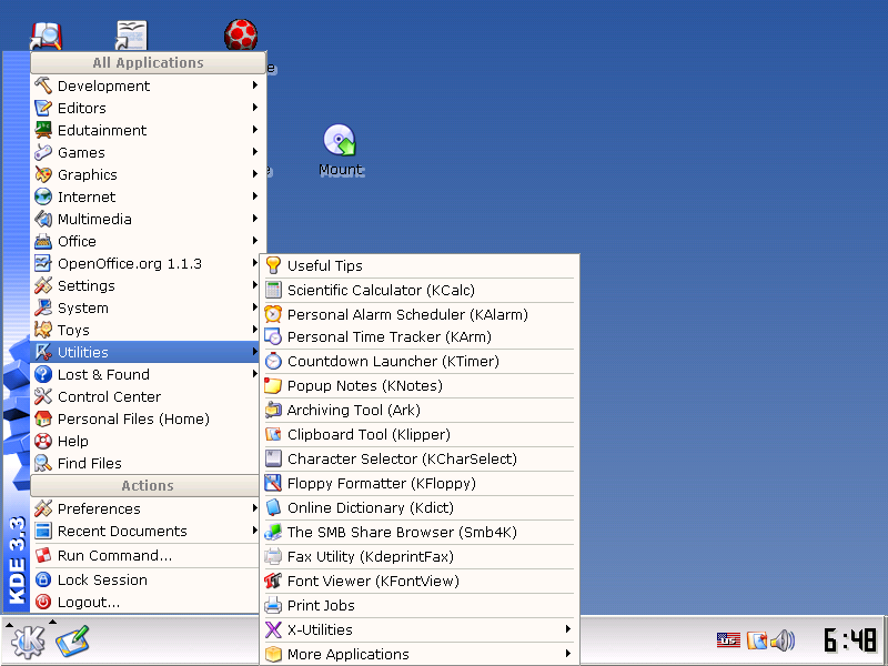
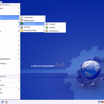
This KDE Menu Improvement is meant to improve the visibility and focus of KMenu Links or Shortcuts for a normal Joe user. The Default KDE Menu is not clean and neat, especially when other X applications and Gnome Applications are installed. So, to improve the Look and Feel of the KDE Menu, and to improve the Focus of KMenu shortcuts I have tried this improvement.
I wish this to be included in KDE 3.4. This Menu Improvement is just Application links (shortcuts) arranged based on Type (purpose) and Popularity. The First Item in the submenu is the most useful / used application. Like in the 'Internet' Menu "KMail" is kept on the top of the list. Which you can change of course.
I hope this will improve the look & feel of KDE, and using KMenu will be much easier because of the easier recognition and arrangement of items.
HOW TO INSTALL:
1. Just copy the."applications-kmenuedit.menu" file to "$HOME/.config/menus" folder,
e.g., if your user name is 'joe' then copy this to '/home/joe/.config/menus' folder.
(it would be a nice idea to backup your old "applications-kmenuedit.menu" file for restoring your previous KMenu setup.)
2. Restart KDE (perhaps Kicker might be enough).
(C) GNU GPL/LGPL [Mohd. Asif Ali Rizwaan] just in case you were worried about license


Ratings & Comments
13 Comments
I think is a better idea if menus can colapse/expand like in window$ 2000. Window$ menu edition is better too. At least this is good on window$...
The idea is good, the script not. My kicker crashes (totally) -> done playing... Please improve your script. Suse 9.1, KDE3.3
I think it's an interesting idea ... But lines are cluttering. Don't you think it would be better if it were spaces between entries instead, so that similar enteries are tied like a paragraph of a text ?
1st of all I use slackware 10+. So, My full slackware installation gives cluttered kde menu items. this is just the arrangement of slackware menu (which is the default pristine kde menu). So, mandrake, redhat, suse is not the point here. only default kde menu with other applications (gnome and x windows which are installed in slackware's full installation). this is just a minor re-arrangement. not a new menu layout or something. yours friendly, Rizwaan.
Not to sound rude, but I'm having a hard time seeing what this does, that the default KDE menu doesn't do. Are people realy so lazy that they'd install a patch to avoid organizing their menu themselves? And if people are that lazy, how are they going to get the patch installed? You guys all know that you can customize your menu by right clicking on the K in the taskbar and selecting "Menu Editor" right? What else is there to this?
Yes. This would be a good improvement to KDE. However I don't think it is possible to do with the current system. Maybe you should bring it up with whoever maintains that code as they might know. But I think the desktop file spec wouldn't have scope for this kind of thing..
I don't see what the big deal is. Why can't people just customize their own kmenus? That way, everyone can have a kmenu that works best for them. What I would suggest is an improvement in the ability to customize the menu. A tool or utility that allows the user to customize, kmenu, right click menu in konq, desktop right click menu and so on. A utility with tabs that correspond to each specific available menu (konq, desktop, kmenu, etc.). This one app would make it possible for all to have thier own kde menus. Such an app would so make it easy to add or subtract menu options without deleting kservicemenu items from /usr/apps/konqueror/sericemenus and so on. I believe that, would be the most logical approach. What does everyone else think? The Borg Queen
never seen such a populated applications menu, but maybe it's just me... i only tend to install what i need anyway it could be something useful if you actually install *everything* you can on your box, but all those separators look quite ugly
I just want to explain why I voted bad: I also belive, as the reporter does, that KDE menus are cluttered, but as the person I'm replying to,I don't like the propposed approch. In that aspect I coincide with you (the person I'm replying to!): somewhat, a better solution would be to do what for exaple distributions like SuSE already do, to use more submenus. But I'd go further about clutter in K-Menu: - What about hiding by default unused menus, submenus, and entries just like Windows does since who knows when ? Of course, you could optionally click in a button at the top of th menu ">>" that will show you the unused entries. That's what I call plain simple a slick way of simplifying things. Example: If you haven't clicked on X since 1 week ago or more, hide it. If you click in ">>", to view all hiden entries/submenus (the unused entries would have a different background color so that you can easily see what were missing before), and then click in that submenu/entry you haven't used since 1 week ago, then change it to be a not-hiden entry (i.e. update the list when clicking in a hidden entries). Of course, every once and again, the hidden entries list must be updated, so that you parse the last-time-clicked info. One thing to be aware: this is personal information that is being stored in the computer! And of course this should be: a ) deactivable b ) configurable (how often to update the list, which is the policy for hiding, etc) - I still have other suggestions to improve the K-Menu, if you want more ;-). Thanks to everyone reading who riched this point. If you did so..what do you think about this? Have a nice day, Edulix.
actually the whole hiding thing in menus is pure M$ Nonsense to me. just my opinion of course, but i don't get that hide-it philosophy thoroughly used in windos. and one submenu per application is cheesy too. i guess i'm sticking with kde's menu
I used to think that too. If I click the rmb on the page I get a waking 13 options to choose from, Back, forwards and relaod are at the top, and I never use them. If they were hidden I would only have 10 options to choose from. I never use set-encoding, stop-animations or copy to either. So that leaves 7, almost half the original number of entries. The same thing goes for most of the menus, i've never used window/move-tab left so I should be shown the option. Hiding things I don't use improves my perfomnace, customizes the UI to my needs automaticaly and makes it less probably that I will click on something that I don't want.
and its cleaner indeed. but not extremely so... whould you be able to make it even more clean, with more submenu's? I dont want the initial menu this big. so graphics and sound should go toghether, for example. and amusement, education etc together etc etc??? Mandrake has a really clean menu by default, maybe you can check it out (there are mandrake livecd's out there...) the current 'internet' menu doesnt even fit on my (1024x768) screen... and games doesnt include most arcade games. and is this distribution-agnostic? I use debian, and I'm not sure if all apps are there, while some are there twice. I dont really use the menu very often (quickstarter rules) but if I do, I mostly have to search for some time... And how does this menu get updated? if some apps exist but arent in your list, where are they? I dunno much about the menu system, while having had troubles with it a few times... maybe you can enlighten me?
I find this aproach to the clutered KDE's menu to be very good. Is there any place to vote for this to be implementes into KDE 3.4? Keep up the good work.