


Playbill - Preview
opeth115


Source (link to git-repo or to original if based on someone elses unmodified work):
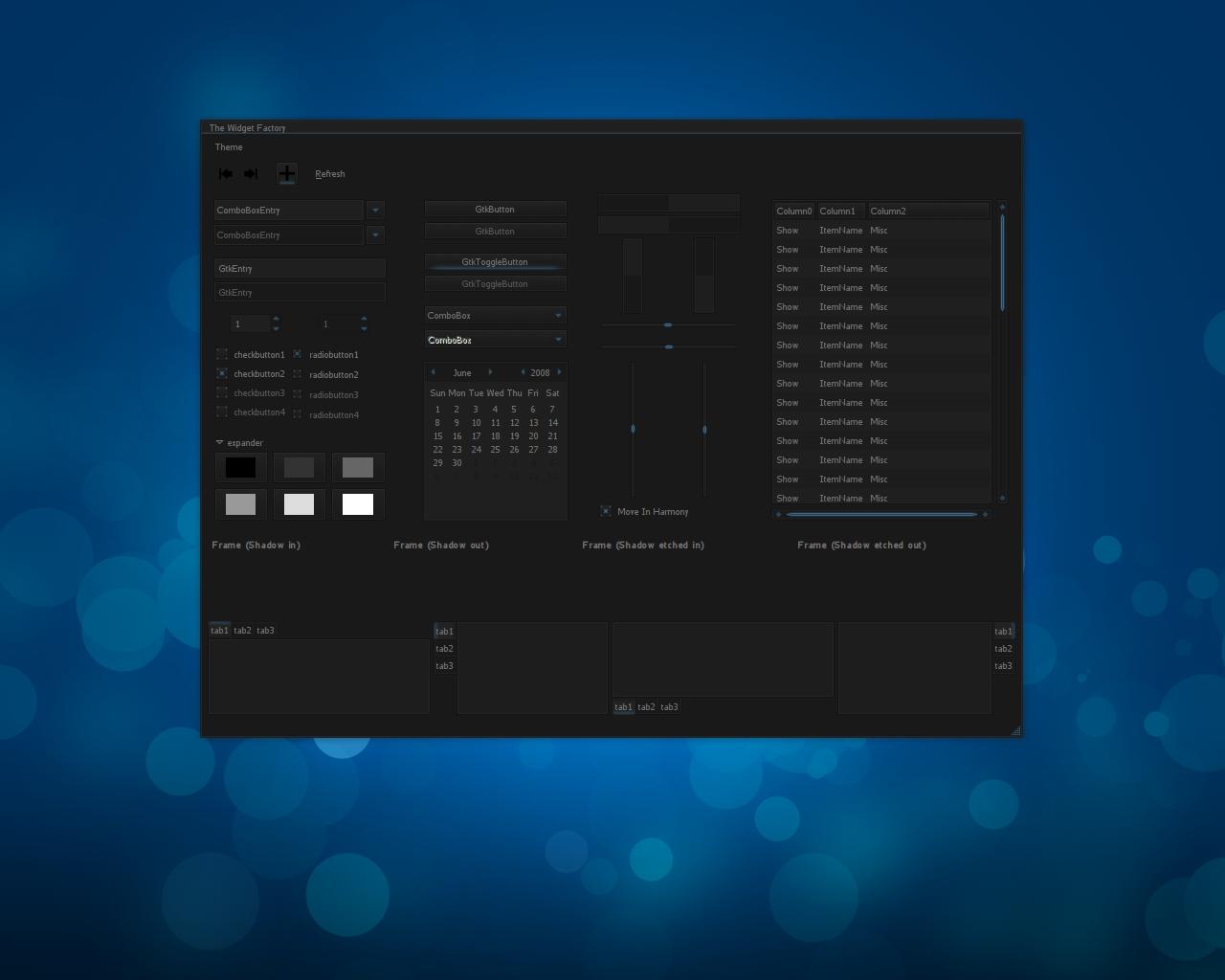
1) Changed the tabs so you can tell the active and inactive apart better.
2) Fixed 2 errors in the GTKRC file for combo boxes
3) Changed progressbars and added some shadows.
4) Fixed some more errors in the GTKRC
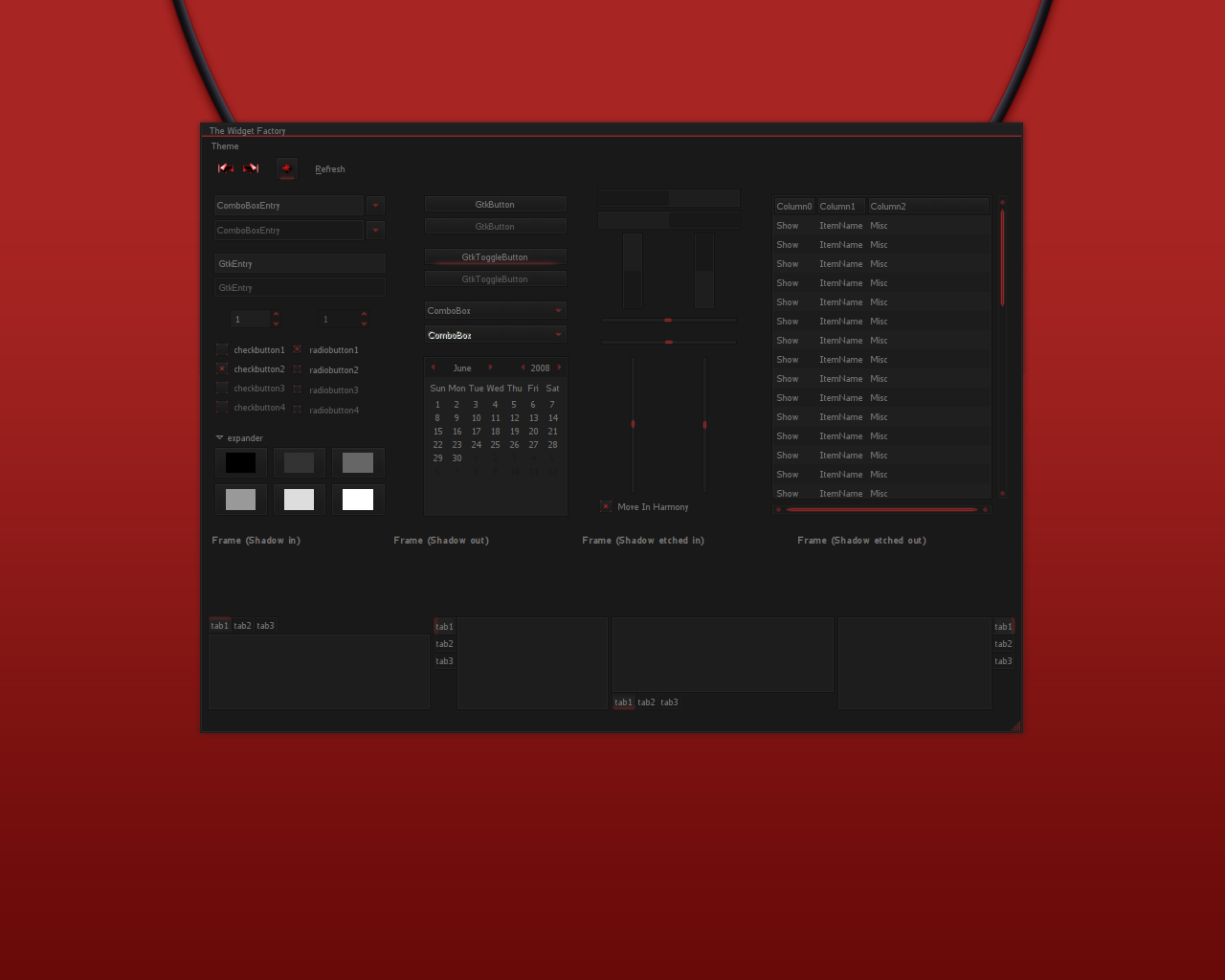
5) Changed the panel bg and added a Pekwm theme =)
6) Fixed the drop down menu color in the red version. It was blue i changed it to red. Woops lol
PLEASE! If you vote bad tell me why! So i can fix it!


Other GTK2 Themes:


Ratings & Comments
38 Comments
Exactly what I've been looking for! Great work. Thanks!!
Repackage it properly, please. I'm dying to install this. Thanks
Whoops. Sorry dude. Figured it out. :) Great job. Can you make the menu highlights a lighter color? Perhaps some tpye of contrast? I was thinking #ffa603... :) Maybe lighten the input boxes (just a bit) too.
Like the theme.... However one little thing that is bothering me is the small while line that is at the top of the panel bar. If I move the panel bar to the top then the white line moves to the bottom. Is it possible to get rid of this while line?
Nevermind.... It was something on my end.... your theme is just great....
That is damned impressive.
The idea is interesting but result in too bug contrast in some places.
Hi, Thanks for your work, I think it could be nice to provide Orange and Green versions ;) What do you think about that ?
Awesome dude, thanks for share it.
=D
this theme is really wonderful! :D only one thing: I get an horizontal blue line over the entire xfce panel and dock that looks a bit weird; is it supposed to be there?
It was meant to be there but i was never really sure if i liked it or not so it is now removed!
This is an absoultely wonderful theme! You achieved the perfect minimalistic and futuristic theme! One suggestion though: You should comsider utilizing the Murrine engine for your progressbar because they look alittle empty. Try making your own as well! :)
I'm gunna have ti figure out how to play with the murrine engine and apply it to the progress bars =P I will work on it and update!
I would have to agree. The theme looks great, but the progressbar should be a bit more visible. I'm not sure that the Murrine progressbar would fit in your theme.
Very nice theme. Looks beautiful and cute name too :). Thanks a lot. Just one suggestion, is it possible to make white or gray version too? I am not used to working with dark theme. My eyes just can not stand it. I tried to modify the gtkrc to get a white version myself. But it does not look nice. I am just not an art person.
It may not be anytime soon but i will consider making a white version with grey highlights, it's something i'd be after as well =)
Fantastic theme for your first !! .. I can see this going somewhere with further development.
Thanks a lot man! Could you give me some pointers on what you think i can do to improve the overall theme?
Hi, I dont see any highlight of any sort between the current and other open windows? All the window buttons look the same on the panel.
Yes this is something i neglected as i don't use any panels. I will be sure to update it as soon as possible for you!
Thanks Bro'
Changed the panel give it a try and tell me if it's workable please!
Its beautiful...thank you. Now its a lot clearer. Keep up the good work.
hej, nice idea, but i want to ask You which version on twf u use? i'm looking for one with calendar and i cant find it anywhere