


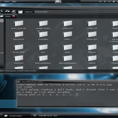
metacity theme based on "Scaled Black : Murrina" made by twigsby.
If anyone wants me to delete this I will.
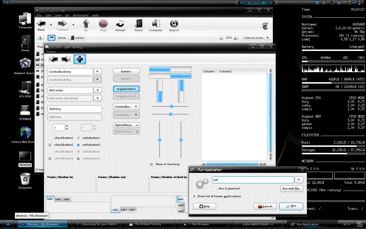
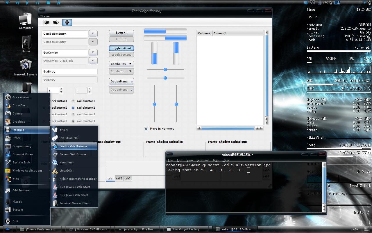
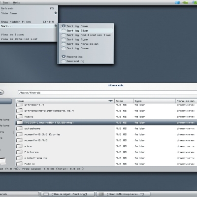
This theme tries to bring an dark elegant style for the gnome desktop, I aim this theme for those who don't use a dock at the bottom but use the gnome-panel. All ideas / suggestions are very welcome. Please comment what you like about my work and what you don't.
Requires the pixbuf and murrina engine
I accidentally deleted the bluer version!
sry for that!
IMPORTANT! -set the bottom panel to 32px
issues:
firefox fonts.
to fix that go here:
http://www.gnome-look.org/content/show.php/Darkfix+%28+easy+fix+for+browsers+%29?content=74504
that is an amazing fix made by code933k
which works with most browsers

thank you all for your name-suggestions
for this theme!
I have been to lazy (or busy) to change that
so the name of this theme stays the same.
I have good name suggestions for my next
theme however


Ratings & Comments
79 Comments
Do you know how to change the color of the text on the CPU frequency scaling monitor? As its hard to read the black text on this theme. And once again, thanks for this theme :)
Thanks! It's changed now :) please re-download and install and apply //Robert
Thanks :D
Hey, dude! That's THE best theme I've ever seen! Congratulations on the smooth work! By the way, here's just a little sugestion: I like the alternative blue theme, but I miss the borders of the original one. So, could you add side borders to the windows in the alternative blue? Besides that, it's just perfect. Also, it remindes me of that plastic buttons of the old cell phones, so I was thinking of smthg like "poliethynight", or "starry-plastic", I dunno...
Thank you for your lovely comment!! If you like the standard window borders theme better than the alternative version, just select window borders theme standard and controls theme alternative (If I misunderstood you completely please reply!) Thank you for the names also!! (I'll put them under consideration) //Robert
Hey, dude! That's THE best theme I've ever seen! Congratulations on the smooth work! By the way, here's just a little sugestion: I like the alternative blue theme, but I miss the borders of the original one. So, could you add side borders to the windows in the alternative blue? Besides that, it's just perfect. Also, it remindes me of that plastic buttons of the old cell phones, so I was thinking of smthg like "poliethynight", or "starry-plastic", I dunno...
Thanks for that, you rock! :)
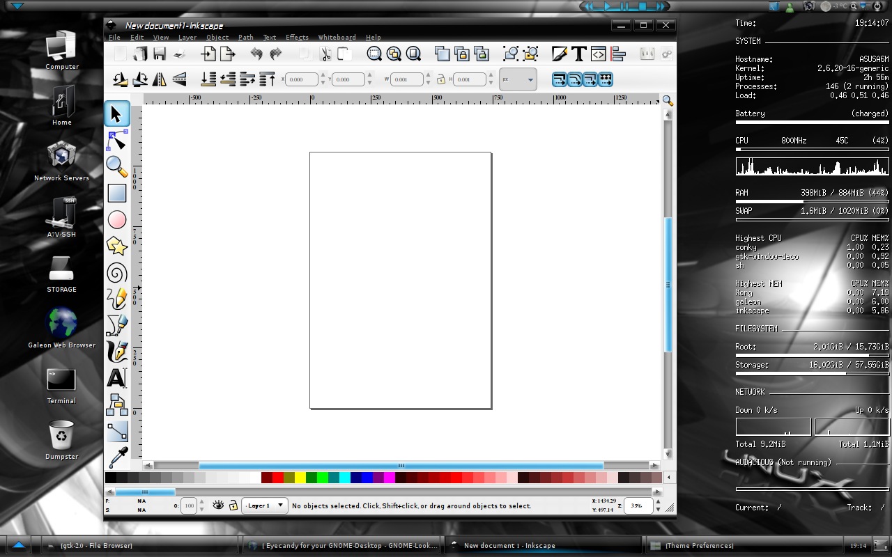
I love your theme and I use it all the time but I have to switch theme everytime I want to use Inkscape because it cuts off part of the buttons in it. Is there anyway you could fix it?
Thank you! that means a lot to me! :D I'll look into it! /TheRob
Yes, I have the same Inkscape problem. It doesn't make the program "unusable", but if there was a solution, that'd be great. BTW, SlicknesS is really cool too, but I still prefer NoName, so please don't drop it.
Thanks for your comment! Are you sure you are using the latest version (1.11) ?, since I fixed a problem with the inkscape icons. //Robert
Yes, you are right. I was using a much older version. I see now that you listed that as a fix in the latest version. Unfortunately, I much prefer the old version with rounded buttons, subtle button colors, and rounded windows. So I guess I'll stick with the older version and just live with the Inkscape problem since I don't use it very often. Hmm..., I wonder if I can try doing some tweaking myself and get the "best of both". I've got some vacation time, so I'll look into it.
Well, that was simple after all. I just copied the old Metacity folder contents over into the new theme, and I'm good to go. Inkscape icons are back to normal and I still have all that "rounded" goodness that I liked so much in the old version. Thanks again for all your hard work.
I've just installed it, and it looks to be a good dark theme. However, I feel that the gap between the windows' buttons in the windows list takes up too much space. It could be made smaller.
first: thank you for your interest in my theme! second: I could make the window-list-gap smaller to next version (i have thought about it myself too) I will fix it when I have the time, thanks for reporting your requests! /TheRob
made the panel buttons spacing smaller as suggested :) Nice. Thank you. :)
Hey great theme I'm really liking it. Only problem i have is in firefox when typing in a search bar the drop menu that appears is really dark and i can't read the text. Any way to change this? I'm somewhat new to Linux still. Also could you post your .conkyrc file. I like how you have it set up. Thanks
I'm pleased to hear you like my theme :D firefox fix: take the userChrome.css file included in the archive and copy it to /home/USERNAME/.mozilla/firefox/*.default/chrome where username stands for your username and the *. stands for a random series of numbers and letters and restart firefox. Conky: for the conky-file I wouldn't take much credit as I just took this conky http://www.gnome-look.org/content/show.php/My+Conky+Config?content=62536 and modified the code a little, if you still want my modified file instead I will post it :D /thanks
Wonderful that did the trick. Thanks for the fast response. I have my Conky set up how i want now. Thanks again.
Hmmm... now link it's working. Theme is nice now, but I thought you use just a bit darker blue... I like blue colour from Elegance... Can you use color from this theme? It'll be nice... Now, when you open start menu, blue color is almost exactly the same like cyan - difference is imperceptible...
P.S. Start menu icon still is cyan although I use bluer version... Are you going to fix it? You said before that you'll make new bar.. Is it in progress or not? Greetings...
I adjusted the color of everything that was cyan exactly the same amount, including the start button, you have to load it in gconf-editor from the path where it is ( /home/USERNAME/.themes/noname-25-blue/gtk-2.0/panel/bottom-panel-menu-button.png as for the panel, i have run out of ideas but I'm constantly trying out new things. btw, could you pls tell me about the pm function here on gnome-look (i'm pretty new here), so I don't know how it works. I could make everything even darker blue if you want to. If I understand you correct you want the background colors of the windows to be the same thou?
Maybe you could call it: Slickness Tell me what you think.
thanks man! I like it , I like it a lot! i have to put it under consideration! I will probably name it to slickness in near future :D
NoName sounds better for me... ;) What about new colors? Will you publish new version?