Guys, remember that using background panels images is very dangerous.
So many people using different sizes of gnome-panel and sizes of upper and bottom panels are also different, so it's almost impossible to get the right one for each panel.
Only if you pack a few tens of various image sizes of it..
This is now my Theme of choice. Truly Beautiful work.
I have a few suggestions, however.
1) the metallicity theme doesnt really separate windows to well. It's hard to explain, but if you install this (http://www.gnome-look.org/content/show.php/Aqua+Advanced?content=59285), and compare, you'll see what i mean.
2) and this is really a complaint aimed at most themes made for GTK, the panel icon is to small. When you expand the panel to anything larger than the default 23 pixels, it creates a terrible line through the middle. I, and I would imagine a lot of others, use a large monitor, and like to have a larger panel.
Minor complaints, and nothing that stops me from using this wonderful theme. But, if your striving for perfection, i would start here.
Correction, I just checked this out in more detail. Your panel stops at 36 pixels.
It would be nice if theme developers made there panels able to expand out to 48 pixels, as that's where the third jump in size for the icons is at (and what my bottom panel is set to).
Again, this is just nit-picking at an overall gorgeous theme, but it's a pet peeve of mine. I suppose i picked your theme to vent this on because i like it so much :)
Thanks a lot for your comments, i am so happy now :D
1) Concerning the window border, you're right, we can't see the limits between windows cause all is white... This is why I never use this theme without compiz shadows.
As I am working at the moment on another white theme, I'll try to make a better metacity and update Orbital.
2) I also agree with your remark about the panel background. The theme actualy uses the bg_pixmap property to set the background image. I tried to use something like that instead :
engine "pixmap"
{
image
{
function = BOX
recolorable = TRUE
file = "panelbg.png"
stretch = TRUE
}
}
But it does not work...
If anybody knows how to do it, please tell us!
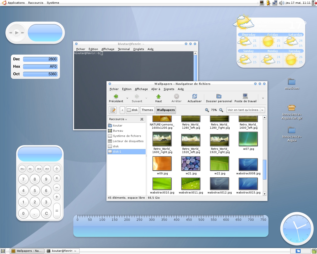
Why is the first line of the text in weather screenlet white? Shouldn't it be blue or black or something? It renders the city name and actual condition unreadable...


Ratings & Comments
14 Comments
Guys, remember that using background panels images is very dangerous. So many people using different sizes of gnome-panel and sizes of upper and bottom panels are also different, so it's almost impossible to get the right one for each panel. Only if you pack a few tens of various image sizes of it..
This is now my Theme of choice. Truly Beautiful work. I have a few suggestions, however. 1) the metallicity theme doesnt really separate windows to well. It's hard to explain, but if you install this (http://www.gnome-look.org/content/show.php/Aqua+Advanced?content=59285), and compare, you'll see what i mean. 2) and this is really a complaint aimed at most themes made for GTK, the panel icon is to small. When you expand the panel to anything larger than the default 23 pixels, it creates a terrible line through the middle. I, and I would imagine a lot of others, use a large monitor, and like to have a larger panel. Minor complaints, and nothing that stops me from using this wonderful theme. But, if your striving for perfection, i would start here.
Correction, I just checked this out in more detail. Your panel stops at 36 pixels. It would be nice if theme developers made there panels able to expand out to 48 pixels, as that's where the third jump in size for the icons is at (and what my bottom panel is set to). Again, this is just nit-picking at an overall gorgeous theme, but it's a pet peeve of mine. I suppose i picked your theme to vent this on because i like it so much :)
Thanks a lot for your comments, i am so happy now :D 1) Concerning the window border, you're right, we can't see the limits between windows cause all is white... This is why I never use this theme without compiz shadows. As I am working at the moment on another white theme, I'll try to make a better metacity and update Orbital. 2) I also agree with your remark about the panel background. The theme actualy uses the bg_pixmap property to set the background image. I tried to use something like that instead : engine "pixmap" { image { function = BOX recolorable = TRUE file = "panelbg.png" stretch = TRUE } } But it does not work... If anybody knows how to do it, please tell us!
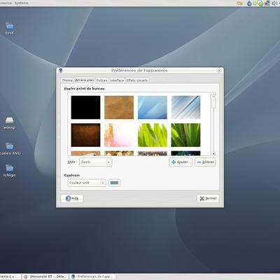
Real nice! Excellent work! However, what editor do I use to edit the blue colours on the active window, selected items and icons?
Never mind. Edited the gtkrc file manually .
i love it ;)
Why is the first line of the text in weather screenlet white? Shouldn't it be blue or black or something? It renders the city name and actual condition unreadable...
This is due to the theming limitation of that screenlet. If you want to set another color, you have to edit the source code...
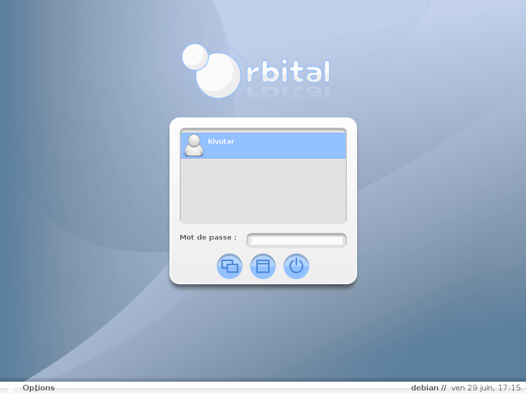
Good idea ! Here is a bmp screenshot : http://kivutar.fr/linux/Orbital.bmp Thanks a lot for all your comments :D
What about inactive and pressed buttons? Could you make screenshot with this? I'm trying to conver from .svg but thats looks ugly.
Looks very nice. If you upload somewhere screenshot in better quality I'll make xfwm4 theme.
well done :)
sweet! nice screenshot too.