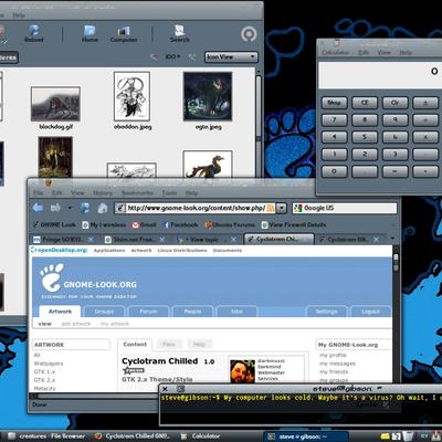
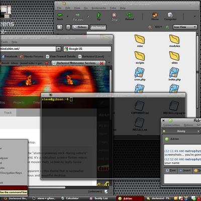
Description: I was up late one night combining several themes together to make one large super theme. I started off with Mira, Dust, and Aurora Black Panther.
After another day, and endless tweaking, I created a whole new theme that rocks hard! I also removed all the elements from Dust.
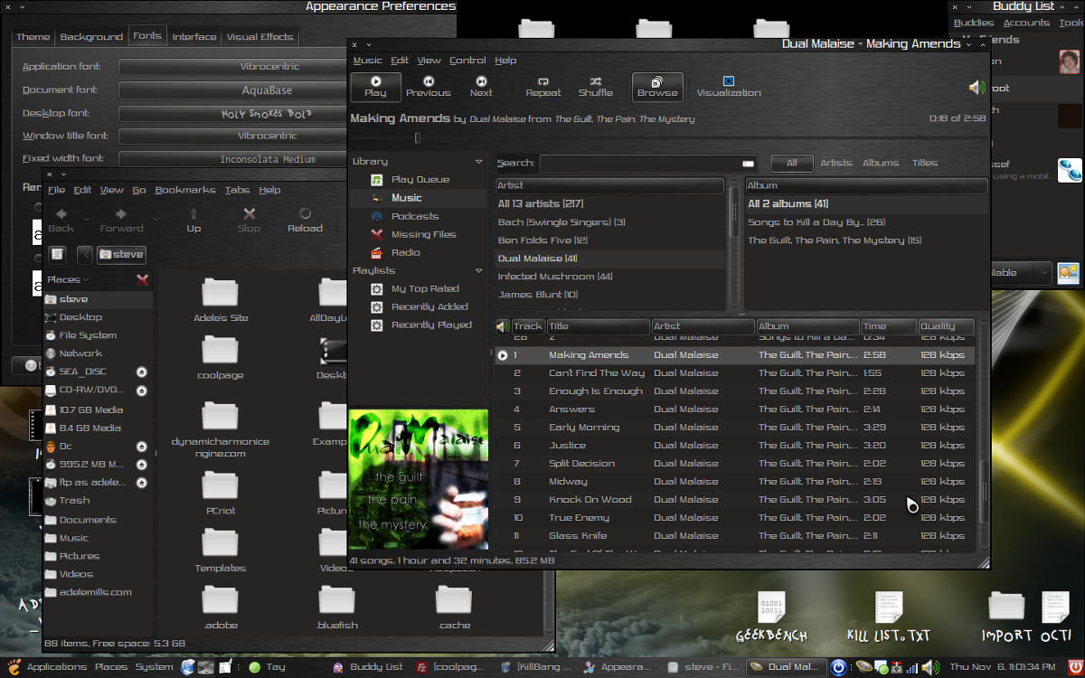
This is a black, brushed metal theme with some cool gradients and shinyness. I tried to make it not "overdone".
This is my first attempt at a theme, so please leave plenty of feedback. Thanks!
sorry about the poor quality screenshots, 300k limit is kind of lame.
Also note, that the metacity theme is just LxG with a brushed metal skin instead of a glossy look. I will try to replace this when i get the time. It was merely what i was working with when i was trying to create this theme. His theme is here: http://www.gnome-look.org/content/show.php/LxG-Egalite?content=92101
[EDIT] If you are going to rate this theme "bad", please give a valid reason. This way I can fix the bad parts to make this the greatest theme ever created!Last changelog:
This is just the theme I have been looking for i been looking for a theme like this for a long time Thank you for all your hard work and please keep it up :P the icon set and pointer set I had did not seam to fit so I used an Icon set called hydroxygen also found on Gnome-Look.org and courser set (mouse pointer) Obsidian also found on gnome-look.org your theme works grate I had no prob getting it to work both with your theme and the icon and pointer sets I'm happy as a 6 year old with a sugar high...
thanks for all the kind words...
this is my first theme and I started off just by making a hodgepodge of several other themes and combining them.
as i get better at this, a lot of the bugs will be fixed.
but i've been working a lot on my other theme called "KillBang Kazow!". if you like this theme, you might like that other one as well.
also, if you like my themes, please give me a higher rating. some jerkwads keep giving me a "bad" rating without even downloading the theme or commenting on what they don't like about it.
... for my notebook ;) But in Intrepid is a GTK-Engine Error-message. The second problem is that the Icons are in 16x16 in Nautilus and Firefox - I prefer 24x24 here ;) The Menu with 16x16 and System 24x24 is okay. Never mind: Thank you :)
This theme is so close to being the most perfect match for what I wanted but there was just one little thing that made me hesitate...
Is there any way that you could un-inverse the windows in Open Office? It is really hard to see what Im typing when Im typing light gray letters onto dark grey paper lol. If there was any way you could keep the white paper with black font letters this would be my permanent theme!
I appreciate the awesome work!
there are options in openoffice that let you change the colors of default pages and such... white page with black text is what i have it set for normally.
play around with the options and you'll find it... g'luck!
I was busy tweaking and modifying this theme so much, that i created a whole new theme. i'm going to upload it as a separate theme rather than a newer version of this theme.
Voted up, man...
but I think for some improvements you could made notebook backgrounds flat, the background image should be tiled, and the buttons more flat too... otherwise is a good theme, some too much contrast, good work ;)
thanks for the comment.
i will be working on changing some of the bottons, and column headers and making them more metallic rather than gradient-based. Also I will be fixing the panel and changing the metacity theme to make it seamless.
by v2.0, this should be the ultimate theme. thank you everybody for your helpful advice!
As a desktopthemer myself I can appreciate a good theme - and this is a good theme - because you seem to have found an answer to most problems that occur with black themes. Firefox works well with this theme which is rarely the case with black themes. So congratulations! But there is always a "but': I do not like the blue shadows. I'm not a fan of the metacity theme. Personally I do not make metacity-themes anymore because it is a hassle and because most people use compiz and emerald themes. (Most people interested in changing the looks of the gnome desktop anyway) You should try making emerald-themes. They are a lot more flexible and easier to combine. I see that you have used a metallic background. If you look at my theme (Aluchrystal) you will see that I have also used a metallic background for the GTK-theme AND the Emerald theme. So try making an Emerald-theme with the same black metallic background with for example black shiny min-max-restore buttons should give your theme a more consistent look.
I've you like I will give it a try. But I'd prefer it that you learn it yourself...
Paullinux
This is truly an excellent dark theme. One of my favourites out of all the one's I've tried so far.
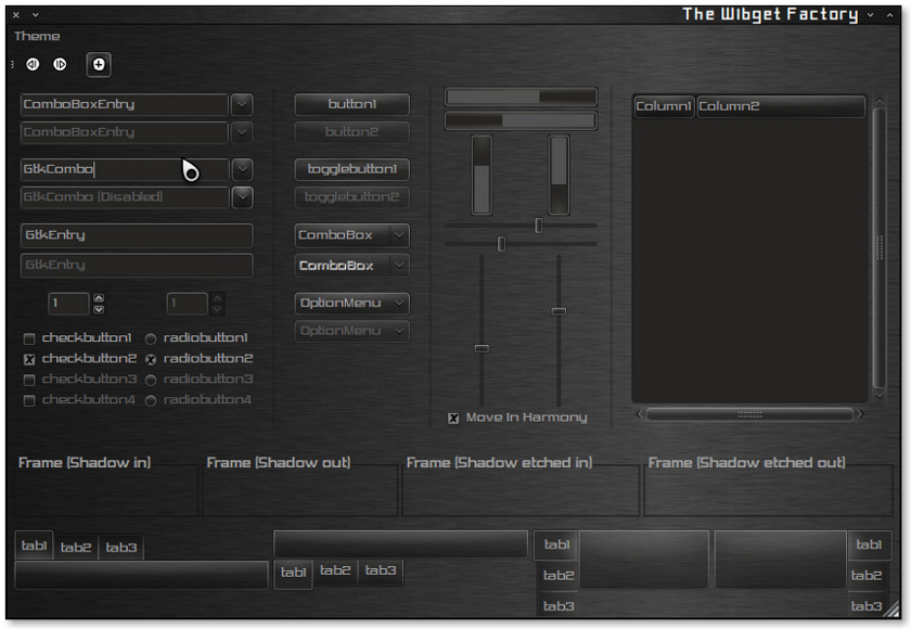
One suggestion. The input boxes are kind of confusing. An X or check mark would be better than a solid grey box. Not sure if it is checked or not. Same goes for radio buttions. Perhaps something that makes it a little more clear that the option is selected. Maybe blue instead of grey?
I have another suggestion :)
On your blog it would be a good idea to give anonymous permissions for posting comments and use the Drupal captcha module to prevent spam. Not many people want to leave comments on blog sites if they have to create an account.
Cool, i added CAPTCHA and now people can post anonymously. thanks again for the help.
i'm going to update the theme tonight w/ v1.01 (new radio buttons and check boxes)
Good start, I personally like where it is headed.
A few things to fix that i think will make it flow better.
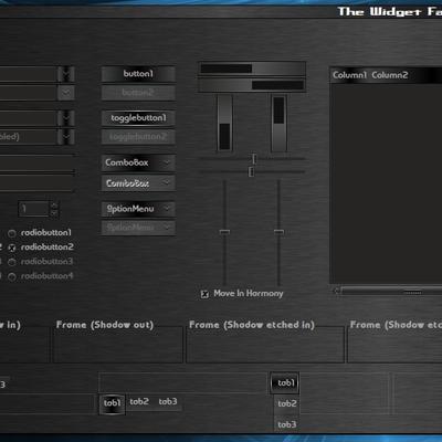
1. The title bar is rather lacking. If you were to remove the black line between it and the rest of the window. That way it blends together so that it looks like its molded in with the window. I find this much nicer looking.
2. The title bars text is too big. Its nice how the title bar is slim but the text is to over powering i think. Maybe move the text to the center too.
3. How does it look if you were to remove the glare on the brushed metal?
4. On the panel the window list filled with buttons (applications) does not flow well with the panels background. ie the buttons background gets very light then it cuts off to the really dark background on the panel. I think this is a problem for most stuff, like my sys tray items backgrounds are darker then the panels background. Also in programs the icons can be darker then the background.
5. The part that i circled in red at this image http://i33.tinypic.com/2q0pm60.jpg seems to not fit in well either, how about if you were able to make it so it looks like a transparent box is covering the brushed metal background instead.
Other then these problems i noticed its very good.
thank you for your helpful advice.
1. maybe i'm just not proficient enough in theming to know how to do this, but the metacity theme stretches the background out when resizing while the gtk theme doesn't. so when the black line isn't there, the brushed background doesn't always line up. when i added the black bar, it seperated the two and made it not stick out as much. if i can learn how to keep the metaicty backgound anchored like the GTK background, i can remove the black bar and have it always remain lined up.
2. Isn't the size of the titlebar font controlled by the system? i can make it smaller using GNOME's appearance thingee. I'm also not a big fan of centered text in the titlebar. It's an easy fix and I'll see how it looks...
3. what do you mean by remove the glare? do you mean make it less shiny? i can experiment with changing it and see what happens...
4. ahhh the panel. i was waiting for somebody to mention that. i can't for the life of me get the panel to be seamless. i'm probably going to change the panel background in the future.
5. i agree. i will look into changing that. i was also thinking about maybe adding a border to that part to maybe give it some depth...
i am still new to this whole themeing thing so i will try real hard to fix these things soon.
There are themes that succeed in blending the menubar with the titlebar. Just take a look at the SlicknesS-theme or the 'UbuntuNextG'-theme.
The problem is your GTKRC-theme uses a single window-bg, while the mentioned themes have multiple backgrounds.
This allows them to use a separate background for the menubar. And this is the key to make it blend with the titlebar.
thanks for the help. i'm going to look into this, and by the time we hit v2.0, we should have a nicer blended metacity theme.
i'm also thinking about changing the scrollbar troughs and the column header things. it will be a big update and may take me a little while but it will be worth it.


Ratings & Comments
23 Comments
This is just the theme I have been looking for i been looking for a theme like this for a long time Thank you for all your hard work and please keep it up :P the icon set and pointer set I had did not seam to fit so I used an Icon set called hydroxygen also found on Gnome-Look.org and courser set (mouse pointer) Obsidian also found on gnome-look.org your theme works grate I had no prob getting it to work both with your theme and the icon and pointer sets I'm happy as a 6 year old with a sugar high...
thanks for all the kind words... this is my first theme and I started off just by making a hodgepodge of several other themes and combining them. as i get better at this, a lot of the bugs will be fixed. but i've been working a lot on my other theme called "KillBang Kazow!". if you like this theme, you might like that other one as well. also, if you like my themes, please give me a higher rating. some jerkwads keep giving me a "bad" rating without even downloading the theme or commenting on what they don't like about it.
... for my notebook ;) But in Intrepid is a GTK-Engine Error-message. The second problem is that the Icons are in 16x16 in Nautilus and Firefox - I prefer 24x24 here ;) The Menu with 16x16 and System 24x24 is okay. Never mind: Thank you :)
As beautiful motive on first time very. It requires several corrections else, but it is fine. Great work. ;]
Gnome is asking me about a missing gtk engine, without telling me wich one....can you tell me, please?
This theme is so close to being the most perfect match for what I wanted but there was just one little thing that made me hesitate... Is there any way that you could un-inverse the windows in Open Office? It is really hard to see what Im typing when Im typing light gray letters onto dark grey paper lol. If there was any way you could keep the white paper with black font letters this would be my permanent theme! I appreciate the awesome work!
there are options in openoffice that let you change the colors of default pages and such... white page with black text is what i have it set for normally. play around with the options and you'll find it... g'luck!
I was busy tweaking and modifying this theme so much, that i created a whole new theme. i'm going to upload it as a separate theme rather than a newer version of this theme.
Voted up, man... but I think for some improvements you could made notebook backgrounds flat, the background image should be tiled, and the buttons more flat too... otherwise is a good theme, some too much contrast, good work ;)
thanks for the comment. i will be working on changing some of the bottons, and column headers and making them more metallic rather than gradient-based. Also I will be fixing the panel and changing the metacity theme to make it seamless. by v2.0, this should be the ultimate theme. thank you everybody for your helpful advice!
As a desktopthemer myself I can appreciate a good theme - and this is a good theme - because you seem to have found an answer to most problems that occur with black themes. Firefox works well with this theme which is rarely the case with black themes. So congratulations! But there is always a "but': I do not like the blue shadows. I'm not a fan of the metacity theme. Personally I do not make metacity-themes anymore because it is a hassle and because most people use compiz and emerald themes. (Most people interested in changing the looks of the gnome desktop anyway) You should try making emerald-themes. They are a lot more flexible and easier to combine. I see that you have used a metallic background. If you look at my theme (Aluchrystal) you will see that I have also used a metallic background for the GTK-theme AND the Emerald theme. So try making an Emerald-theme with the same black metallic background with for example black shiny min-max-restore buttons should give your theme a more consistent look. I've you like I will give it a try. But I'd prefer it that you learn it yourself... Paullinux
correction: the blue shadow I was talking about has nothing to do with your theme, so no worries !
haha cool, thanks! i'll get working on an emerald theme soon... i promise!
This is truly an excellent dark theme. One of my favourites out of all the one's I've tried so far. One suggestion. The input boxes are kind of confusing. An X or check mark would be better than a solid grey box. Not sure if it is checked or not. Same goes for radio buttions. Perhaps something that makes it a little more clear that the option is selected. Maybe blue instead of grey?
I was thinking the same thing. I will change this soon i promise.
I have another suggestion :) On your blog it would be a good idea to give anonymous permissions for posting comments and use the Drupal captcha module to prevent spam. Not many people want to leave comments on blog sites if they have to create an account.
awesome... i'll do that tonight. thanks for the tip!
Cool, i added CAPTCHA and now people can post anonymously. thanks again for the help. i'm going to update the theme tonight w/ v1.01 (new radio buttons and check boxes)
Good start, I personally like where it is headed. A few things to fix that i think will make it flow better. 1. The title bar is rather lacking. If you were to remove the black line between it and the rest of the window. That way it blends together so that it looks like its molded in with the window. I find this much nicer looking. 2. The title bars text is too big. Its nice how the title bar is slim but the text is to over powering i think. Maybe move the text to the center too. 3. How does it look if you were to remove the glare on the brushed metal? 4. On the panel the window list filled with buttons (applications) does not flow well with the panels background. ie the buttons background gets very light then it cuts off to the really dark background on the panel. I think this is a problem for most stuff, like my sys tray items backgrounds are darker then the panels background. Also in programs the icons can be darker then the background. 5. The part that i circled in red at this image http://i33.tinypic.com/2q0pm60.jpg seems to not fit in well either, how about if you were able to make it so it looks like a transparent box is covering the brushed metal background instead. Other then these problems i noticed its very good.
thank you for your helpful advice. 1. maybe i'm just not proficient enough in theming to know how to do this, but the metacity theme stretches the background out when resizing while the gtk theme doesn't. so when the black line isn't there, the brushed background doesn't always line up. when i added the black bar, it seperated the two and made it not stick out as much. if i can learn how to keep the metaicty backgound anchored like the GTK background, i can remove the black bar and have it always remain lined up. 2. Isn't the size of the titlebar font controlled by the system? i can make it smaller using GNOME's appearance thingee. I'm also not a big fan of centered text in the titlebar. It's an easy fix and I'll see how it looks... 3. what do you mean by remove the glare? do you mean make it less shiny? i can experiment with changing it and see what happens... 4. ahhh the panel. i was waiting for somebody to mention that. i can't for the life of me get the panel to be seamless. i'm probably going to change the panel background in the future. 5. i agree. i will look into changing that. i was also thinking about maybe adding a border to that part to maybe give it some depth... i am still new to this whole themeing thing so i will try real hard to fix these things soon.
Do you have a White version? Will you make it?
There are themes that succeed in blending the menubar with the titlebar. Just take a look at the SlicknesS-theme or the 'UbuntuNextG'-theme. The problem is your GTKRC-theme uses a single window-bg, while the mentioned themes have multiple backgrounds. This allows them to use a separate background for the menubar. And this is the key to make it blend with the titlebar.
thanks for the help. i'm going to look into this, and by the time we hit v2.0, we should have a nicer blended metacity theme. i'm also thinking about changing the scrollbar troughs and the column header things. it will be a big update and may take me a little while but it will be worth it.