DeviantArt has a little bit nude art. But a lot of crappy porn too! Whatever admins and moderators say, a finger in a pussy in front of a bad quality webcamera is not art... xD
okay, for the prelight or pressed image?
if i used it for pressed it would be a bit brighter which would be kind of nice, but a brighter prelight would be good, too.
okay, well, i decided to use the really bright one for prelight and made a blend of my darker prelight and the brighter one for the pressed image. it's updated now, take a look! :)
thank you.
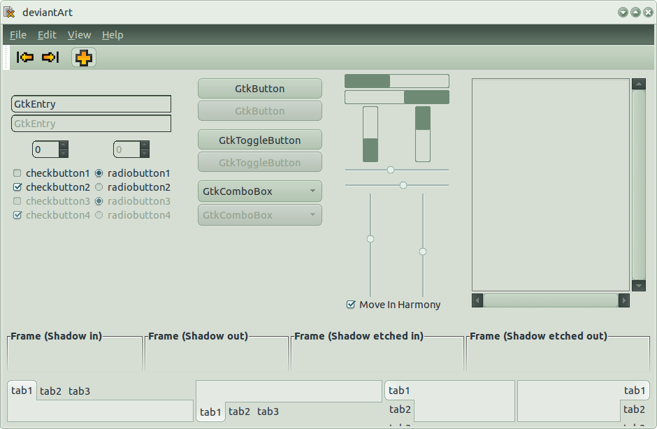
the panel is meant for the top, so if you're using it on the bottom it might look funny. i don't know how to have different top and bottom images, i need to fix that... as for the panel buttons... well, they look a lot better than they did before.
i'm using my retropixel icons (the ones for >, <, +)
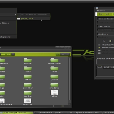
the whole theme is based on the GUI on deviantart.com, (except for the scrollbar and check-circles), so the orange is from there. i was thinking of adding an alternate progressbar, a much simpler one, since dA has 2, i'll add it in the nnext release...
Well, I think you should improve the combo boxes, scrollbars and the frames a little bit.
And that orange is too bright.
If I found some spare time, I can send you some files.
which ones are the combo boxes?
and which frames? the ones near the bottom that fade out or the one by the scrollbars?
the scrollbars... i made them myself, just based on the deviantArt style, what do u think could be done to improve them?
if you want, you could give me ideas...
btw, i fixed the volume-slider, now it goes all the way to the end, and i messed with the menus, too.


Ratings & Comments
26 Comments
Lol, nice. It really look like deviant art design :)
Thanks :D
Now, deviantArt should be called DeviantPorn... :D I never seen more creepy amateur porn than or deviantArt!
Well, I guess someone considers it art :/
DeviantART does have porn(it's not allowed), it's nude art, big difference.
That's doesn't, not does.
DeviantArt has a little bit nude art. But a lot of crappy porn too! Whatever admins and moderators say, a finger in a pussy in front of a bad quality webcamera is not art... xD
Depends what your definition of art is. Images on dA have to be of artist value. dA has a filter option anyway, so you don't have to look at it.
Nice, but the "close" button should definitely be red, like in the DA adverts http://imgur.com/0FBPu.png
thanks! the buttons light up red when you mouse over them. or do you mean the brighter red, i was thinking about that...
Oh, yeah I never noticed that it was red when I hovered over it, but yes I'd make it the same red as in the deviant advert.
okay, for the prelight or pressed image? if i used it for pressed it would be a bit brighter which would be kind of nice, but a brighter prelight would be good, too.
I think either one would be nice, but it's your theme not mine :)
okay, well, i decided to use the really bright one for prelight and made a blend of my darker prelight and the brighter one for the pressed image. it's updated now, take a look! :)
um... i just realised we had this whole exchange on the gtk's page XD
Lol ^_^
i like it. Except the panel and the boutons in panel. But everything else is really cool ! What is the ison set you're using ?
thank you. the panel is meant for the top, so if you're using it on the bottom it might look funny. i don't know how to have different top and bottom images, i need to fix that... as for the panel buttons... well, they look a lot better than they did before. i'm using my retropixel icons (the ones for >, <, +)
I think the orange looks a little out of place, but the rest looks great!
the whole theme is based on the GUI on deviantart.com, (except for the scrollbar and check-circles), so the orange is from there. i was thinking of adding an alternate progressbar, a much simpler one, since dA has 2, i'll add it in the nnext release...
Hi, I have to say that the idea is very good but it need some more touches.
thanks! what do you think i could do to it?
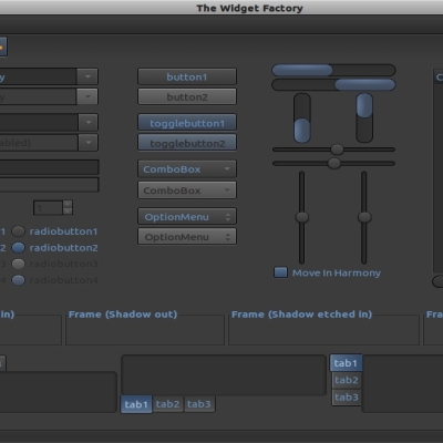
Well, I think you should improve the combo boxes, scrollbars and the frames a little bit. And that orange is too bright. If I found some spare time, I can send you some files.
which ones are the combo boxes? and which frames? the ones near the bottom that fade out or the one by the scrollbars? the scrollbars... i made them myself, just based on the deviantArt style, what do u think could be done to improve them? if you want, you could give me ideas... btw, i fixed the volume-slider, now it goes all the way to the end, and i messed with the menus, too.
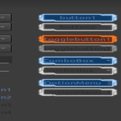
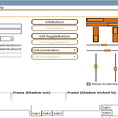
Ok, here is my vision http://imgur.com/t0Vin.png