


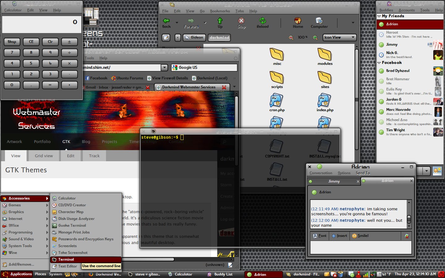
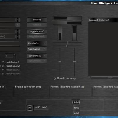
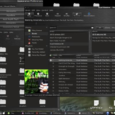
Cyclotram Ubuntu
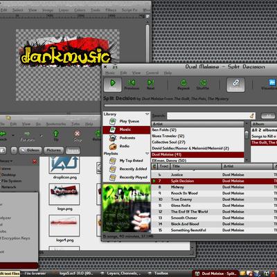
darkmusic


Source (link to git-repo or to original if based on someone elses unmodified work):
v1.0 (4/22/09)
-New panel background (will now resize up to 100px wide).
-New panel buttons and hover design.
-Smoothed out edges of some of the buttons.
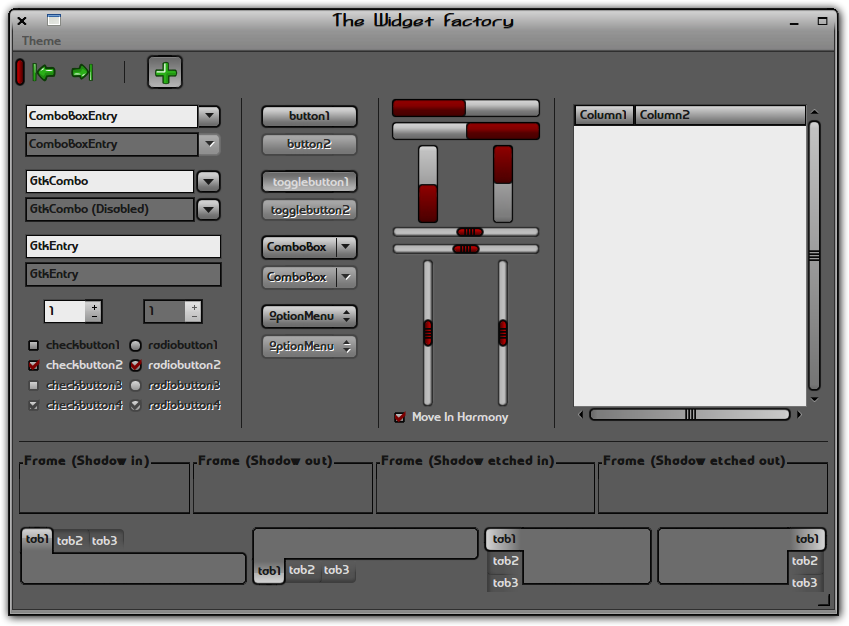
-Darkened the red coloring on scrollbars, sliders, and progress bars to match the menu item highlight.
-Added black border around menu item highlight to match the borders around each button.
-Added black border to selection highlight for list views.
-Added "grip" lines on sliders to match the scrollbars.
v0.90 (4/20/09)
-Smoothed edges of notebooks and buttons.
-Fixed strange tab overlap that occurred on left/right tabs.
-Changed Metacity title and button colors.
-Changed check boxes and radio buttons.
-Made range troughs 1px wider to fit the slider better.
v0.85 (4/19/09)
-Brand new Metacity theme that matches the style of the buttons. Also, it blends seamlessly into the menubar.
v0.81 (4/19/09)
-Fixed hideous tooltip problem.
v0.8 (4/18/09)
-Changed all the colors, made theme darker so its easier on the eyes
-Added metacity theme (its a variation of "strangematter")
-Tweaked sliders and troughs
v0.2 (4/17/09)
-changed sliders (made them match progress bars)
-made check boxes and radio buttons match the theme better
-made list headers, shadows (frames), and spin buttons (+ and -) match the theme a bit more


More GTK2 Themes from darkmusic:
Other GTK2 Themes:


Ratings & Comments
14 Comments
While you may have not intended it to be specifically I find this to make a good "kids" theme.
This is one of the coolest gtk themes I've seen. A couple of technical details you might want to consider are the error msg's on the concole like: .themes/Cyclotram/gtk-2.0/gtkrc:864: Unable to locate image file in pixmap_path: "Menu-Menubar/tbuttontb-off.png" .themes/Cyclotram/gtk-2.0/gtkrc:867: Background image options specified without filename Other than that, I think it's great!
cool... I think it's fixed now. it was just a stupid typo.
The updates seemed to fix all the little flaws, I don't see what else you could do its close to being perfect. These colors flow so good together, and its easy on the eyes. Oh yeah maybe having the panels set to go good beyond "25" like someone else posted.
Nice to see something different
thanks for the comment... i've done a lot of updates in the last day or two... what do you think?
i'm going to start working on changing the background and text colors... i was thinking about releasing a few different versions including a black theme with white text. whatcha think about that?
I'm real picky about what theme I use. I been using the same one for 3 years, but this one is about to take its place. PLEASE keep up on this, and I will for sure follow your work!!!
This definitely has potential. Especially for some of the "cartton" style icon sets, such as Gartoon, Buuf, or garGANTuan. It kind-of reminds me of the old "Comix" style for KDE3 (which sadly doesn't appear to have survived the transition to KDE4). Can you make this theme work better with panels that are larger than the default size, or vertical?
hey, thanks for the comment. i was thinking the same thing about the cartoon-like icons... i'll work on the panels... maybe by making square buttons or something... theres still a lot of work to be done on this theme so keep checking back.
I'll be honest and say that I personally don't care for the theme too much, but I must say that I like that font you've got on there. What font is that?
"World of Water"... and I'm about to upload v0.2 in a few minutes... so tell me what you think of the changes...
Nope, still don't care for it. I will admit, I think my tastes are different than most other people on here. About that font though, is that in the 6,760 fonts package I've seen on here?
go to synaptic and search for "ttf " (space after the ttf...) download every interesting package of font in the repos... i get all the ones that arent foreign fonts... i'm not quite sure which package has it though...