


::Background::
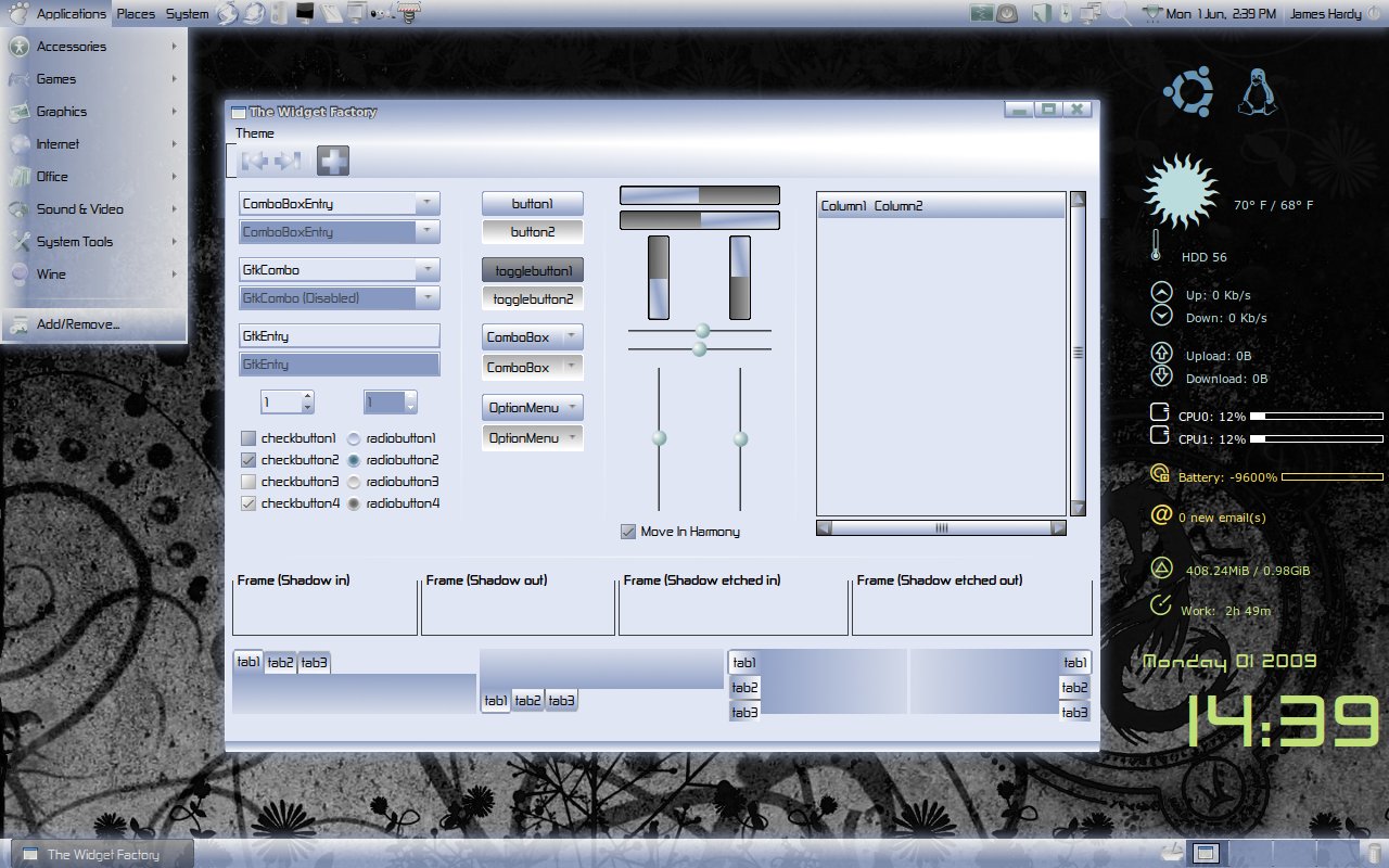
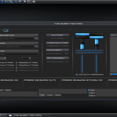
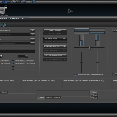
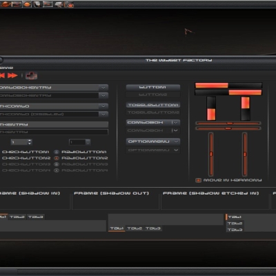
A theme that i have been working on to compliment my Polar Icons 2 theme (see link provided below). It has taken quite a long time for me to make so i apologise for the wait, this is partly due to all the widgets being novel to this theme (at least when i made it). This theme is intended to provide the slick looks of alot of the dark pixmap based themes and create a lighter one (something i have noticed is quite rare for some reason). This will remain an on-going project so any flaws noticed let me know and i will do my best to fix them.
:
 lanned changes::
-look into changing scrollbar
-look into changing progressbar
:
ackage includes::-gtk theme
-metacity theme
-index.theme file
-emerald theme
::Links::
Polar Icons 2:
http://www.gnome-look.org/content/show.php/Polar+Icons+2?content=100614


Ratings & Comments
35 Comments
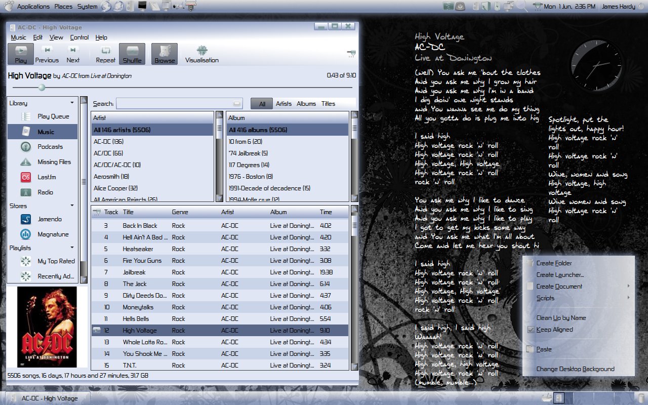
Thanks for this great theme! I'm kind of over all the "shiny black" themes, so it's good so see my desktop a little brighter. One question though, it appears like your panels are translucent? How do you do that? Cheers!
Ya you can do it using compiz fusion. Open the compiz fusion settings manager and go onto the opacity, brightness and saturation settings. Then on opacity click the "new" button and type in the following (name=gnome-panel) then just select how opaque you would like it to be (i currently use 85). You can also use these settings to make practically anything semi-transparent i als0 use it to make my menus see-through. Good luck and let me know if you have any problems or have any further questions, James
Thanks, Helped me too
I'm very sorry but I must say that I really don't look this kind of theme.. I've seen a lot of theme like this (MK64's themes, for example.. lasts works, at least): it seems all so confused! The font doesn't fit in with the rest.. Colors are too much light to make this theme shines.. It's only my opinion, it's clear! Consider it as less important than the positive others.. Maybe the problem is only mine.. and my taste's wrong.. maybe.. bye, man.. and, last words: I'm so envious of all of you themers guys.. 'cause I'm not able at all to make a skin of mine.. totally unable!! go on with your works, so..
Hi brainvision, thanks for your comments. Personally i don't think anyones opinion is of any less worth than others. I think alot of it comes down to personal taste i personally am quite a big fan of MK64's work and admittedly alot of our themes seem to share common elements. I can however appreciate your point as this theme is quite well "busy" if you like and possibly slightly more difficult to use than some counter part engine themes. Regarding your comment on being unable to create themes. You may well find that with only a little experimentation you can create a theme of your own. If you can locate a pixmap based theme as a base (like this one) you need only to edit the png files to make some basic changes to the theme. I started out doing this to the robs Overglossed theme a few months ago and have progressed bit by bit from there (although i am still far from a pro). Another engine that is quite easy to manipulate is the murrine engine if you can locate a few of those, they may also be worth a look. Best of luck, James
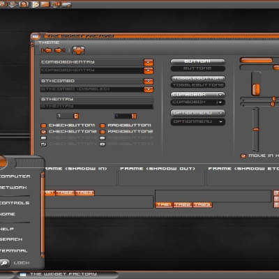
Do you think you'll do a black version of the polar theme in the future?
Yes i think that this is a very probable idea. I have been considering it for a while, ive just got to fine polish this one a little first and then ill probably start on that. Thanks for the interest, James
please, sombdy can tell me how 2 install these theme, plss...i'm new on linux...
Sure, what you need to do after downloading a theme is move the downloaded file onto your desktop (just to make things easier) then open your appearance settings under System>Preferences>Appearance. Then you need to left click on your new theme folder (in this case called polar that you placed on your desktop) then select create archive. This will create a file called polar.tar.gz. then simply drag and drop the file onto your appearance preferences window whilst on the themes tab. This will install the theme. Let me know if you have any problems ill be happy to help. Best of luck, James
You got something good going on here. I love the buttons and the whole concept is interesting. Now for the things i think needs improvement. The background for the progress bar has to high contrast in comparison with the rest of the theme. The scrollbar feels a little out of place. Maybe round off the corners? And finally the border between pixmaps and engine colored areas seem kind of sharp, maybe its just my color settings. I realize this is an early release and look forward to an updated version, whether you take my opinion into consideration or not. =) Keep up the good work!
Tyvm for your ideas, I have to admit the scrollbar and progressbar have both been areas i also felt still needed a little work so i will probably have a go at improving both of them. Would you mind giving me an example of where the pixmaps and engine colored areas are sharp so i can get a better idea of what you mean. Thanks again for your suggestions, keep your eyes peeled to see theme in this theme soon =) Best regards, James
Nice to hear, looking forward to it. I made a picture to explain what i mean with the pixmap and engine colored ares. http://pici.se/pictures/WZKyRRIMx.png Now I don't have any experience with pixmap engines so I'm not to sure how to go about "fixing" this. But maybe add a middle segment to separate the areas, kind of like the thin borders on the buttons. And/or adding some kind of pixmap background instead of having engine colored areas. Well this is just my personal opinion so everyone might not think this needs "fixing".
Great work... I would like and emerald theme with rounded buttons ;).... thanks for this one...
Ill see what i can do for you
sssssssssssuper work my friend :) thank you :)
Thanks Kai =)
What's the font on your screenshot? I want you too :)
Its called Zekton it can be found here... http://www.gnome-look.org/content/show.php/Zekton?content=50553
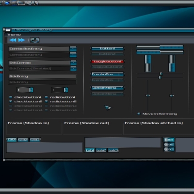
Maybe you should decrease the white blend slightly on the notebook (I think) image file ? I also think that the disabled entries are given too much contrast(dark grey against light blue). Maybe you should give them the same look as the active one, but with a much brighter font color. Also, what about giving that progressbars a little more relief on the through part( white one ), you could do this with one or 2 blends. These are just suggestions :) Keep up ;)
Hi Thibaut, Thanks for your feedback and suggestions i agree with alot of what you are saying. I am currently already trying to lighten the disabled entries, as the current colour contrasts far too greatly with the rest of the theme, although i am as yet somewhat torn on exactly how i should go about it so thanks for your suggestion i will definitely be trying that =). The progressbars also definitely need to stand out more from their backgrounds so ill be working on them. Im a little confused as to what you mean by the notebook, are you refering to the metacity titlebar, menubar and toolbars? Best regards, James
I'm really glad I could be of help ;) By notebook I was meaning that large frame which comes right under the tabs, because the file corresponding is often named so. It's not that its colors contrast too much, but the frame will contain all that range of colors (from white to blue), which is rather wide. So you should check that every components (checkbox, buttons, frames) are still visible :) You choosed a dark font color, which is good because it'll always be readable ;)
Thankyou very much for your criticisms and advice, they have proved very constructive, i have actually now implemented or begun to implement changes in ALL the areas that you suggested so expect to see lots of your suggestions in the finished theme =) Best regards, James
This is shaping better and better ;) One last suggestion, and one of my guidelines when I draw some gtk themes (at least in my recent ones) : If you want to give the components a sharper look, there is a simple rule to follow. I see you use a black outline for your buttons for example. If you were using both a black outline and a whiter outline (see http://gnome-look.org/content/show.php/Abstract.DarkGlow+Pack?content=88060 for example. Look mostly for tabs, notebook and buttons) I think the overall theme would look a bit cleaner ;) Thanks again for listening to me :) Best regards, Thibaut
Thanks for the suggestion, after viewing your theme i have to say i think i agree, ill give it a try and if it works (im expecting it to) it'll be on the next release. Btw i love Abstract.DarkGlow its a very professional and highly polished theme well done. Best regards, James
Hi Guy, it is really nice your theme... indeed I'm trying to make a polar desktop... it only remains firefox theme and gtk one.... cheers...