


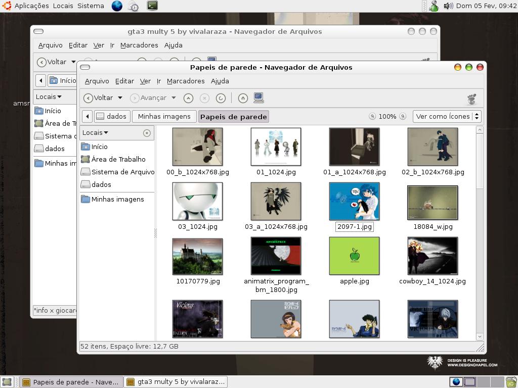
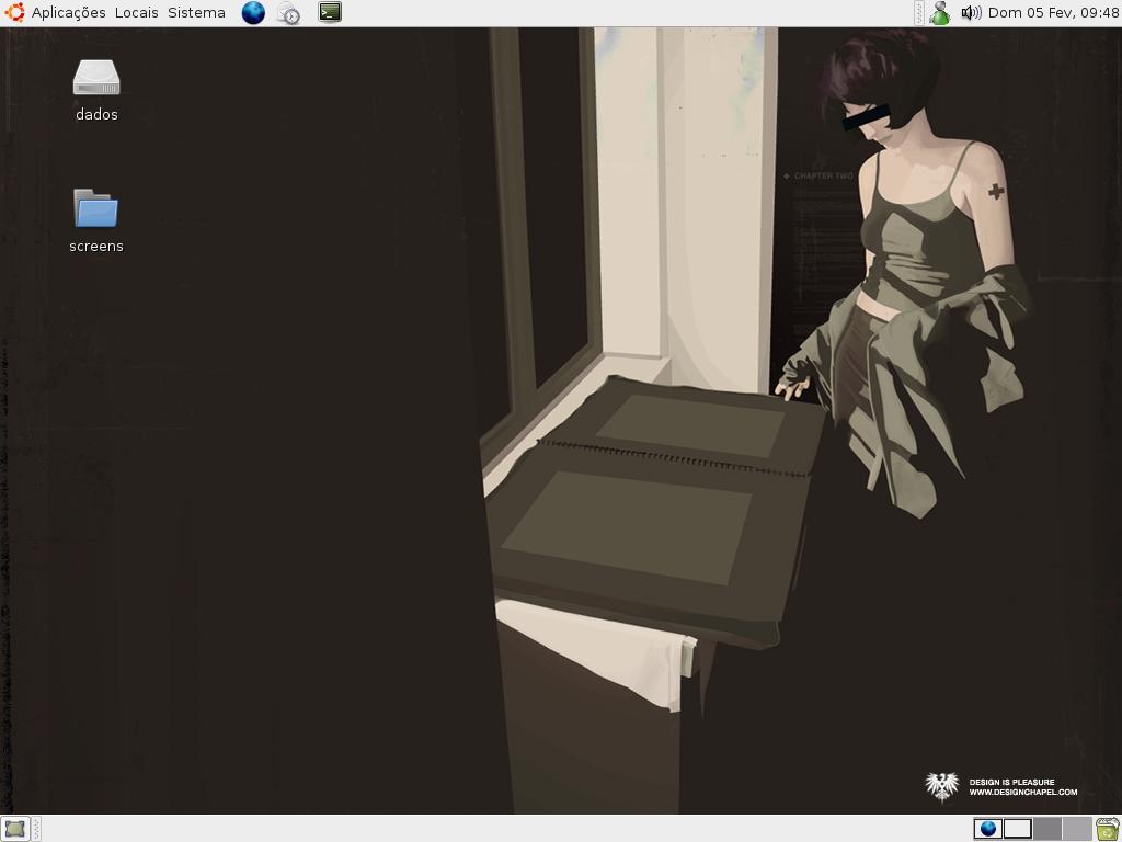
 linux can have beauty too
The buttons aren't very cool yet.. next release I'll change this
And now I stealed elements from another theme, "Gray"
It's only the mix of other four themes: Industrial, Anianiam, Gray e T-Ish
thanks
EDIT: Link for download fixed, sorry


Ratings & Comments
8 Comments
Nicest theme I've seen anywhere. I use it with Clearlooks controls, Human Icons, and Virtue 9pt in the Title Bar. I've stopped looking for a theme! The only minor criticism I have is that some buttons on non-Gnome apps, eg OO.o and Mozilla, don't have PRELIGHT. Man, if you never make another theme, it doesn't matter. This is the best! Nice work! Cheers, Steve
Hi, I would love to use your theme but the link is down (redirect me to "microsoft support" :p ). Thanks you very much.
Sorry for that :( I fixed the link
Hi! the theme is great, but the color of menu bar (lila), personaly dont like. the stock icons (orbital) look fantastic and de scroll bar milk too. congratulations!!
yeah, the menus are boring me now.. that time appeared beautiful.. I will change this :) There are many things I want to do... but I have much work to do in one of my jobs :P ... maybe next year I finish it ;)
I actually want a theme like this for gnome: http://www.kde-look.org/content/show.php?content=30789 I would love if someone make one like these
Great job! I particularly like the Unified-style metacity theme. Only criticism I can think of would be the buttons/tabs.. They're awfully squared-like for an OS X theme - but that's something I might just hack myself and toss you the result :) Keep it up.
Hi, thanks for the review! yeah, the buttons are too flat fot osX.. but I like it :P This theme is more based in Industrial than the mac theme Milk If I had more time I would make a theme more based on Milk, and this will be more mac os like :P