

Azenis
jameshardy88


Source (link to git-repo or to original if based on someone elses unmodified work):
11/02/09 - Version 0.1 released
11/02/09 - 0.1.1 (Small scrollbar glitch fix)
12/02/09 - 0.1.2 (Tabs adjusted & READ ME added)
13/02/09 - 0.1.3 (Wallpaper added)
13/02/09 - 0.1.4 (Metacity theme retouched and fixed)
14/02/09 - 0.2 (Retouches to buttons, panel buttons and scrollbars)
15/02/09 - 0.2.1 (Very slight default colour change to counter the open office dark theme bug)
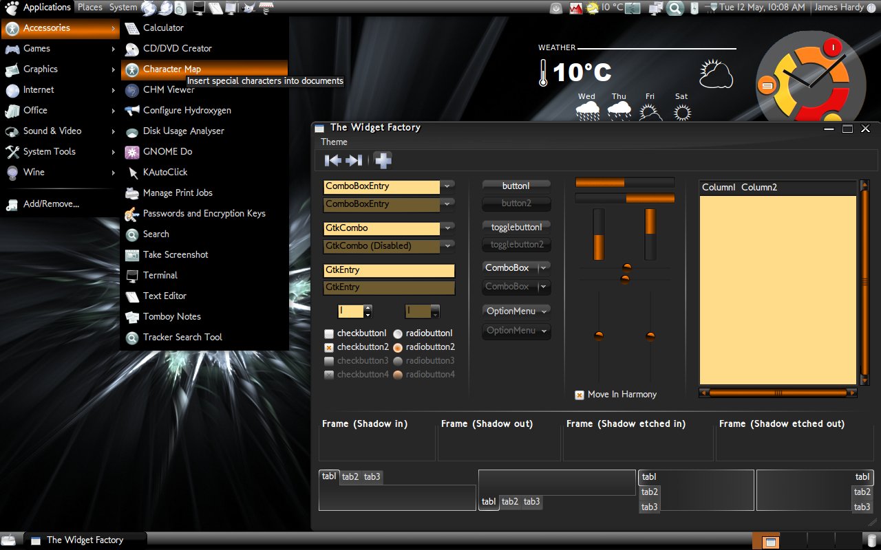
16/02/09 - 0.3 (Full suite launched, including a Skydome and GnoMenu)
19/02/09 - 0.3.1 (All new metacity theme! old theme still contained within download for those that want it)
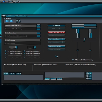
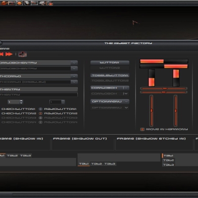
23/02/09 - 0.4 (Massive update changing many areas of the gtk theme including buttons, panel buttons, listheaders and more with the intention of "glossing down" slightly to improve usability. Icon theme also uploaded (requires separate download)
01/03/09 - 0.4.1 (cursor theme added, requires separate download)
12/05/09 - 0.5 (Another massive overhaul including amendments to tabs, entry boxs, buttons and more, also changed default icon theme)


More GTK2 Themes from jameshardy88:
Other GTK2 Themes:


Ratings & Comments
21 Comments
Everytime I think I've settled on one of your works I discover that you've created something else I knew nothing about!! Very nice work!! Now I've got to find a way to get the window themes which appear in Gnome so nicely to appear in xfce, my preferred work environment. Thanks again...
This theme is pure beauty.
nice theme!
Thanks noobster =)
yes,keep up the good work!!! thank you
Thanks =)
Downloads over 2thousand but only 53%. I really now that well and i can tell you: " Keep up the good work, you've done till now a right job" Greetings
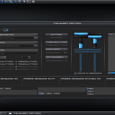
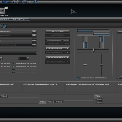
This theme is very nice indeed, but I find the 3d-look of scrollbars and label bars too flashy and flamboyant. I would use it as my dark theme if there was a way of toning this down.
Thanks, yes sorry i know it is a bit flashy but that was kind of one of the objectives of the themes design. I may make another theme based on this one afterwards that will be toned down slightly on the glossy front.
In fact, I think they are flashy to the point where it affects usability. For example, the song/title/genre etc lines in Rhythmbox should not overshine the selected items in color brightness, as the visual attention should be drawn to the serlected item. Also, the steep color gradient of the same line and the manu highlights are kinda breaking up the visual integrity of them, making them look like a delimiter between two areas rather than objects in themselves. But for the flat parts of the theme, I think they are really good. Like in very, very good.
Due to these comments I have attempted to change many key elements of the theme to improve usability. Many listheaders and buttons should now be less flashy and more user friendly. Please let me know what you think.
Well it's still too flashy for me (both scrollbars and orange select color), but I guess I just look for a more calm theme... I also don't like the fact that you cannot set the gnome-panel color to your liking, as the background of menus and tasks is always black. I do like the pale yellow-brown used instead of white. Many dark themes just leave the white spaces as they are, which strains the eye.
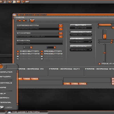
How did you get the dark background in gnomenu? With your theme I got it brown. a bit orangeish. With other themes showing a dark background in screenshot, like BlackVista, I got a white background... Where is the problem?
mine is an adaptation of the "glow" Gnomenu theme. Basically i just recoloured the blue background that you get by default so that you could read the white text that is default with my theme on a colour that is in-keeping. (hope that makes sence lol)
when finished download your themes i have this error: gzip: stdin: unexpected end of file tar: Unexpected EOF in archive tar: Error is not recoverable: exiting now
Hmm most odd. I have re-uploaded the theme now and subsequently downloaded myself without a hitch, let me know if you still have any problems. Im sorry for whatever caused the error.
I love the theme, i like the human ubuntu look but wanted something darker, usualy i opt for dark when i have no choice, this lets me use both.
one of the nicest i have seen yet - tweaked with the japanese icon theme. your theme for icons I did not have or find. looks great - many blacker darker themes are so dark browsers and forums can't handle them. this is great! Plan to use this for a long time.
Thankyou very much, your very kind. I've been hearing lots of good things about this Japanese icon theme with regard to its application to my theme, ill have to check it out myself and see if its worth substituting. If you are interested in finding the default icon theme you should be able to find it here... http://gnome-look.org/content/show.php/black-white+2+Style?content=72619 let me know if you have any problems or further questions.
What if you made a series of your marvelous theme, using various colors to replace orange (I think it would be splendid with blue, green and soft purple, for example). Anyway, it is fantastic as it is. Thank you
Thanks, its a definite possibility, though there are still a few tweaks that i would like to get ironed out of this on before i embark on creating more.