


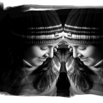
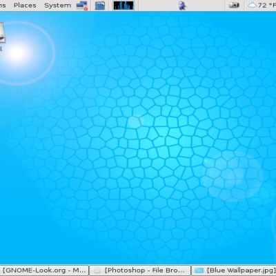
Very similar to the others I posted here on the site. Any thoughts? Im getting ready to post a new seires of WP very soon here.. just want to get several shots of this look down before i move on.... can't hurt

Ben.


Source (link to git-repo or to original if based on someone elses unmodified work):


More Wallpaper Other from bkeating:
Other Wallpaper Other:


Ratings & Comments
4 Comments
Thanks for the modification! Wow. A lot of authors don't do that. You've definitely built up a solid foundational theme with variation. I'd say get a few of these babies thrown into kdeartwork the next time around. It give KDE a modern, professional look.
respect to ya.. this the exactly the kind of wallpapers I came looking for on this site!! totaly rocks dude!!
It does it job as wallpaper nicely -- thanx -- Fab
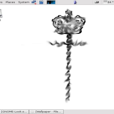
I rather like this one. It's not too bright - much easier on the eyes. When using version b I would use the intensity blending feature to make it a little less bright. This one has just the right brightness. The horizontal ba sticks out a little bit, but does make the desktop look wider. I would make it fade out on the left side. Start on the left side of the K and fade it out in gradient fashion to the left side of the desktop. You are a great artist! Ty