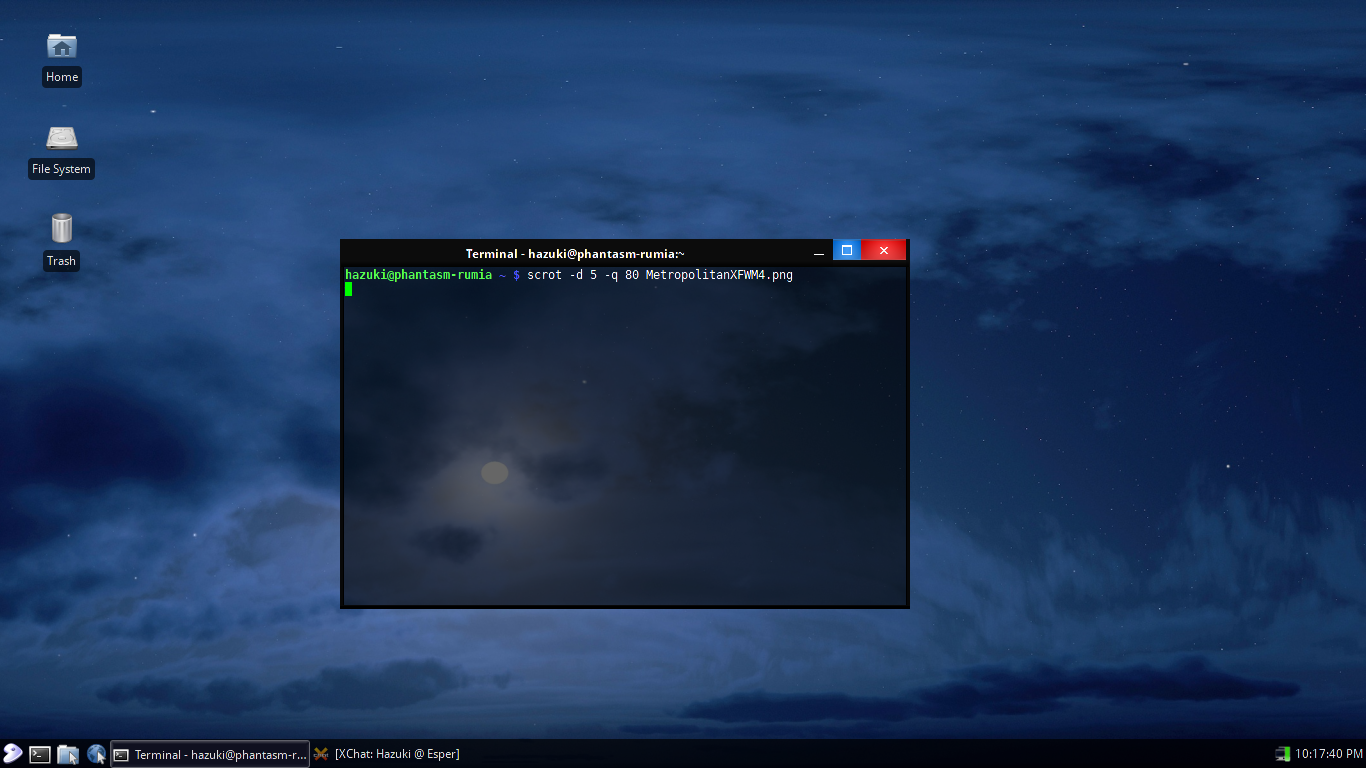
Description: Ever since the release of Windows 8, I was dismayed by the lack of care put into the new window decorations. Yes, Aero was bloated and overly-glassy, but 8 has not only gone entirely too far in the other direction but also removed the ability to even see your text and the min and max buttons against a dark background. WTF, Redmond?
So, having found a recently-uploaded theme that mimics Win8, I downloaded it and remade most of the pixmaps with an eye toward restoring some joie de vivre to the (in my opinion) needlessly Spartan Windows 8 windeco.
The result of that work is Metropolitan, a sleek, softly-gradiented theme with just a bit of the old glass look in the buttons and a deep black titlebar. It's subtle, but it makes a difference.


Ratings & Comments
0 Comments