Just because something is good for kids doesn't mean it isn't good for adults...you put cartoon icons and comic font in this and what would you expect to be the reaction?
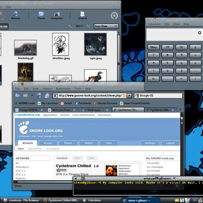
Anways how about a black theme? Change the red to black, try a stronger font like HandelGotD or OBHandel, make it darker and slim, and voila! Cyclotram Darkside
hey, i'm not saying the cartoon-look is a bad thing... just that not everybody would like it so that why I made the slim version. also, i chose the font and the icons because of suggestions from comments people made. personally, cyclootram is my favorite GTK theme ever.
the "darkside" idea is pretty good... if i make the dark grey color even darker and use a dark grey instead of the red... i could really make it work. do you think it would better all dark and greyscale? or should i add some dark coloring to it?
should i use the original cyclotram (bold lines) or this slim version to make the darkside version?
thanks for the input!
I agree.
I don't think you really need to change anything else, but you can try and see what you get. Having a font like HandelGotD would give it a more futuristic feel. OBHandel is freely redistributable, HandelGotD is not.
Not sure about a completely black theme, dark gray is probably strong enough. Just change the red bars and buttons to black.
Cyclotrauma? Heh.
I had a check along the Cyclotram serie, I don't find it "cartoon looking" or "good for kids" (even if they would like it), this is just a smooth and good looking new idea. It deserves to be voted good.
Keep it up with your artwork. :)


Ratings & Comments
6 Comments
Just because something is good for kids doesn't mean it isn't good for adults...you put cartoon icons and comic font in this and what would you expect to be the reaction? Anways how about a black theme? Change the red to black, try a stronger font like HandelGotD or OBHandel, make it darker and slim, and voila! Cyclotram Darkside
hey, i'm not saying the cartoon-look is a bad thing... just that not everybody would like it so that why I made the slim version. also, i chose the font and the icons because of suggestions from comments people made. personally, cyclootram is my favorite GTK theme ever. the "darkside" idea is pretty good... if i make the dark grey color even darker and use a dark grey instead of the red... i could really make it work. do you think it would better all dark and greyscale? or should i add some dark coloring to it? should i use the original cyclotram (bold lines) or this slim version to make the darkside version? thanks for the input!
I agree, that red is too strong , black would be more appropriate and yes, a little darker and voilà.... I would use this slim version to mod.
I agree. I don't think you really need to change anything else, but you can try and see what you get. Having a font like HandelGotD would give it a more futuristic feel. OBHandel is freely redistributable, HandelGotD is not. Not sure about a completely black theme, dark gray is probably strong enough. Just change the red bars and buttons to black. Cyclotrauma? Heh.
I had a check along the Cyclotram serie, I don't find it "cartoon looking" or "good for kids" (even if they would like it), this is just a smooth and good looking new idea. It deserves to be voted good. Keep it up with your artwork. :)
thank you for being so supportive! if you have any suggestions for me, please let me know!