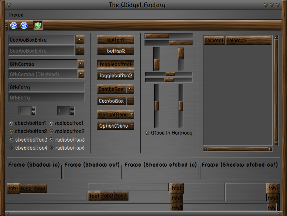
Hey does anyone remember the wood and "metal" (grey gradient) theme from way back in the day, like 1998, maybe even earlier?
It was a really popular theme back then (HandOfGod time period) and I've tried to find it but the search engine indexes from back then are pretty bad. It really looked awesome. It might have been called gradient or pixmap, I can't remember and haven't been able to find it after an hour or so searching. Definitely pre gtk 1.2.
Hey I really like this theme and its concept! it has great potential. great work buddy!
I think you should pursue this! I think it would look cool with a lighter wood color. they text would probably show up much better too! Something tells me light yellowish shiny wood. Or Redish Shiny wood (Like Apple loves to use).
Anyway Great work voted up! :)
Thanks !
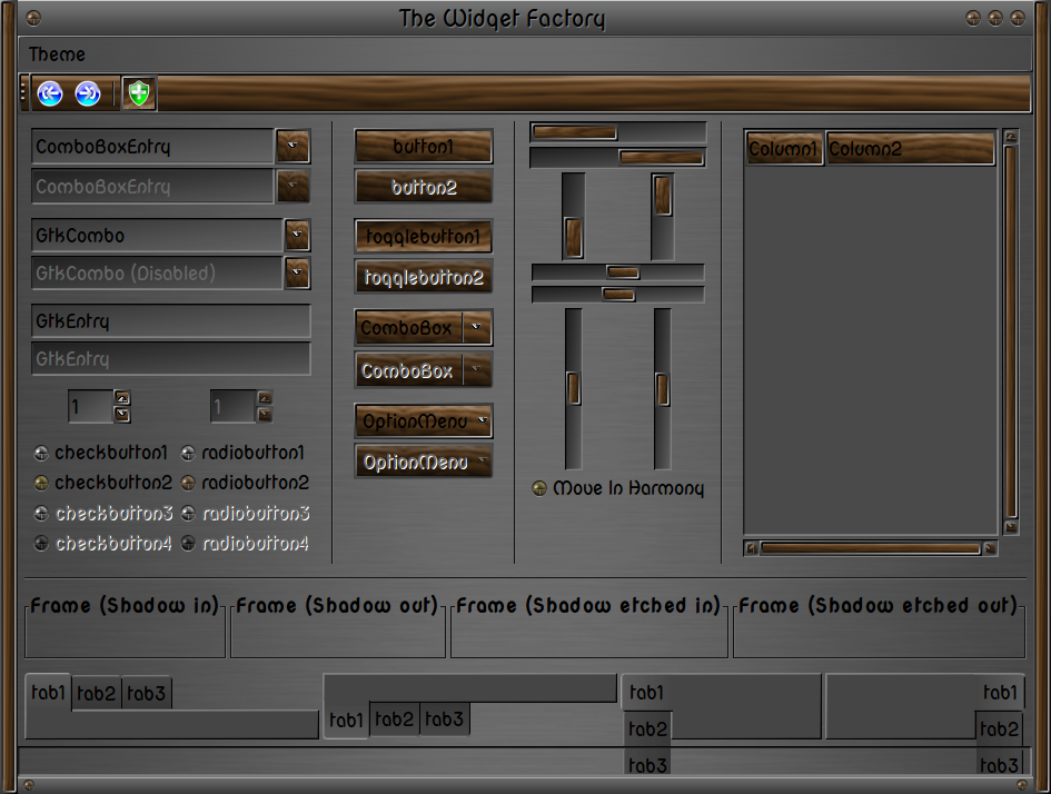
I've played with this theme since NewYear, and I did other versions of this: metal with blue plastic, and metal with "pine" wood - light yellow color of wood.
If you want this, I will upload these. :)
Holy Cow
Inovative concepts....
Here is some new and exciting work.
Nice grasp of gtk theming
Like your scientific style approach and your extra explanations in gtkrc.
Please keep up the work.
Screenshots need improving
This is not just another wood theme,
the style remindes me of a sculpture syle.
THANKS !!!
I wanted to do a simpliest style - the gtkrc files are bigger and bigger - maybe we should turn into the simplicity with our works ???
What improving are you thinking about ?
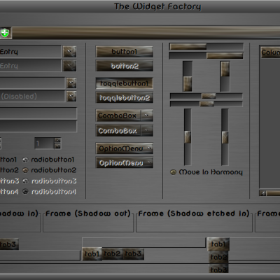
I Favor the Metal'n'Wood-Alt. I like the wood inset in the metal
button look.. I like your check buttons.
Most of all I like the notebook-tab sculpture look of the Alternate theme. It really shines with some apps like
Osmo, gtkperf, I bet It would look good with tabbed PCManFM.
Good = starting your theme from terminal shows no errors.
The gtkrc file is nice, I imediately knew you had done alot
of experimenting and hard work.
The big picture , I can not say , if it is better or not, I believe
it has more with tunning to the engine than just saying
less is better in this case.
I can tell you If you want a fast or light theme a small and simplified arrow will gain you 4 to 5 seconds with
gtkperf.
I like efficiency but am not willing to give up art..
throwing the Simplified word around seems to be
hip., but I also want choice and pixmap engine gives
you both.
Anyway, thanks this one will work nicely with at least
4 different wood- steampunk e-17 shell themes.
keep doing what your doing it is looking good.
I've thought about a old computer's users, when I said, the theme is not fast. Anyway I did it not only for me...
If you have any suggestions to fast this - I willingly listen to it. Thanks for offering your help. :)


Ratings & Comments
11 Comments
Hey does anyone remember the wood and "metal" (grey gradient) theme from way back in the day, like 1998, maybe even earlier? It was a really popular theme back then (HandOfGod time period) and I've tried to find it but the search engine indexes from back then are pretty bad. It really looked awesome. It might have been called gradient or pixmap, I can't remember and haven't been able to find it after an hour or so searching. Definitely pre gtk 1.2.
I am not sure what theme are you talking about... :(
Hey I really like this theme and its concept! it has great potential. great work buddy! I think you should pursue this! I think it would look cool with a lighter wood color. they text would probably show up much better too! Something tells me light yellowish shiny wood. Or Redish Shiny wood (Like Apple loves to use). Anyway Great work voted up! :)
Thanks ! I've played with this theme since NewYear, and I did other versions of this: metal with blue plastic, and metal with "pine" wood - light yellow color of wood. If you want this, I will upload these. :)
That sounds really great! Especially the "Pine Wood" Theme Thanks for all the hard work :)
That sounds really great! Especially the "Pine Wood" Theme Thanks for all the hard work :)
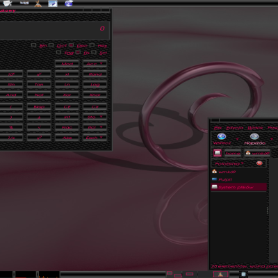
Holy Cow Inovative concepts.... Here is some new and exciting work. Nice grasp of gtk theming Like your scientific style approach and your extra explanations in gtkrc. Please keep up the work. Screenshots need improving This is not just another wood theme, the style remindes me of a sculpture syle.
THANKS !!! I wanted to do a simpliest style - the gtkrc files are bigger and bigger - maybe we should turn into the simplicity with our works ??? What improving are you thinking about ?
I Favor the Metal'n'Wood-Alt. I like the wood inset in the metal button look.. I like your check buttons. Most of all I like the notebook-tab sculpture look of the Alternate theme. It really shines with some apps like Osmo, gtkperf, I bet It would look good with tabbed PCManFM. Good = starting your theme from terminal shows no errors. The gtkrc file is nice, I imediately knew you had done alot of experimenting and hard work. The big picture , I can not say , if it is better or not, I believe it has more with tunning to the engine than just saying less is better in this case. I can tell you If you want a fast or light theme a small and simplified arrow will gain you 4 to 5 seconds with gtkperf. I like efficiency but am not willing to give up art.. throwing the Simplified word around seems to be hip., but I also want choice and pixmap engine gives you both. Anyway, thanks this one will work nicely with at least 4 different wood- steampunk e-17 shell themes. keep doing what your doing it is looking good.
I've thought about a old computer's users, when I said, the theme is not fast. Anyway I did it not only for me... If you have any suggestions to fast this - I willingly listen to it. Thanks for offering your help. :)
Sorry, it was a quick reply... I mean, on worse computers this theme may loads slow.