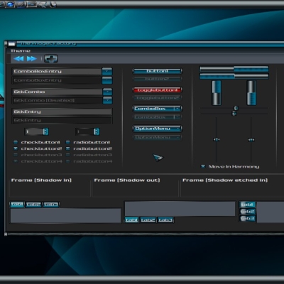
Description: Please let me know what you think of the metacity theme buttons as i am considering changing them
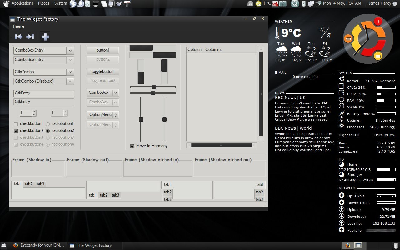
This is a new theme that i have been working on. I have been trying to emulate the features of some of the greatest pixmap themes like SlicknesS and TechniX that use dark widgets with a light base giving a nice dark theme feel without compromising usability. Please let me know what you think of it and let me know about any areas that could do with modification or adaption.
The Icons for this theme can be found here... http://www.gnome-look.org/content/show.php/Polar+Icons+2?content=100614Last changelog:
0.0 - Preview released 0.0.1 - Alternate preview released 0.1 - First release
I don't know how to install the icons pack what are you using. :(
Could you give me a hand with this issue?
And I have a little question, which is the name of the software that u are using to show: the ubuntu logo clock, statistics about your system and other stuff; it's very nice.
Is it gdesklets???
Best regards
Firstly once you have downloaded it open it up until you find the folder called "Polar Icons 2" and remove it from the archive (put it on your desktop or something). Then right click on the folder and select "create archive" so that you should have an archive called "Polar Icons 2.tar.gz. Then open up your appearance preferences and simply drag and drop it onto it. If you still have any issues let me know and i'll assist you further.
Secondly it isn't actually gdesklets it is all done (including the clock) with conky. It is a REALLY great program, its useful for so many things. I am hoping to release my conkyrc files in the next release of this theme.
The conky config has now been uploaded you should be able to get it here...
http://www.gnome-look.org/content/show.php/Conky+%5BJamesHardy88%5D?content=104814
Could you fix the menu bars a little bit? I like the theme as a whole but I can't read any text on either menu bar, which is kind of a deal breaker for me.
I just realized this was because I had colors changed, however I like the background of windows to be dark, and for some reason the menu text in this theme is tied to the window background color.
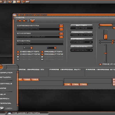
Do you think to make check,radio and progress
bar colors orange or dark blue or another attractive color to flash in black not black and the buttons black and rounded?
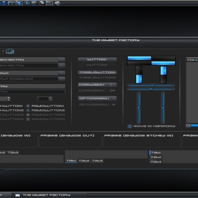
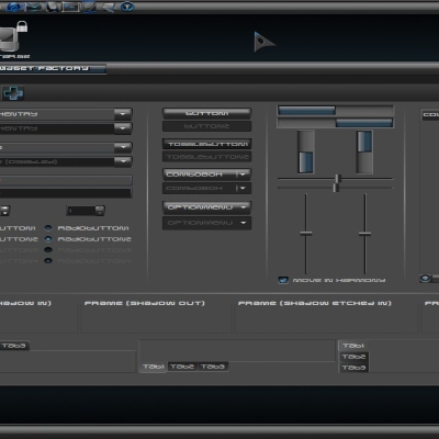
A pattern certainly seems to be emerging, i think i may go ahead and just release the first preview as a full theme. I may possibly develop the second proposal a little further as a separate theme.


Ratings & Comments
24 Comments
I don't know how to install the icons pack what are you using. :( Could you give me a hand with this issue? And I have a little question, which is the name of the software that u are using to show: the ubuntu logo clock, statistics about your system and other stuff; it's very nice. Is it gdesklets??? Best regards
Firstly once you have downloaded it open it up until you find the folder called "Polar Icons 2" and remove it from the archive (put it on your desktop or something). Then right click on the folder and select "create archive" so that you should have an archive called "Polar Icons 2.tar.gz. Then open up your appearance preferences and simply drag and drop it onto it. If you still have any issues let me know and i'll assist you further. Secondly it isn't actually gdesklets it is all done (including the clock) with conky. It is a REALLY great program, its useful for so many things. I am hoping to release my conkyrc files in the next release of this theme.
The conky config has now been uploaded you should be able to get it here... http://www.gnome-look.org/content/show.php/Conky+%5BJamesHardy88%5D?content=104814
any chance of getting your conky set up? aside from the fugly clock it's beautiful!
I will see what i can do about including it in the next release.
I have finally uploaded it, you can find it here... http://www.gnome-look.org/content/show.php/Conky+%5BJamesHardy88%5D?content=104814
Could you fix the menu bars a little bit? I like the theme as a whole but I can't read any text on either menu bar, which is kind of a deal breaker for me.
I just realized this was because I had colors changed, however I like the background of windows to be dark, and for some reason the menu text in this theme is tied to the window background color.
I'll see what i can do about changing that so its abit more user friendly. Thanks for bringing this to my attention
Do you think to make check,radio and progress bar colors orange or dark blue or another attractive color to flash in black not black and the buttons black and rounded?
Sorry would you mind elaborating on exactly what you mean as i am a little unclear...
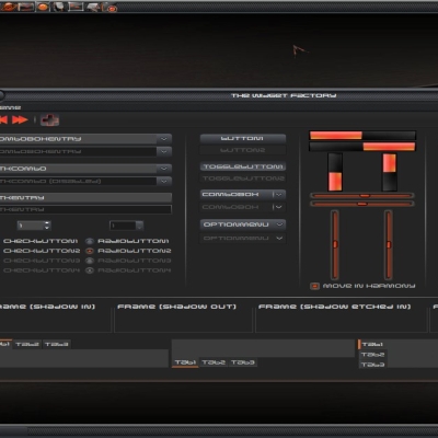
Looks tasty! :D Definitely the first one though, the elements in the 2nd are too dark and make it look weird as a whole.
Thanks, I have taken all of your advice and literally just released the first one, check it out
I can't tell any difference between the two...
The second preview has blacker widgets, the difference is subtle i have to confess...
Ah...OK, so it's not just me, then...
The second one is too-black for graphite! Interesting job, btw.
A pattern certainly seems to be emerging, i think i may go ahead and just release the first preview as a full theme. I may possibly develop the second proposal a little further as a separate theme.
u made a good job i prefer the first one, with grey scroll- and progress-bars, cause it looks smoother
I have to confess i am inclined to agree, overall it does seem to be fit together better as a complete theme.
good preview
Thankyou =)
Looks really good nice job...
Thanks, this is what i have been working on during breaks from the Black Mac Icons ;) don't worry they are still progressing nicely =)