

elementary_pbr_unity
NanaBuluku


Source (link to git-repo or to original if based on someone elses unmodified work):
Unitary Light 0.0.8 has been uploaded!
Fixed issues with tab highlighting
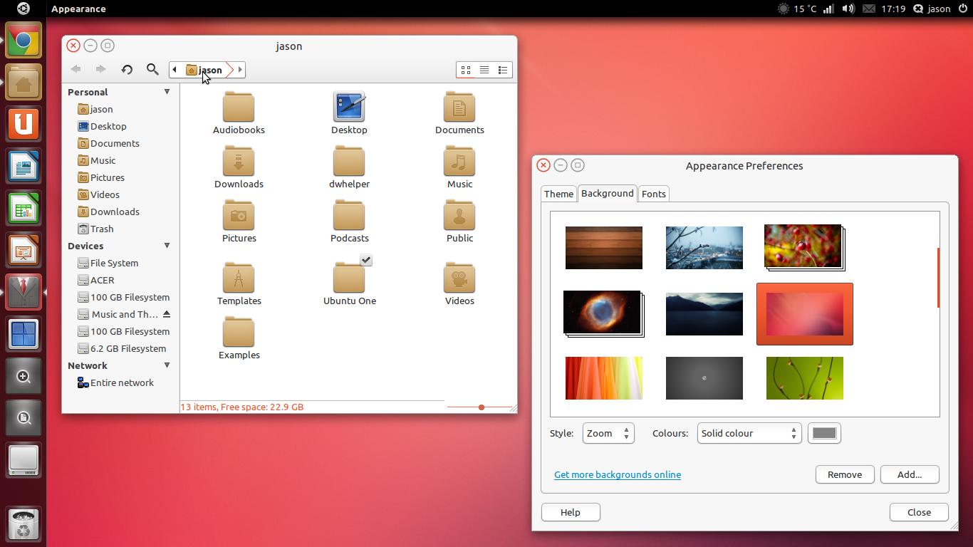
Fixed nautilus elementary status bar
Highlighted list entry gradient fixed
Buttons and tabs now have more consistent gradient
Faenza Dark now suggested icon theme as it has gained better Unity support
Added "unitary night" a variation with a darker colour scheme.
Updated
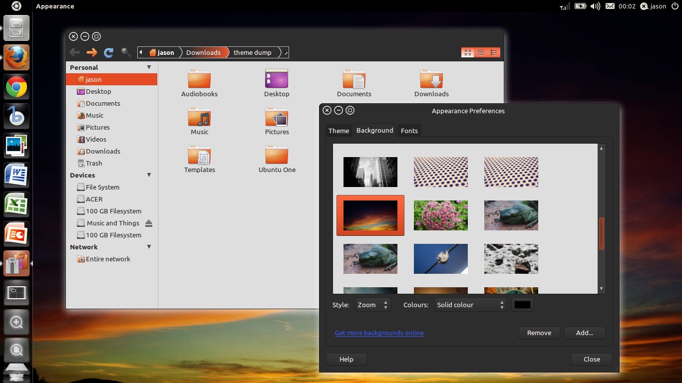
mono 0.0.6-2
now has similar scrollbar and progress bar style to light while keeping with the mono colour scheme.
Updated
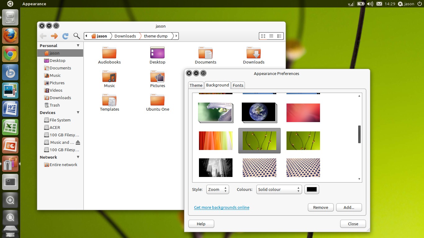
light 0.0.7-2
experimenting with new scrollbars and progress bars that I think better suit the color and style of the theme.
Updated
mono 0.0.6-1
light 0.0.7-1
-chrome(ium) now honours gtk
-new breadcrumbs for mono
-insensitive menu items are now much more readable in both themes.


More GTK2 Themes from NanaBuluku:
Other GTK2 Themes:


Ratings & Comments
14 Comments
ms office???!!!
Ha! Yeah, my university uses the ms office suite. Sometimes we "hand in" files instead of paper. While word .doc compatability is OK, the debilitating excel (especially with graphs and figures) and powerpoint compatibility issues render libreoffice absolutely useless for anything I use office software for on a day to day basis.
What about crossover? (http://www.codeweavers.com/)
Yeah, I've had a look at that. MS office running under wine from the ubuntu repositories seems to work well enough (after a few tweaks) for me. Though I've heard that the codeweavers suite works a lot better.
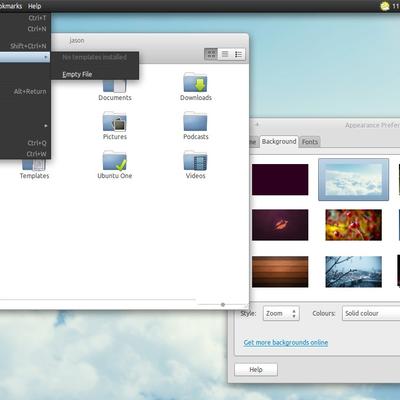
First of all, very good work. I want to create a theme once I get Natty installed on my netbook (this weekend I hope). I like thinner scrollbars than the ones you have in your screenshots. I do like the two different themes and would use them both. I am curious as to what the progress bars look like. Maybe you could show more apps opened that will show the different features. There is a tool, I believe it's called the widget factory (?) that is in synaptic that would show off this stuff for people to see better. What size monitor are you using to do this excellent work on? A Desktop? If you would like, I will probably have Natty on my Asus Netbook by next week and will be happy to give you more info. Keep going. I will be watching! :)
Cheers! I'm on a large laptop + external monitor at the moment and don't have a netbook to try it out on so that would be brilliant. Yeah, the scroll bars are a little wide for me too, a lot of people were complaining about the new ultra thin bars in elementary so I thought I'd make them really fat. The current ones are just place-holders though, I was wanting to make them somewhat similar to the unity scrollbars once the the design had been finalised for the Natty release (which I believe it has now). Cool, install Natty and theme away! It's definitely stable enough for everyday use at the moment (in my personal experience). Thanks for the feedback!
Oh, I have the widget factory but it hasn't been updated in yonks and doesn't display the theme as well as normal applications because the panel has stolen the menu. The progress bars are almost identical to the elementary theme but lighter. I'm hoping to mess around with them on the weekend and see what I can do.
I like the way you are taking it. The "white theme" for giving it a name-, the one with orange scrollbars, looks rather nice. Did you squeezed the size of the buttons on the window in the end? On that theme they look smaller, but perhaps it is the lighter background.
Cheers, the buttons were always a little smaller in the light theme than in the mono theme, but I have moved them a bit further from the window border as per your suggestion and I think the metacity is looking a lot better for it. I have greatly reduced the size of the buttons in mono also and they sit nicely in the background now instead of taking over. Thanks a lot for the feedback, it's very useful hearing back from people who have a good eye for design.
But, IMHO, the windows buttons are too big -or you should move them a little down- they are almost touching the window border. Anyway, good work, did you removed the earlier Unitary releases?
Cheers for the feedback! Yeah the buttons are probably a few pix too big, I'll get on that. I removed the earlier releases because I found a couple of glaring problems but the "light" version will be back up soon.
Cheers for the feedback! Yeah the buttons are probably a few pix too big, I'll get on that. I removed the earlier releases because I found a couple of glaring problems but the "light" version will be back up soon.
Cool, but I think Nautilus' sidepanel should be of the same grey of the windows frame instead of black, for better consistency... just my opinion - nice job!
Yeah, good point. I was kinda 50-50 on the dark side panel. Seems a bit much and kind of takes over a bit. Cheers for the feedback!