
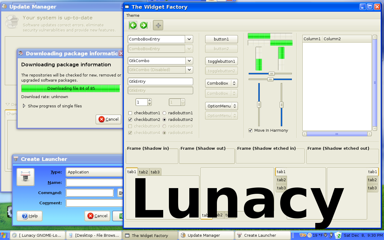
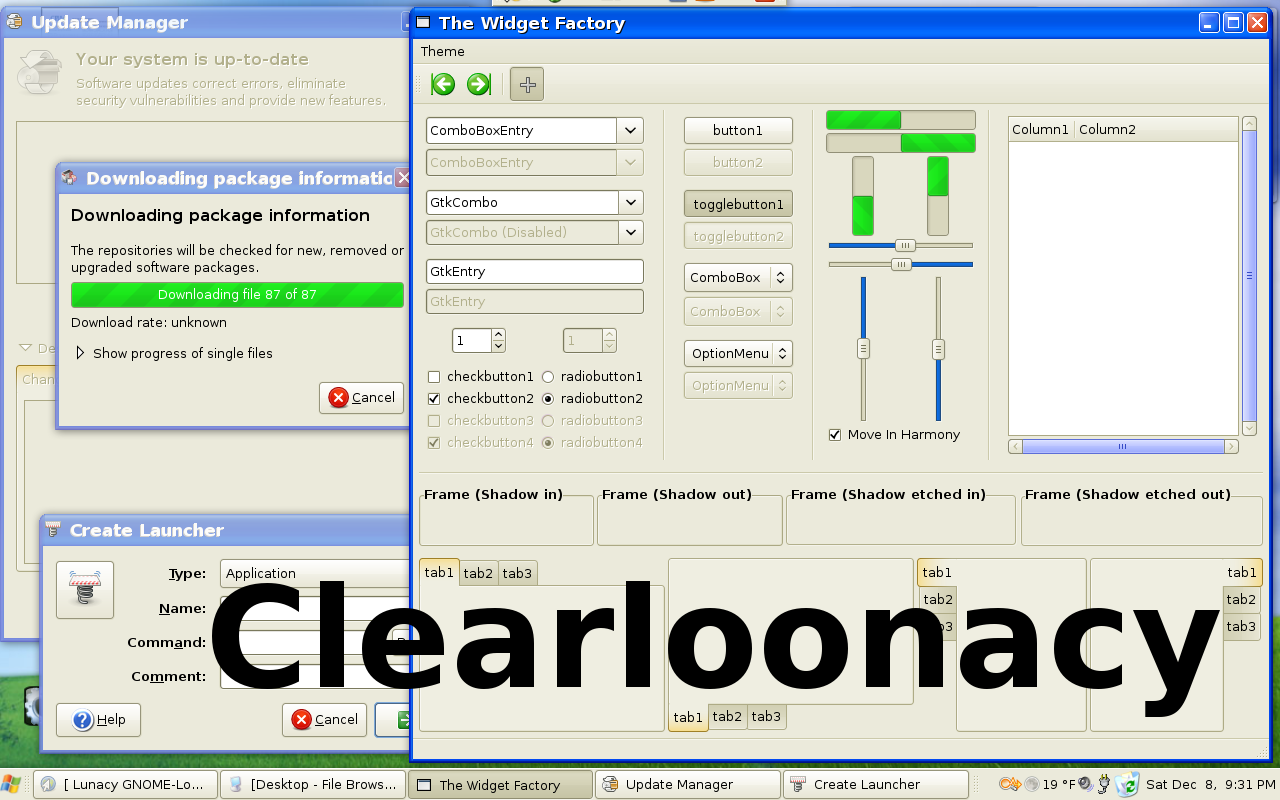
Lunacy
Source (link to git-repo or to original if based on someone elses unmodified work):
With a Linux desktop that looks like Windows XP you can:
* Remember the days when M$ had gotten its operating system almost right, before they shoved a beta-quality Vista down our throats.
* Mollify a new Linux convert who wants a familiar interface.
* Enjoy the irony!
* Piss-off Microsoft-haters!
* Piss-off Microsoft!
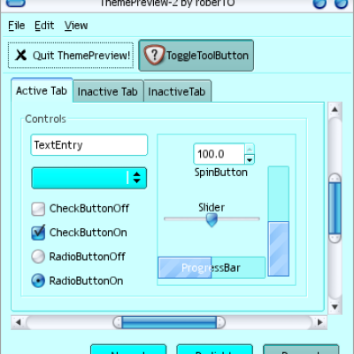
Both themes require Gnome 2.20 and Clearlooks. Lunacy also requires Ubuntulooks. The new GTK color dialog is supported, as are vertical Gnome panels up to 2000 pixels tall.
For those who are curious:
The icons are GnomeXP:
http://www.gnome-look.org/content/show.php/GnomeXP?content=69587
The Metacity window decoration is Lunacity:
http://www.gnome-look.org/content/show.php/Lunacity?content=62350
1.0
Clearloonacy created from the GTKRC for the default clearlooks with GUMMY style in Gnome 2.20.
Lunacy created from Clearloonacy.
1.1
For both themes forced the scrollbars to Luna light blue, so they retain that color when you set a new color for selected items. Also, accuracy changes to the default selected items color.
For Clearloonacy, set the tabs to be the same yellow color as they are in Lunacy.







Ratings & Comments
9 Comments
pretty good. i would consider toning down the green in the progress bars though. its a bit too neon at the moment
Hi! Where did u get windows xp icons? Could u plz tell or if someone else has an idea? Thanx!
The icons are GnomeXP: http://www.gnome-look.org/content/show.php/GnomeXP?content=69587 The Metacity window decoration is Lunacity: http://www.gnome-look.org/content/show.php/Lunacity?content=62350
Man, you rock!!! it looks pretty good indeed, nice!! :D
concur with knux! will definitely help those ppl who might need time to get used to linux!
This should help wean users onto Linux with a more comfortable appearance :)
This is very close to XP, but the text in the "system tray" should be white, though.
Actually, I gave that a try but was not successful. Ultimately, I decided to lighten the panel a bit so the black text would show up better. Three questions for whoever on Gnome-Look might know: Can anyone point me to a reference manual that completely documents what settings to tweak exactly what colors in the Clearlooks engine? Also, anyone know how to make "Create Launcher" (and any other dialogs that use the panel background) render with the normal background?
OK... Only Two questions. :)