

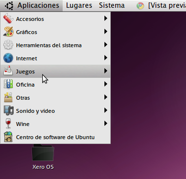

Ambiance II
LuxieRayku


Source (link to git-repo or to original if based on someone elses unmodified work):
Perfection 2.0 - more glassy, fixed some bugs, changed a lot of things
Perfection 2.1 - Some small changes at progressbar, scrollbar, menu, menuitem etc.
Perfection 2.2 - Fixed some bugs and small changes
Perfection 2.3 - Fixed bug of menubar
Perfection 2.4 - A lot of changes
Perfection 3.0 - A lot of changes
Prfktion 4.0 - Added pixmaps and some other small changes


More GTK2 Themes from LuxieRayku:
Other GTK2 Themes:


Ratings & Comments
19 Comments
I'm very impressed, this is by far the best light theme. Best of all, I love how the colors are customizable.
I've already fixed this in your theme on my computer, and I think others would appreciate it too if you removed all references to specific typefaces (fonts) in the gtkrc theme, because I like my FreeSans, OK? Instead of GNOME, I'm using Xfce, and I was wondering just why I was getting this font in the panel that looked like the "Sans" font or something similar. I tried logging out and back in -- didn't fix it. I even tried rebooting -- still didn't fix it. I thought for a few seconds and tried changing themes, and the other one I tried honored my specific font preferences. So I went into Perfection's gtkrc file, searched for "font" and deleted all your references to specific fonts. After all, if I had wanted to use those specific fonts, I would have said so in the Xfce4 Settings Manager. Foisting particular fonts on me like that drove me nuts for a few minutes until I figured out what was going on, so I would appreciate it if you would please refrain from that in the future, OK? Other than that little annoyance, I must say that I like this theme. :-) Fred in St. Louis
No problem, now the theme is better and the "problem" is fixed
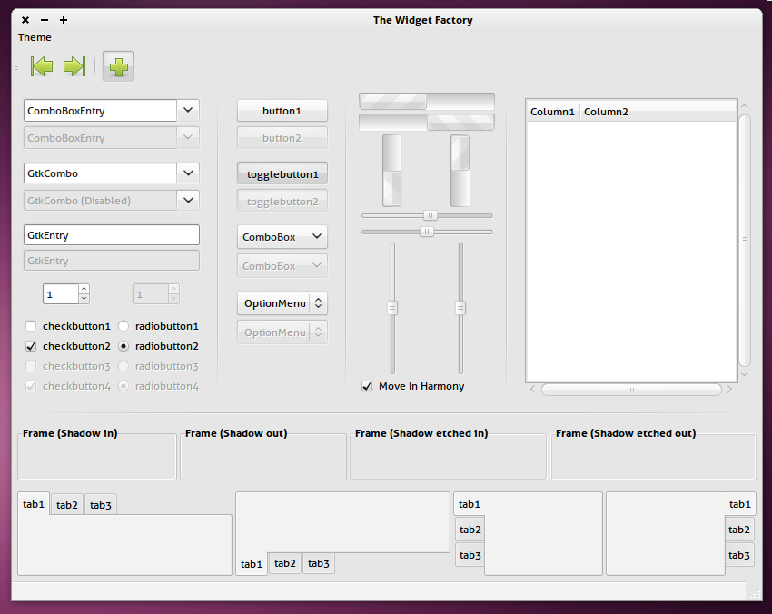
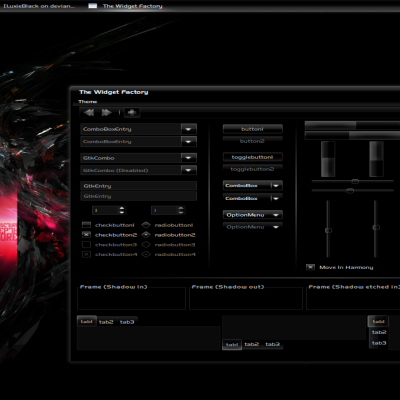
I like the updates in the new release. I've made some minor tweaks to get it the way that I like it (removed the shadow in the menu bar, shortened the gap between tabs, etc.) One think I can't figure out how to change is the shininess in the background for a selected tree item. It's too shiny for my taste. Any suggestions? If you need to see what I'm talking about, I can post a pic somewhere. Thanks for your great work on this theme. It's severely under appreciated.
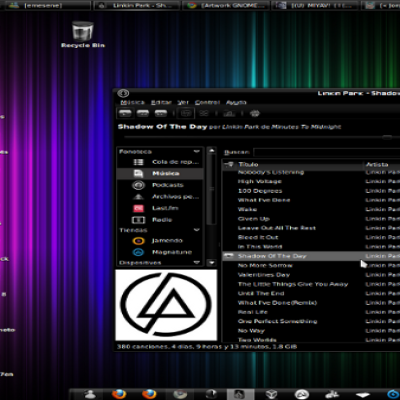
Yeah, send me a screenshot, and thanks for the comment Here is a screenshot of my actual desktop http://luxieblack.deviantart.com/art/Crystal-perfection-162330468
Wow!! Your desktop looks great!! Here's the screenshot. http://img228.imageshack.us/img228/2865/screenb.png I've circled the area I'm referring to in red. It just looks too shiny. I would prefer a matte gradient (maybe even solid color) background. Thanks so much Luxie!!
I also will try to make some other changes at the theme, I think I'll add some color like dark blue, and a new metacity In the screen I used the rgba module :P
Something goes wrong when I tried to install in on Ubuntu. The name appears, but when I applied it does not work but goes to the default theme
1-What version of Ubuntu? 2-Have you installed murrine from git?
This is a surprisingly underrated them. I think it looks fantastic. The only issue that I've seen is that the menu bar doesn't seem to blend with the rest of the theme. Is that intentional or is there something wrong with my computer?
It's a bug of theme, I will fix it. I used globalmenu al the time so I don't see the menubar :P But I will fix it, no worry
Thanks for the fix. It looks great!! :-)
A modification of another theme. Again. Why don't you mae your own? I'm sure you can do something good too. We need new stuffs, not modifications of other themes. My opinion.
One thing: compare both themes, not seem because only I used Dichotomy as "base" so I've changed all the theme. Honestly I'm not very good at programming, so to make this murrine theme I've edited the existing theme Dichotomy This is my own theme and is new stuff but originally it was a modification of another theme
Hi Dear, this theme is fine and works so smooth on my machine. Thank you for making this nice theme!!! It's awsome and I like it!!! Greetings Karmicbastler
Nice theme.The only thing I did not like was the panel background. I have a 42 px bottom panel and a 24 px background just looks ugly. I deleted the the line referencing it in the gtkrc so its all good. I think there might be people out there that don't know how to do that and just write the theme off as unusable. I don't mean to pick on you, as there are lots of themes with this "feature". Just needed to get that off my chest.
To be honest, I made the theme in 30 minutes, I've used the panel bg of Elementary I will make some changes at the theme soon
Looks awesome! on the screenshot.. it doesn't work on my computer, requires Murrine from git? Thanks.
I'm not sure, I have it installed so I recommend you also install it