Description: Please DO NOT download this unless you really know what you are doing. This is a proposed theme, it has been beta tested by my admin & beta testers. Please bare in mind not all computers are the same. Please report any issues you have.
Credits will on the "homepage link" when I am done with it. To see it in action. a screencast using it on a UE 2.3: http://www.youtube.com/watch?v=SanjC3rqyRE&fmt=22 It also shows me installing it on a raw copy of Jaunty in a virtual machine.Last changelog:
how come your themes take over my ubuntu? even if i am not using them, the login screen cursor uses the UE cursor. In compiz, it won't let me remove the UE skydome or unanimate it
What does piss me off, that I actually am not done with it & I get hammered accordingly. 45% when I am done? Please let me finish, pricks.
I said proposed, You know what? I will make it closed source, like that? What I can do in a day is better then those that give me a bad review can do in a lifetime.
From here forward there will not be a UE theme pack released here until I see deemed as I see fit. Give me a Bad review, you go boy... I see in a day what this site sees in a month (traffic wise), good luck with all that.
I do have beta testers, what do I need this site for? I initially thought why not test with you, sorry no more. As I test; dig my grave & try and bring it up to 50%, where I started?
It is over enjoy what you had.
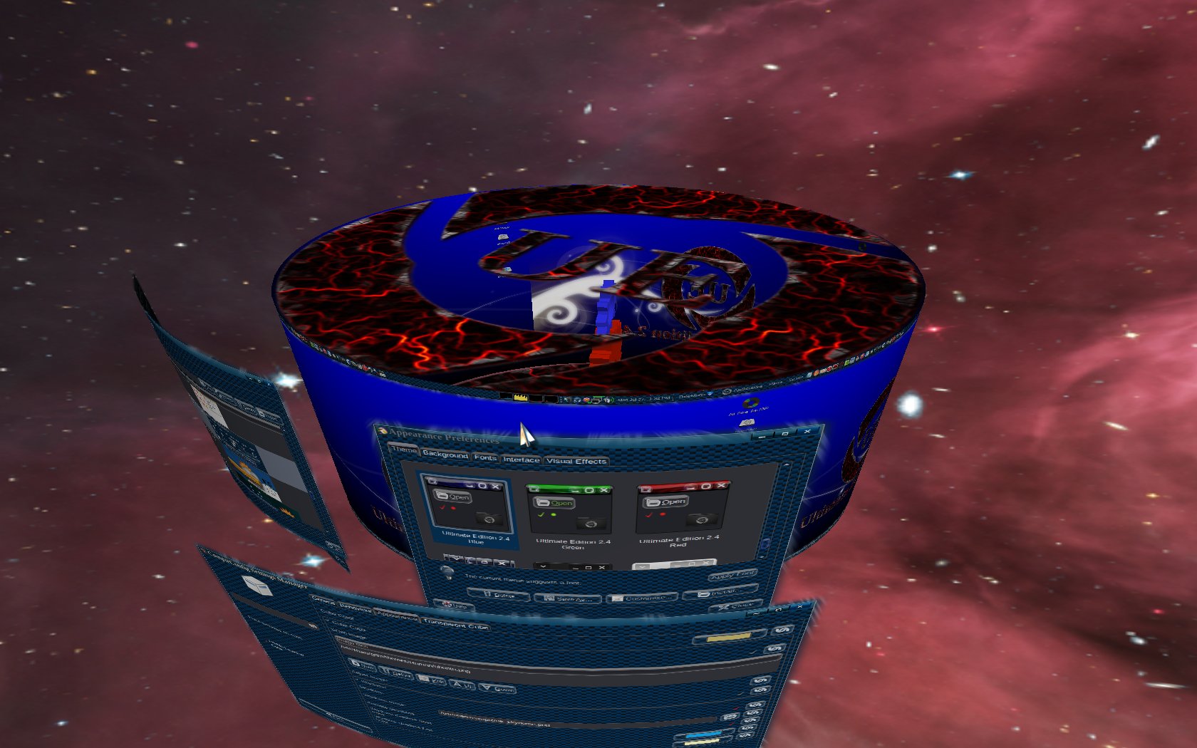
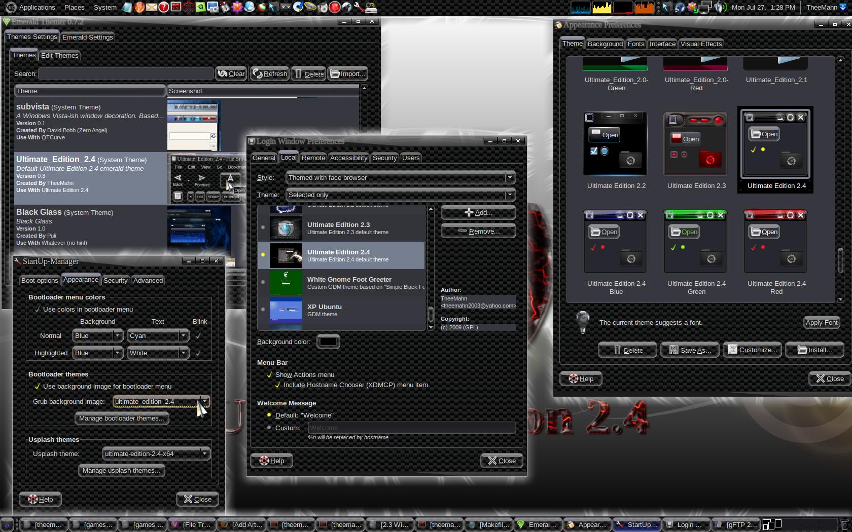
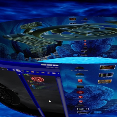
You know the theme pack has been changed as far as screenshots. I re-wrote it to use a high gloss black background. I did not update the initial post. Thanks for testing the the theme. I change the file on my server and repercussions are felt, not just here. That is why I place the theme proposed. Please re-download.
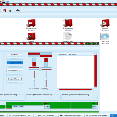
Please everyone compare v/s the screenshot and report.
TheeMahn
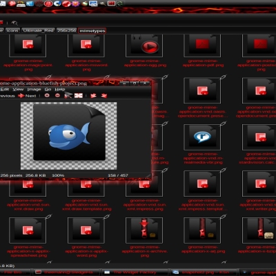
I played with that texture way back when and realized real quick it just gets annoying real fast.
Theme textures are nice when kept light but that is a bit much. Cut back on the texture and keep it minimal. You should also consider a different pattern.
Look like i'm back in 80's. And, also, this checkers are awfull: who will pay to my eyes surgeon? :-)
Interface must be flat, lightweight and pretty clear: your ideas about glass elements isn't bad, but that textures... Oh, looking at they for 10 seconds i feel pain in my eyes!


Ratings & Comments
10 Comments
how come your themes take over my ubuntu? even if i am not using them, the login screen cursor uses the UE cursor. In compiz, it won't let me remove the UE skydome or unanimate it
HHMMM.? I wonder who ? HHmmm? It damn sure wasn't Tex !
What does piss me off, that I actually am not done with it & I get hammered accordingly. 45% when I am done? Please let me finish, pricks. I said proposed, You know what? I will make it closed source, like that? What I can do in a day is better then those that give me a bad review can do in a lifetime. From here forward there will not be a UE theme pack released here until I see deemed as I see fit. Give me a Bad review, you go boy... I see in a day what this site sees in a month (traffic wise), good luck with all that. I do have beta testers, what do I need this site for? I initially thought why not test with you, sorry no more. As I test; dig my grave & try and bring it up to 50%, where I started? It is over enjoy what you had.
You know the theme pack has been changed as far as screenshots. I re-wrote it to use a high gloss black background. I did not update the initial post. Thanks for testing the the theme. I change the file on my server and repercussions are felt, not just here. That is why I place the theme proposed. Please re-download. Please everyone compare v/s the screenshot and report. TheeMahn
For the constructive critism, it will most likely change before going final.
I have an advice for you: look here for realising how good theme looks like :-) http://browse.deviantart.com/customization/skins/linuxutil/#order=9
I played with that texture way back when and realized real quick it just gets annoying real fast. Theme textures are nice when kept light but that is a bit much. Cut back on the texture and keep it minimal. You should also consider a different pattern.
SUBJ
Yes, give me a minute ;)
Look like i'm back in 80's. And, also, this checkers are awfull: who will pay to my eyes surgeon? :-) Interface must be flat, lightweight and pretty clear: your ideas about glass elements isn't bad, but that textures... Oh, looking at they for 10 seconds i feel pain in my eyes!