


http://gnome-look.org/content/show.php/crystals?content=56826
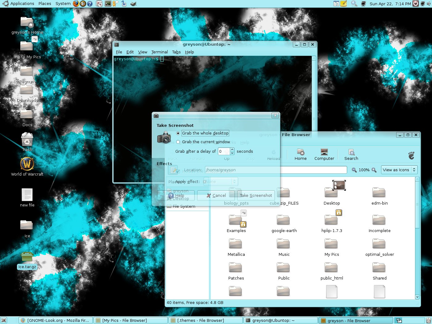
Icon set I used is
http://gnome-look.org/content/show.php/Human+Effect+Pack?content=46012
thanks to BaQs for making them

Alternative background i made
http://gnome-look.org/content/show.php/fracbg?content=56935


Ratings & Comments
5 Comments
the bright cyan hurts my eyes :|
If you're going to rate it bad, please comment so I can try to improve it. :)
please comment :)
Better than my first theming attempts :) But still, not usable.. Strong saturation and contrast can be ok for icons, but not for the gui background, it's not an "eye friendly" idea. I mean, try reducing some saturation and contrast.
The new backgroudn I made goes WAY better with the GUI, but thanks for the constructive criticism.