

Many thanks to Half-Left for all his help

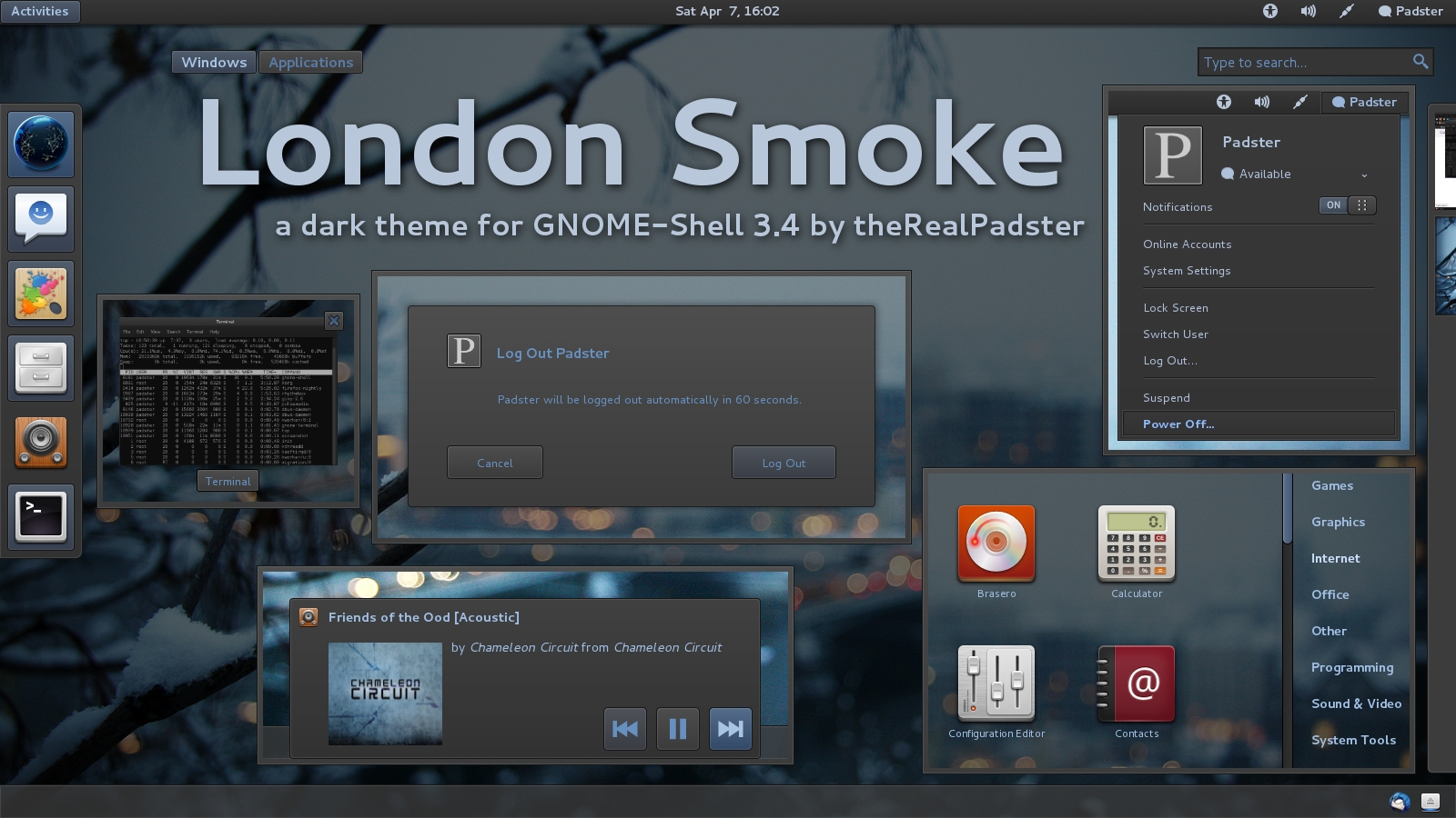
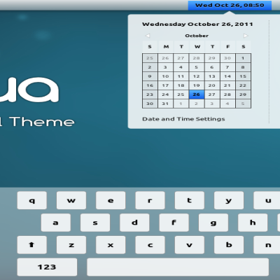
Now works with GNOME-Shell 3.4!


Source (link to git-repo or to original if based on someone elses unmodified work):
June 5, 2011: initial release
1.01:
-moved to latest Adwaita codebase (better support for certain things, like rtl)
-fixed double-border in messaging notifications
-added 2px padding in between shell-tab-switchers
-revamped corner-ripple
-bigger icons in search-results
-various other improvements in search-results
-added shadows to notification-tray entries
1.02:
-fixed padding issues with messaging-notification-bar-right-click-menu
-fixed search-engine buttons (made them fit in more, and added hover/pressed functionality)
1.2:
-ported over to new GNOME-Shell 3.2 base (added many new features)
-cleaned up notification-popups code
-added inner highlight to menus, removed shadows
-added 100ms transitions to many things
-changed workspace-thumbnail highlight
1.2.1:
-moved the readme from the gnome-shell.css to a separate file
-added instructions for fixing the menus with font-scaling factor at 1.2
1.2.2:
-fixed spacing between "Windows" and "Applications" buttons
1.3:
-GNOME-Shell 3.4
-tweaked submenus
-fixed jumping summary-buttons
-added some missing things
-improved visibility of text on hover-buttons
-changed transitions on buttons from 100 to 200 (smoother)
-other random bug fixes


More Gnome Shell Themes from Padster:
Other Gnome Shell Themes:

Ratings & Comments
33 Comments
Very nice and elegant work. Much praise!
Thanks, glad you like it :)
May be it's me, may be I am wrong, may be it's not the place here to discuss it, but every time I test some G-*hell theme the text in the panel and icons are so f* big(like default one). I wonder if I need an eye doctor or ... There are some exceptions of course. :) Good Luck P*r & Thanks f* sharing.
The text is not huge, it's just 12 pt, bolded.
:) Ok
Very good artistic sense. Very, Very nice! Thx.
Thanks!
Great theme! The only problem is that you're mixing px and em, which makes things messy if you adjust "Text scaling factor".
Thanks :) The default theme uses both ems and px, so are you saying this is a bug with it, too? the thing is I'm not sure how to get everything looking right with only one, also.
Don't know about default theme, but I had to tweak some code after I changed scaling factor to 1.2 .popup-menu-item:active { <......> padding-top: 5px; /*LOOK -needed?*/ padding-bottom: 5px; padding-left: 27px; padding-right: 27px; } Without this the menus were crewed.
So what do you advise I do? Change those values to px?
Perhaps. May be this is the only place which is sensitive to the font scale factor. Even if you add this info into readme I think it will be enough - people will adjust this manually if needed, just like I did.
Oh, I just noticed you just tweaked the pixel values to what fits your settings. So it will mess it up for anyone else not using the same font size, then, eh? Yeah, I think I'll just include it in the README.
Hi again. I'm here to finally fix the font-scale problem. I also found a small glitch in alt-tab menu. Both of these are fixed with this patch
@@ -189,6 +189,7 @@ .popup-menu-item { padding: .4em 1.75em; + border: 1px; spacing: 1em; } @@ -200,10 +201,6 @@ border-radius: 0px; box-shadow: inset 0px 0px 1px 1px rgb(30,30,30); color: #8cbcff; - padding-top: 4px; /*LOOK -needed?*/ - padding-bottom: 4px; - padding-left: 22px; - padding-right: 22px; } .popup-menu-item:insensitive { @@ -1818,6 +1815,7 @@ .switcher-list .item-box { padding: 8px; border-radius: 8px; + border: 1px; } .switcher-list .item-box:outlined { /*top button on alt-tab down arrow-thing*/ @@ -1828,7 +1826,6 @@ border-radius: 4px; box-shadow: inset 0px 0px 1px 1px rgba(255,255,255,0.1); color: #a8c4e3; - padding: 6px; } .switcher-list .item-box:selected {And two more bugs (at least in gnome 3.4.1) 1. The icons in search results and app-menues are screwed. Fix:
@@ -795,12 +792,14 @@

 .icon-grid {
     spacing: 36px;
-    -shell-grid-item-size: 118px; /*search-result-button-size*/
+    -shell-grid-horizontal-item-size: 118px; /*search-result-button-size*/
+    -shell-grid-vertical-item-size: 118px;
 }

 .contact-grid {
     spacing: 36px;
-    -shell-grid-item-size: 272px; /* 2 * -shell-grid-item-size + spacing */
+    -shell-grid-horizontal-item-size: 272px; /* 2 * -shell-grid-item-size + spacing */
+    -shell-grid-vertical-item-size: 118px;
 }

 .icon-grid .overview-icon {
2. You miss the descrition for .dash-label, quich fix:@@ -522,7 +519,7 @@ } -.window-caption { +.window-caption,.dash-label { background-color: rgba(13,13,13,0.8); border: 1px solid rgba(0,0,0,0.7); box-shadow: inset 0px 0px 1px 1px rgba(255,255,255,0.2); @@ -567,7 +564,7 @@ /*rgba(168,196,227,0.4) or rgba(102,144,192,0.5)<--*/ } -.window-caption { +.window-caption,.dash-label { background-gradient-direction: vertical; background-gradient-start: #4e4e4e; background-gradient-end: #3b3b3b;I did the things you outlined in the first comment, and that fixed the workspace switcher padding, which I had noticed before, thanks :) If it fixes the font-scaling issue, that's awesome, too. About your second comment, I already have a version out for GNOME-Shell 3.4, it's got those thing fixed already :)
That's strange, when I press download i get 1.2.2, not 1.3
oops, should be fixed now.
Thanks for sharing :] is a perfect for my new fedora.
Any time :)
Nice work. Some of us at the Fedora forum are curious how you get the Fedora logo next to the Activities button like this. Thanks.
Glad you like it :) I'm pretty sure it's the "ActivitiesButton" extension from http://www.fpmurphy.com/gnome-shell-extensions/ I have a few extensions installed, but I think that's it.
Excellent work!
Thank you! Have fun :)
I agree, that it's one of the most professionally feeling shell themes to date. I tried many of them, but without going to details, this one is the only one I prefer to the default shell theme. Those subtle gradients and not so much of contrast gives it a special taste. Plus, it can feel and look well with many kinds of wallpapers, whether they're dark or bright, makes life easier too. I wonder when gnome devs will like to include this one as the shell default theme, shouldn't take so long. ;-)